It used to be a time consuming process to create a halftone pattern. First, I would open a picture in Photoshop, convert it to grayscale, apply a halftone pattern effect, open it up in illustrator, trace it, and if didn’t get messed up somewhere in the process, I would use the halftone pattern in Illustrator. In Illustrator CS3 it is quite a bit easier to create halftone patterns without leaving Illustrator.
NotesThis tutorial was created with Illustrator CS3.I suggest having the Raster Effectsat 300 ppi. This will generate the best quality in the pattern. You can change this by going Effect > Document Raster Effects Settings and chose 300 ppi. Halftone PatternsI don’t want to ramble on here, but it is helpful to learn a little about halftone patterns before getting started. Basically, halftones simulate continuous tones with equally spaced dots of varying size. The eye blends these tiny dots into smooth tones. So anything created in Illustrator that contains continuous tone, can be simulated by a halftone. This includes gradients, blends, and gradient meshes. Moreover, you can apply halftone patterns to photos.Color is also important to note when dealing with halftone patterns. In addition to smooth tones, the human eye blends a limited palette of colors to create numerous colors in a halftone. It kind of works like the color mixer. A halftone pattern mixes dots of Cyan and Yellow to create a green color, just like you mix Cyan and Yellow in your color mixer. If you use processed colors (like the green mixture of Cyan and Yellow) when creating your halftone pattern it might not convert to vector gracefully. I suggest initially using black or spot colors in your halftone pattern. After the halftone is converted to a vector you can change it to a process color (CMYK or RGB). If any of this doesn’t make sense, just use black as the dark color and white as the light color in your gradients, blends and gradient meshes. After they are converted to vector, use any color you like. Halftone Patterns from Gradients, Blends and Gradient MeshesWith your gradient, blend, or gradient mesh selected, go Effects > Pixelate > Color Halftone. Change the Max Radius to 20 and keep the rest of the settings the same. If the dots in the halftone patterns are too small or too big, you can change the Max Radius by double clicking the Color Halftone effect in the Appearance Panel.Now you can trace the image to create vector art. Like the previous Grunge Text Tutorial, it is easier to work with the image once it is vector. Moreover, I am going to use the same settings in that tutorial. First, expand the image by going Object > Expand Appearance. With the image selected, the Control Panel defaults to the Live Trace options. Click the Arrow Button beside the Live Trace button and select Tracing Options. If you wish, you can also go Object > Live Trace > Tracing Options. You don't have to change all the options, just the ones below.
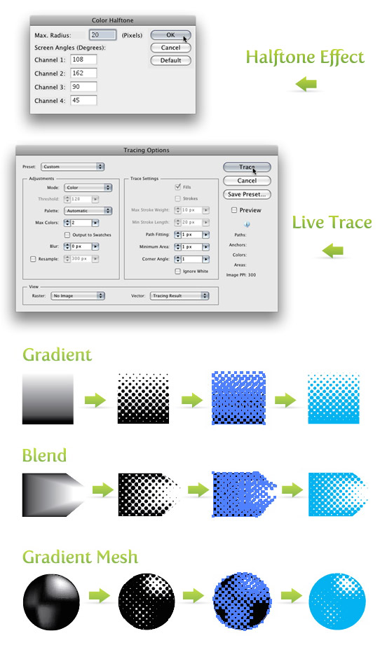 Halftones from PhotosFirst, place a photo on the document by going File > Place and choose your photo. Once the photo is on the document, embedded it by pressing the Embed button on the Control Panel. Next, go Edit > Edit Colors > Convert to Grayscale. Now you can apply the same settings for the halftone pattern effect and vector tracing as before. Again, you can always go back and change the Max Radius if the dots are too small or too big. Now it is really easy to spice up the halftone pattern with color!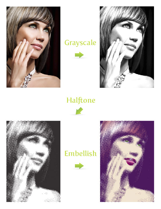 Halftone SwatchesIf you want some more halftone options, check out the halftone swatches available in Illustrator. In my opinion these are not as versatile as the previous techniques, but they are worth exploring. To open these swatches, click on the pop-up menu in the Swatch Panel. Next, go Open Swatch Library > Patterns > Basic Graphics > Basic Graphics_Dots. The last five swatches in the set are the halftone swatches. ExperimentDon’t stop there! Try playing around with the halftone pattern settings or use the halftone pattern effect on color photos and other vector objects. Below is an example of how I integrated these techniques into one of my illustrations.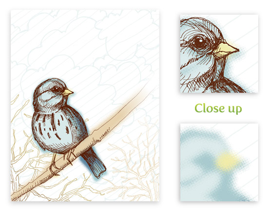 UpdateThere are many of you wondering if you can create these halftone effects with perfect circles in the halftone pattern. Unfortunately, with the techniques above, the circles in the patterns will never be perfect. However, there is an awesome Illustrator plug-in that can help in creating perfect halftone patterns called Phantasm CS. You might have already heard of this plug-in and if you have, you know about it’s unparalleled color adjustment tools. Now, Phantasm CS has added an amazing halftone tool! Phantasm CS now makes it super easy to create a perfect halftone effect. Moreover, you have total control over the halftone pattern. I advise any Illustrator user to buy the plug-in just for the color adjustment tools, but with the added benefit of the halftone tools, you would be crazy not to get this plug-in. I also suggest checking out the Phantasm CS Halftone tool demonstration video and learn about how powerful this tool is!  The post How to Create a Halftone Pattern in Adobe Illustrator appeared first on Vectips. |
|
Posted: 24 Jul 2015 01:25 PM PDT
For a while, it seemed liked every client wanted grungy graphics. This might sound familiar, “I like it, but can we grunge it up more”. Don’t get me wrong, having some grunge can create a great deal of depth to a design or illustration, but there can be to much of a good thing. This is the technique I use because it is quick and consistent, making it easy to scum up any design or illustration.
NotesThis tutorial was created with Illustrator CS3. You should be alright if you have Illustrator CS2.I suggest having the Raster Effects at 300 dpi. This will generate the best quality in the effect. You can change this by going Effect > Document Raster Effects Settings and chose 300 dpi. Adding GrungeWith your text selected, go Effect > Distort > Glass. In the options, use the following settings.
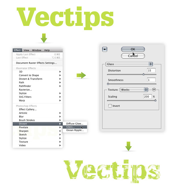 Tracing ImageIf you want to incorporate the text with other elements, it is a good idea to trace the image as a vector. Currently, if you place the text over an element that isn’t white, you will see white in the text instead negative space.First you will have to rasterize the image. Right now, the text is essentially vector art masking out a raster image. Both need to be rasterized before converting to vector. With the grunge text selected, go Object > Rasterize. Keep all the options the same, except change the Resolution to Use Document Raster Effects Resolution. 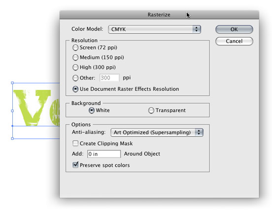 With the new image selected, the Control Panel defaults to the Live Trace options. Click the arrow beside the Live Trace Button and select Tracing Options. Or you can go Object > Live Trace > Tracing Options. You don’t have to change all the options, just the ones below.
Press the Expand button on your tool bar, and now you have vector art! 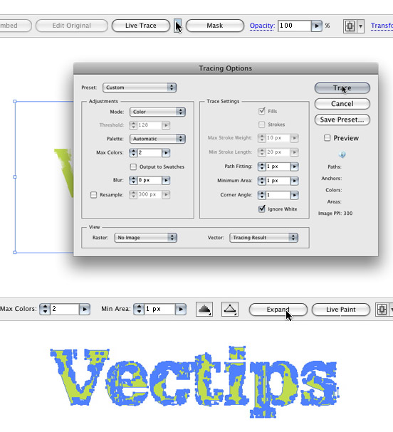 ExperimentTry this technique on objects other that type to get more grunge effects. You can even create your own texture and load it in the Glass effect where you previously chosen Blocks, pretty cool!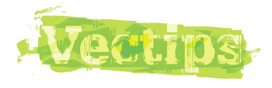 The post How to Quickly Add Grunge To Text in Adobe Illustrator appeared first on Vectips. |
|
Posted: 24 Jul 2015 01:05 PM PDT
Actions are a set of commands or a series of events that you can record and playback in the Actions panel. Actions are great for complex or repetitive tasks. I use the Actions all the time, especially when working with icon sets or buttons, like in the previous tutorial. If you are familiar at all with the Actions panel in Photoshop, you will have no problem with the Actions in Illustrator.
NotesI am working in Adobe Illustrator CS3. I’m note sure when Actions became a feature of Illustrator. For some reason I am thinking it was CS2, but that is probably wrong. I couldn’t find the answer anywhere so if someone knows, please share.Action PanelWhen you open the Actions panel you will see a list of predefined Actions. Look through them, there are some useful ones. One I like is the Reflect action. To activate the action, press play. You can also set a Function key to play the Action, this comes in handy. To set the Function key, double-click on an Action. Here you can set/change the Function key, put it in a folder, and rename. Some of the Actions require you to have objects selected.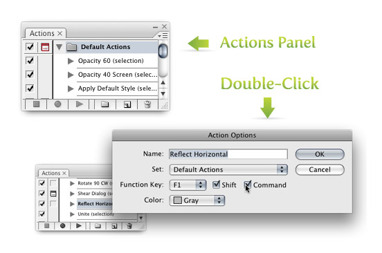 RecordFor a new Action, I suggest you click the New Set icon to create a new set (this keeps your new Actions separate from Illustrator’s). Within the new set, you create a New Action (also an icon at the bottom of the panel). When you press the New Action icon, it begins recording. Now you can go through your events and commands. In the example I provide, I select the two objects, Intersect them, Expand the shape, make the new shape a Linear gradient, change the color of the gradient, and then press stop. Wow, that is quite a bit of steps to do for the rest of the icons! However, I can select the next objects in my icon set, press play (or a Function key, if you have one set) and it does it form me! The Actions function has a tremendous amount potential, I would love to hear what others have done with it!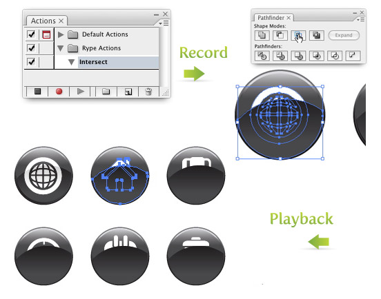 |

Tuesday, October 27, 2015
How to Create a Halftone Pattern in Adobe Illustrator
Tuesday, October 20, 2015
Summer’s End! Faceted Summer Banner Vectors
Now that summer is in full swing in the Northern Hemisphere, and what better way to say farewell to the season than with faceted summer banner vector designs filled with sunshine, rainstorms, and rainbows! With the super trendy faceted texture, we’ve got the makings for some fantastic stickers, web banners, and the beginnings of logotypes.
Tutorial Details
Final Image Step 1Each of the faceted summer banner designs begin with the same banner. Using the Rectangle Tool (M), draw a narrow, horizontal rectangle in light coral. Use the Pen Tool (P) or the Polygon Tool in order to draw a triangle that intersects with both corners on the left of the rectangle. Select both objects and hit Minus Front in the Pathfinder panel. Repeat on the other side in order to complete your ribbon banner.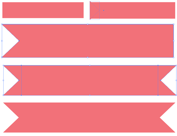 Step 2The text for these summer banner vectors is fairly simple: Summer ’14. I played with three sans-serif fonts: Akkurat Pro, Penelope Anne, and Hero. Whatever font you choose for your banner, do not forget to Expand your text under Object .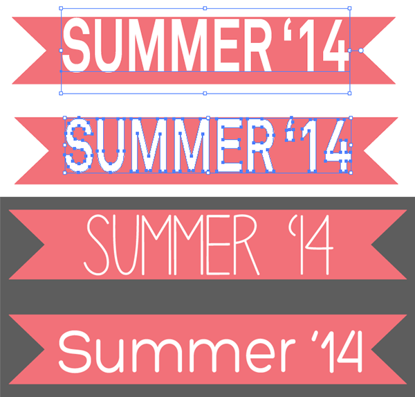 Step 3For the sun that appears in two of the summer banner vectors, start with a circle drawn with the Ellipse Tool (L) in a bright yellow. Under Effect > Distort & Transform > Zig Zag, enter 0.33in, or so, with 4 ridges per segment and hit OK. Expand under Object, and Copy (Control-C), Paste (Control-V), and Rotate the copied starburst on top of the first one so you have a bright, golden sun. Group(G) both shapes together and place beneath the banner ribbon in the Layers panel.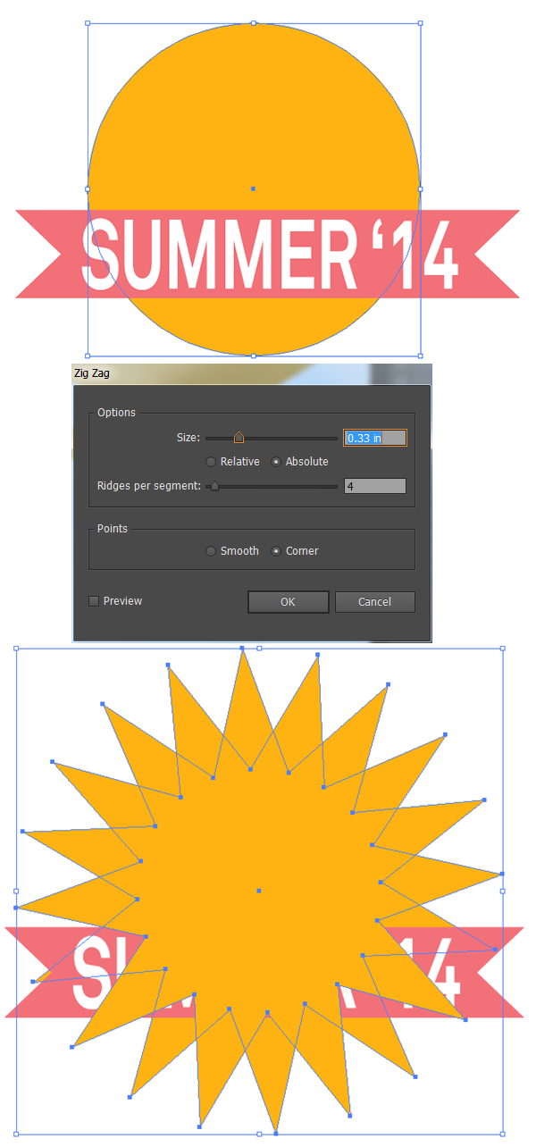 Step 4The sunglasses worn by the sun in the first summer banner vector are comprised of rounded rectangles. Draw a narrow, horizontal rectangle for the top of the glasses and a square for the first frame. Align these pieces to the right side (in the Align panel). Use the Direct Selection Tool (A) in order to select the rectangles that make up the left side of the glasses and pull the live corners inward so the rectangles are rounded. alternatively, if you’re not using Adobe Illustrator CC, you can use the Rounded Rectangle Tool from the start, but you will have to specify the corner radii. Repeat for the other side.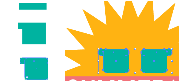 Step 5For the bridge of the glasses, draw a small rectangle between either frame of the glasses and go to Effect > Warp > Arc in order to Bend the rectangle 31% Horizontally. Expand your shape and recolor the glasses frames accordingly. I chose to place pink and blue rounded rectngles in the center of each frame for the lenses and two small gray rectangles on either side of the top of the frames as a Ray-Ban-esque detail. the first banner is complete. Let’s move on to the second and third.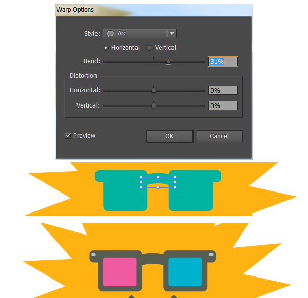 Step 6I Copied and Pasted the sun, as well as the banner itself, for the second summer banner vector. The sun was scaled down and placed to the right. Using the Ellipse Tool to draw a series of circles, of various sizes, in order to form a cloud. when satisfied with the cloud design, Select all of the circles and Unite in Pathfinder.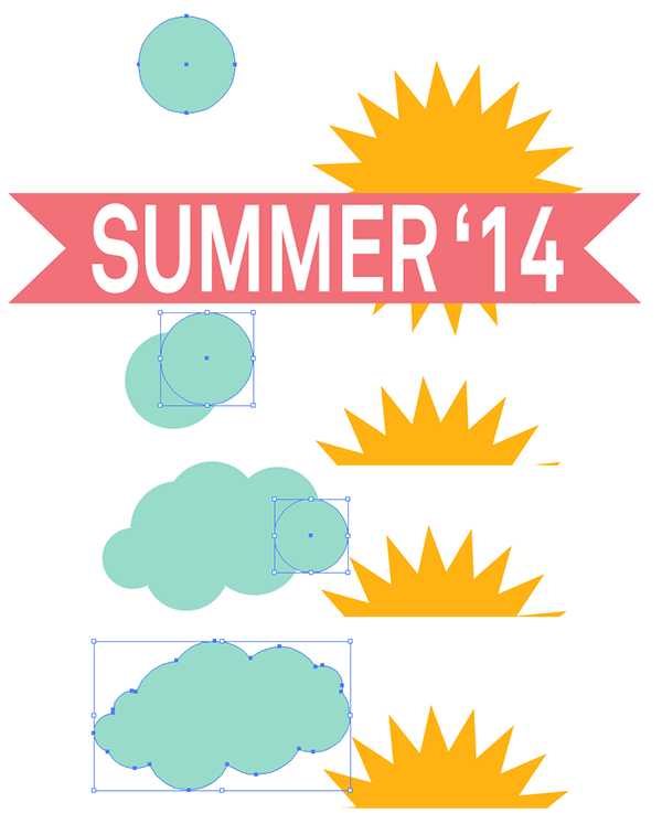 Step 7I’ve layered two clouds behind the sun, one darker than the other, in order to create some depth. Next up are raindrops. Draw a circle and pull the top anchorpoint upwards with the Direct Selection Tool. Use the Convert Anchor Point Tool (Shift-C) in order to change the top of the raindrop to a point. Copy, Paste, Scale, and scatter the raindrops around the composition, under the ribbon banner.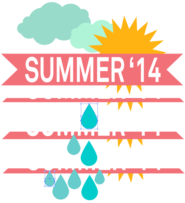 Step 8For the rainbow, which appears in two of the summer banner vectors, draw two identical, narrow, vertical rectangles. Select both and use the Blend Tool (W) to select both rectangles and apply a blend of 3 – 4 Steps.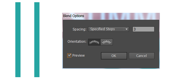 Step 9Expand the blend and change each rectangle’s color in order to create a rainbow. Group together the rectangles and pull them downward with the Selection tool in order to get a longer group of rainbow shapes. Go to Effect > Warp > Arc and set the Vertical Bend to -78%. This will result in a lovely, arching rainbow. Expand under Object.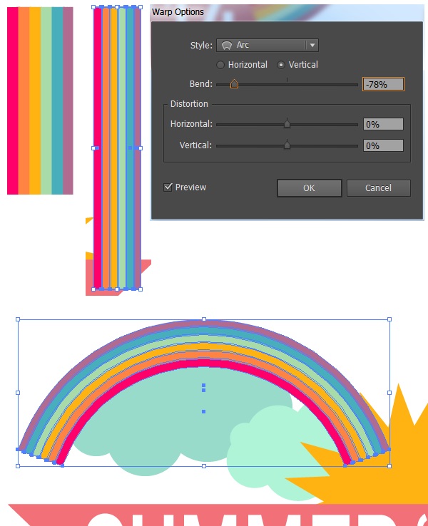 Step 10For the third summer banner vector, use the rainbow, clouds, and raindrops from the second and place all of them behind the banner (as done with the other designs).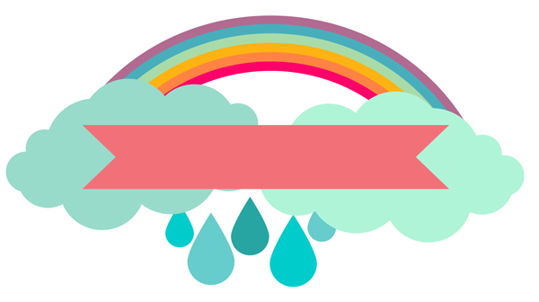 Step 11In order to create the faceted look seen on half of the summer banner vectors in the final product of this tutorial, use the Rectangular Grid Tool (found under the Line Tool (\) in the toolbar) to draw a square grid that’s six across and six down. Repeat the grid and rotate it so it overlaps the first grid on the diagonal.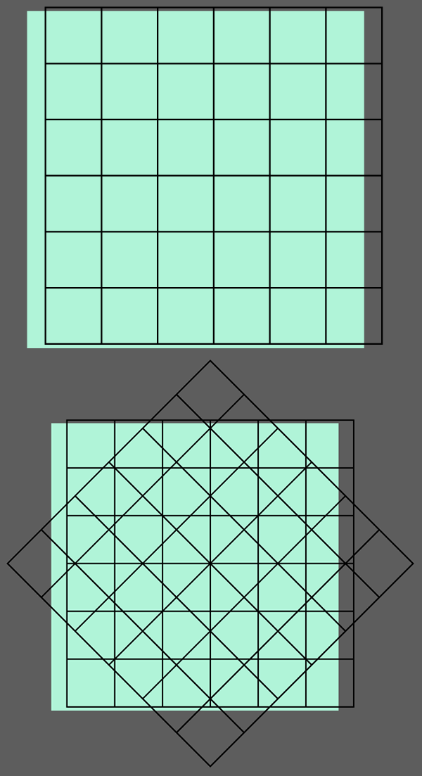 Step 12Select both grids and hit Divide in the Pathfinder panel. once divided, apply a Linear Gradient going from white to black in the Gradient panel. Adjust the gradient’s angle within the panel carefully, as the faceted look won’t happen if all of the pieces are going in the same dirction.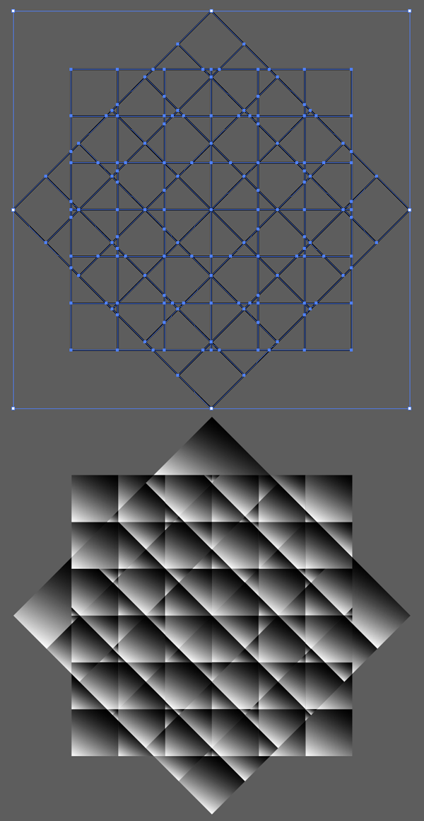 Step 13Copy and Paste one of your badge designs and Unite it in Pathfinder. Copy and Paste the gradient grid design from the last two steps and place it beneath the United banner design. Make sure the gradient grids are Grouped together. Select the united shape a the grid group and Make a Clipping Mask (Control-7). Align the newly clipped design over your original banner design and change the Clip Group’s Blend Mode to Overlay in the Transparency panel. Reduce the Clip Group’s Opacity within the Transparency panel as you see fit. Repeat this step on your other banner designs.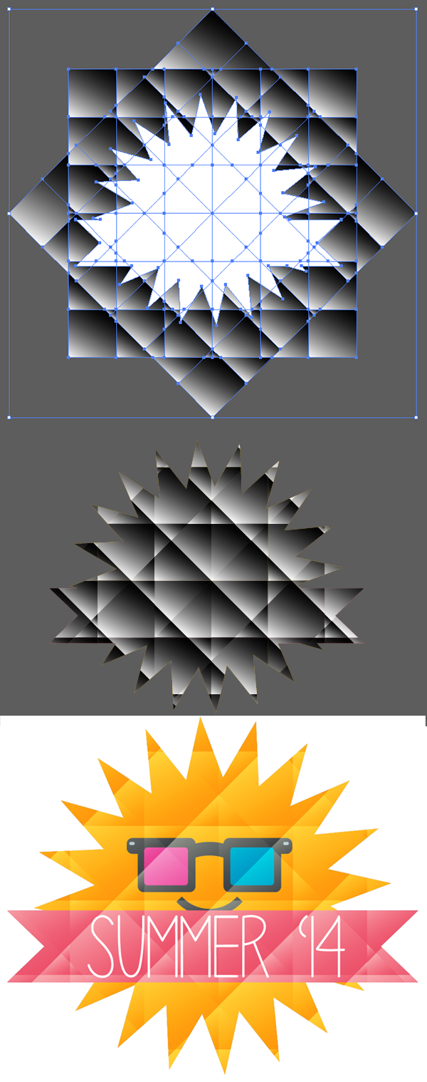 Great Job, You’re Done!Now that you’ve created some banner designs, ready for summer, and learned an easy technique for creating facted designs, take this style into your work elsewhere creating sticker designs, t-shirt graphics, and stock artwork, all ready for your graphics portfolio.Author: Mary WinklerMary works under the brand Acrylicana® designing apparel, jewelry, and illustrating for companies like Disney, Jakks Pacific, Envato, and more. Check out Acrylicana.com for more artwork, tutorials, and more.The post Summer’s End! Faceted Summer Banner Vectors appeared first on Vectips. |
|
Posted: 02 Sep 2015 04:03 PM PDT
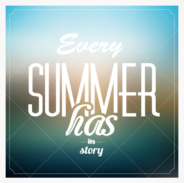 In this roundup article you will find some great summer vector backgrounds which will give a special color to your projects! With a lot of cool and warm color combinations, turquoise water, and summer time elements, these summer vector backgrounds are sure to lift your spirits even if you aren’t on the beach. In this roundup article you will find some great summer vector backgrounds which will give a special color to your projects! With a lot of cool and warm color combinations, turquoise water, and summer time elements, these summer vector backgrounds are sure to lift your spirits even if you aren’t on the beach.Palm Tree Vector BackgroundGreat details and colours on the palm trees and also nice abstract elements that give a summer feel to this background.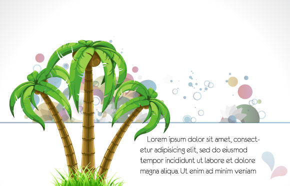 Summer Beach Summer Vector BackgroundThis summer background looks so great, I really like the splash effect on the background. This one will definitely make you feel like you’re on summer vacation! Surfer Summer Background VectorA lot of elements, with modern circles, sunburst lines, and halftone elements, and would be great for a beach music festival poster. This would even be great for a summer party invitation!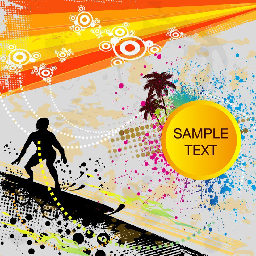 Summer Background VectorNice wave effect that masks some of the elements, leaving a lot of space for text. This would make a great summer poster or even flyer.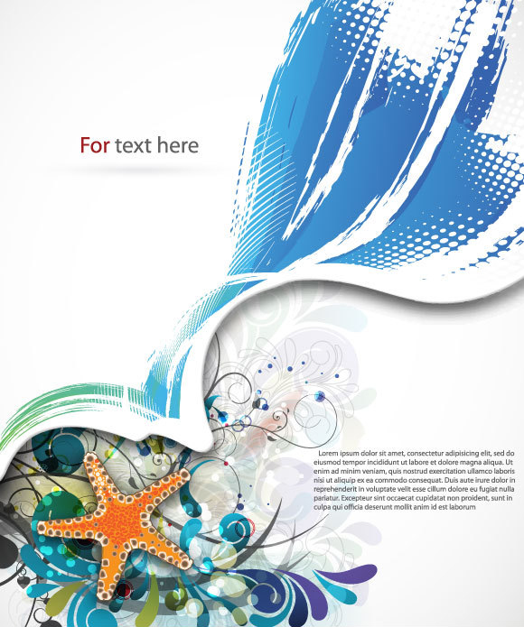 Summer Vector BackgroundDon’t forget to Enjoy the Summer Holidays!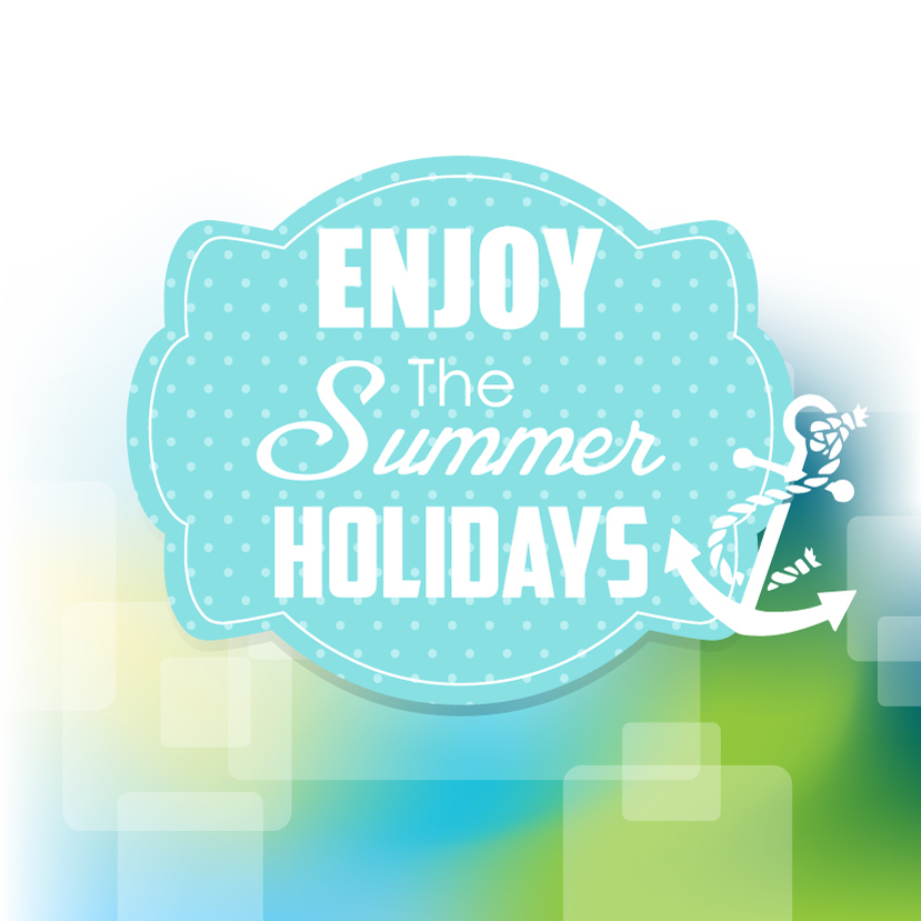 Summertime Beach BackgroundExcellent colours and details on the shoreline, I really like this artwork. Get your snorkels out and get ready to hit the water!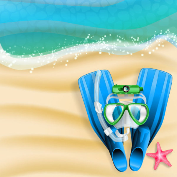 Seaside Summer BackgroundDoesn’t this summer background make you want to be on the beach with an umbrella drink in your hand??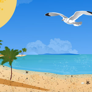 Bright and Modern Summer Vector BackgroundA great summer vector background option for all those projects that need a happy and sunny feel. Whether you love biking on the beach or hanging out with the wind in your hair, this summer vector would be perfect for you.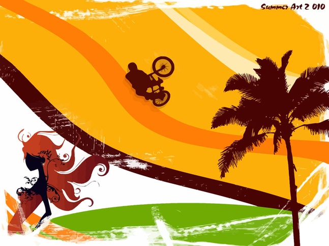 Every Summer Has a Story – Summer BackgroundThis is one of my favorites in this post, since it has a perfect lazy summer afternoon type of feel. Beach Polaroid Summer BackgroundGet your friends ready for summer with this polaroid summer vector background!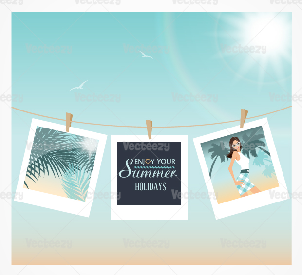
Enjoy the rest of the summer with these awesome summer backgrounds!
|
Subscribe to:
Posts (Atom)