Today we will create, as the title says, a conceptual Eco-friendly Ad in Photoshop using a few stock photos and our imagination. This tutorial will not only cover the techniques used, but also the ideas behind them and how these ideas came. It is important to learn why a step or a technique is used, not just how.
Difficulty: Intermediate
Completion time: 30-40 min
Tools: Adobe Photoshop CS3
Resources:
- Turtle
- Castle
- Arid land
- Paper texture by fudgegraphics
First step in creating new concepts is finding a literal connection between two or more different entities. This is the most important part, because it will be the foundation of your design. Just like in architecture, if you have a solid base to build upon, your design most likely will look great.
I started from the ideas of protection, home and nature, so I started looking for elements fitting this description. If you lack inspiration in finding these, you can always use Google to find images based on these keywords.
For the term of protection, I found a turtle, a symbol of protection, longevity and self preservation. For the home keyword, I wanted to use an actual house, but that only represents a home for a small number of people and I needed something to suggest both a home and a community. And a castle fit perfectly.
Now it’s time to bind these two together in a single scenario!
So how do we make a turtle shell protect a castle? We place the castle in the turtle shell, of course. But now there’s another problem: we must make the audience see the castle inside the turtle shell. So I turned the top side of the shell into a glass dome while preserving its texture and shape.
The secret in finding these connections is to think in a completely different way. Give up common sense, look for the obvious and literal meaning of your keywords and consider the impossible. Think outside the box, like some would say.
Now that we have a plan it motion, let’s begin the execution!
STEP 1
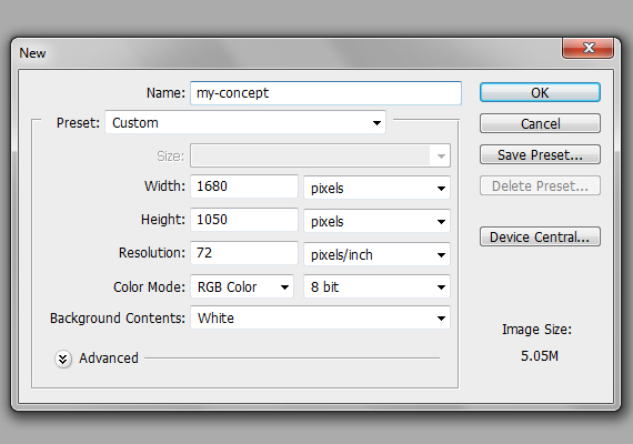
Go to File > New… and create a new document of 1680 x 1050 px in RGB color mode at 72 dpi. Name it “my-concept”.
STEP 2
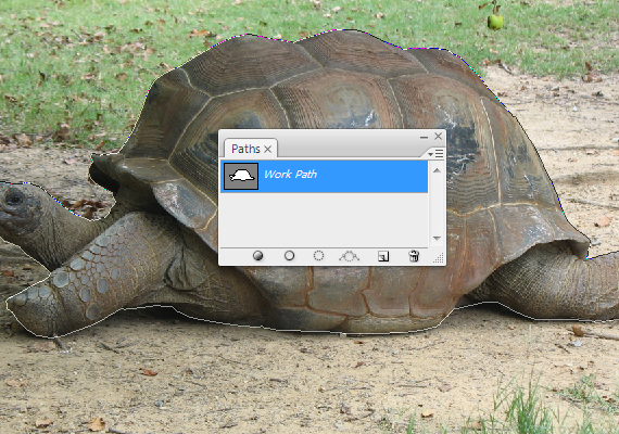
Open the “turtle” image. Now grab the Path Tool (P), set it on paths and carefully trace the turtle. Make sure you close the path.
STEP 3
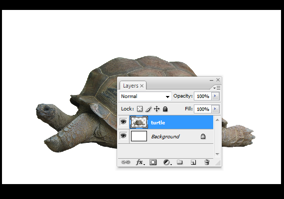
Right-click > Make Selection and hit OK. Copy it (CTRL+C), go back to our document (Window > my-concept.psd) and paste it (CTRL+V). Hit CTRL+T to enter Free Transform mode and make it smaller, as in the image below. Hit Enter.
STEP 4
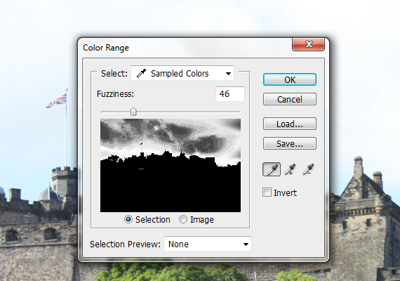
Open the “castle” picture. Go to Select > Color Range and click the sky. Use the settings below and hit OK.
STEP 5
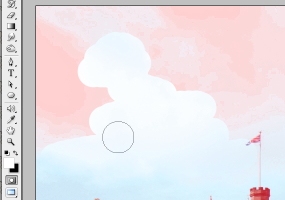
Hit Q to enter Quick Mask mode (there will be a red area over the picture), grab the Brush Tool (B) and paint over the remaining areas. Hit Q again to exit Quick Mask mode.
STEP 6
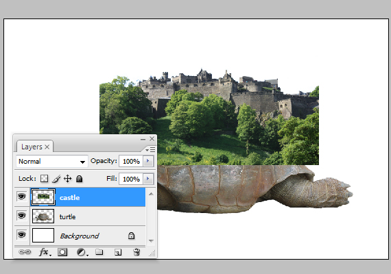
Go to Select > Inverse (CTRL+SHIFT+I), copy it (CTRL+C), go back to our document (Window > my-concept.psd) and paste it (CTRL+V). Resize it and place it like below.
STEP 7
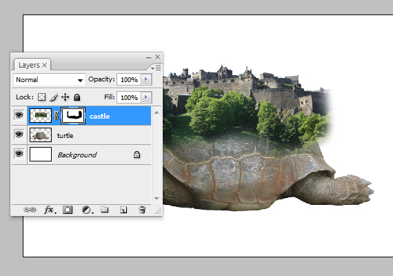
In the Layers palette, click the “Add Vector Mask” button. Grab the Brush Tool (B), set Hardness to 100% and paint over the extra areas of the castle.
STEP 8
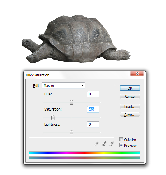
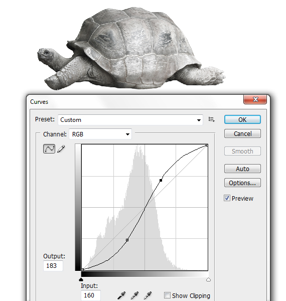
Select the turtle layer. Go to Image > Adjustments > Hue/Saturation (CTRL+U) and Image > Adjustments > Curves (CTRL+M). Use the settings below. Duplicate it (CTRL+J) and set its Blending mode to “Screen” and Opacity to 50%.
STEP 9
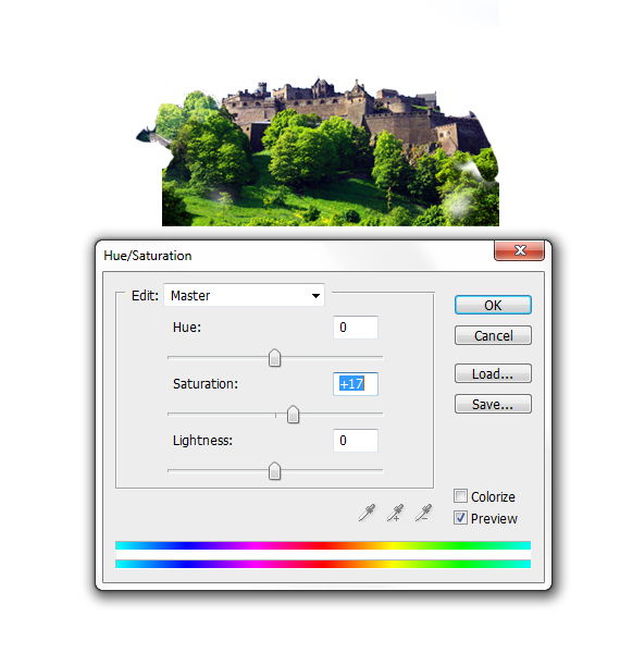
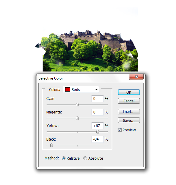
Repeat STEP 8 for the castle layer, but with the settings shown below (Image > Adjustments > Hue/Saturation, Image > Adjustments > Selective Color).
STEP 10
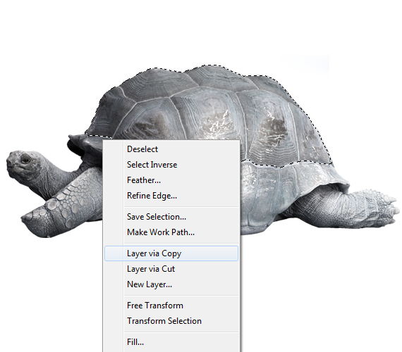
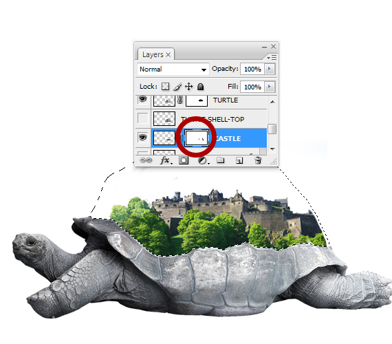
Grab the Move Tool (V), CTRL+click on the turtle to make it the current layer and grab the Path Tool (P). Trace the upper side of the shell, right-click > Make Selection, then right-click again > Layer Via Copy.
STEP 11
CTRL+click the newly created layer’s thumb to load a selection, select the layer with the turtle and click the “Add Vector Mask” button (in the Layers palette).

STEP 12
Select the mask of the layer with the castle and clean up the rough areas using the same selection. Go to Select > Deselect (CTRL+D).
STEP 13
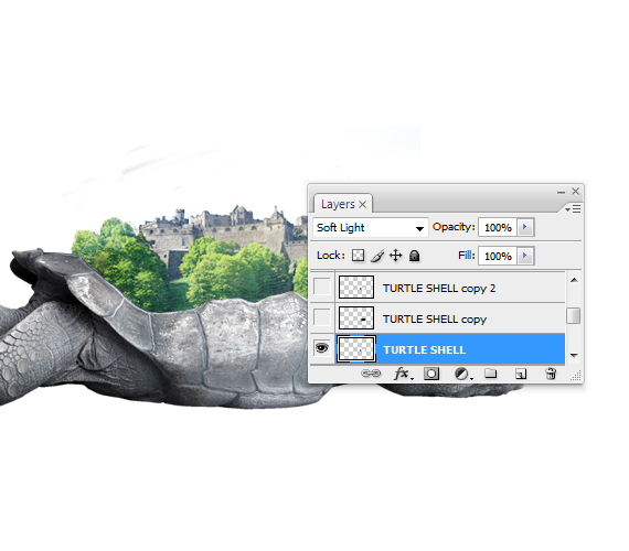
Select the top shell cutout and duplicate it twice. Select the original and go to Image > Adjustments > Desaturate (CTRL+SHIFT+U). In the Layers palette (F7), set its Blending Mode to “Soft Light”.
STEP 14
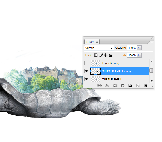
Select the layer above your current one (the first copy), desaturate it (CTRL+SHIFT+U), go to Image > Adjustments > Invert (CTRL+I) and set its Blending Mode to “Screen”. Hit CTRL+U, check the “Colorize” box and use the “Hue” slider to give it a blue tint. Hit OK. Set Opacity to 10%.
STEP 15
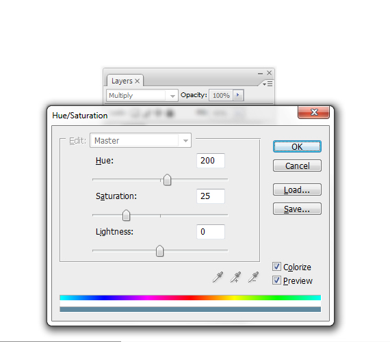
Select the second copy. Go to Image > Adjustments > Hue/Saturation (CTRL+U). Use the settings below. Set its Fill to 40% and Blending mode to “Multiply”.
STEP 16
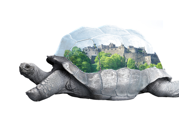
Create a new layer (Layer > New > Layer or CTRL+SHIFT+N). Now grab the Path Tool (P) and trace a part of the shell, as shown below. Right-click > Make Selection.
STEP 17
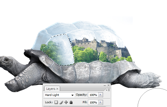
Grab the Brush Tool (B), hit D, then X, set the brush Hardness to 0% and paint a white spot, like below. Hit CTRL+D to deselect. Set Blending Mode to Hard Light. Feel free to adjust its opacity as needed.
STEP 18
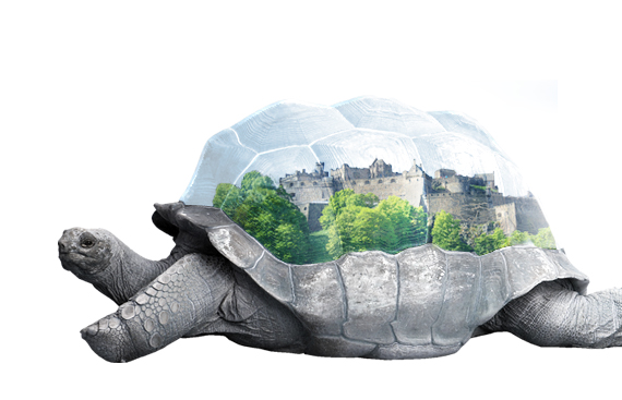
Repeat STEPS 14-15 for the other parts of the shell.
STEP 19
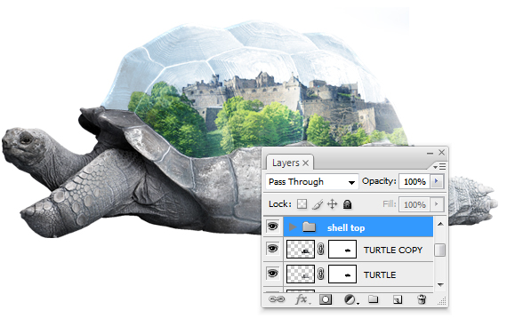
Select all the layers created in STEPS 12-17 and hit CTRL+G to place them in a layer group. Double-click the group’s name and rename it to “shell top”.
STEP 20
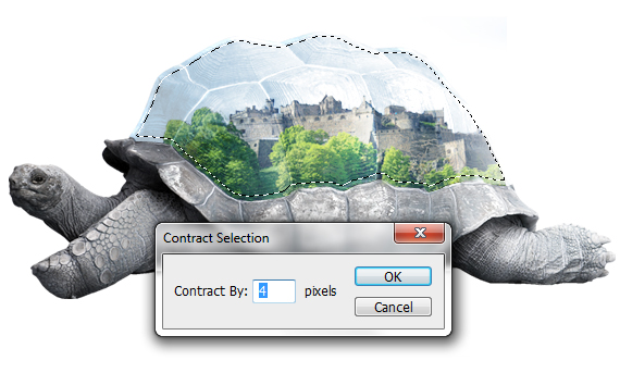
Select the layer group and create a new layer (CTRL+SHIFT+N). CTRL+click the layer below it to load a selection of the top shell cutout. Go to Select > Modify > Contract. Use a 4 px setting.
STEP 21
Go to Select > Inverse (CTRL+SHIFT+I).Grab the Brush Tool (B) and paint with white over the edges of the shell. It doesn’t matter if you go over the edge, we’ll clean it up later.
STEP 22
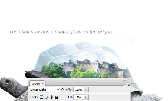
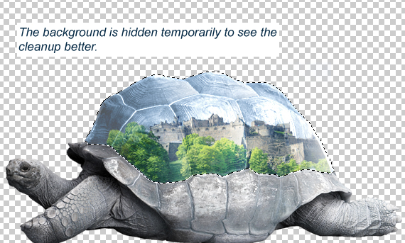
Set its Blending Mode to Linear Light and 15% Fill, then CTRL+click the bottom-most layer in the group, go to Select > Inverse (CTRL+SHIFT+I) and hit Delete.
STEP 23
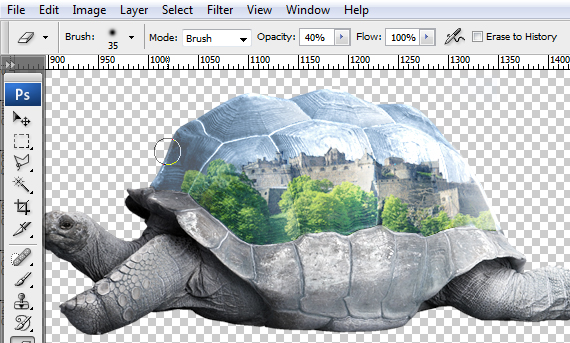
Grab the Eraser Tool (E), set its Hardness to 0%, hit “4” to set its Opacity to 40% and erase extra areas that seem too bright.
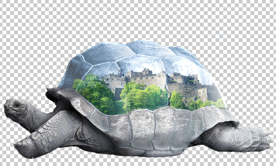
STEP 24
Create a new layer (CTRL+SHIFT+N). Now grab the Path Tool (P), set it on Paths and draw a path through the dents of the shell, like below. Don’t close the path.
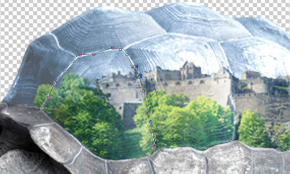
STEP 25
Grab the Brush Tool (B), hit D, then X and set the brush size to 3 px. Switch back to the Path Tool (P) and right-click > Stroke Path. Set it to “Brush” and check the “Simulate Pressure” box. Hit OK.
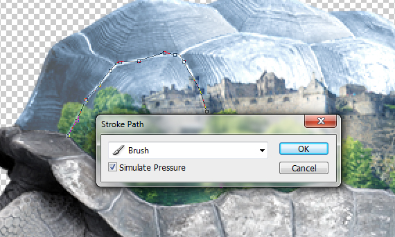
STEP 26
Repeat STEP 25 for the rest of the dents. Erase any bright areas using the Eraser Tool (E), like in STEP 23.

STEP 27
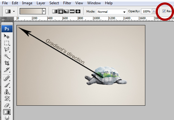
Select the “background” layer and double-click the lock. Hit OK. It will now be “Layer 0”. Grab the Gradient Tool (G), set the gradient shown below, then set it to radial and click-drag it like below.
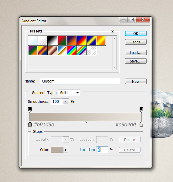
STEP 28
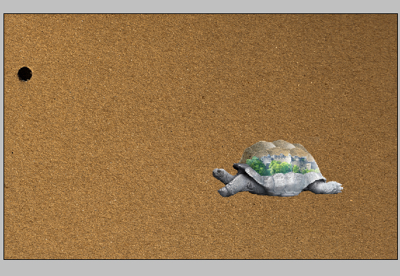
Open the “paper” picture. Select the entire canvas (Select > All or CTRL+A), copy it (CTRL+C, go back to our document (Window > my-concept.psd) and paste it (CTRL+V).
STEP 29
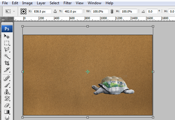
Hit CTRL+T to enter Free Transform mode and resize it to fit the canvas. Hit Enter to exit Free Transform.
STEP 30
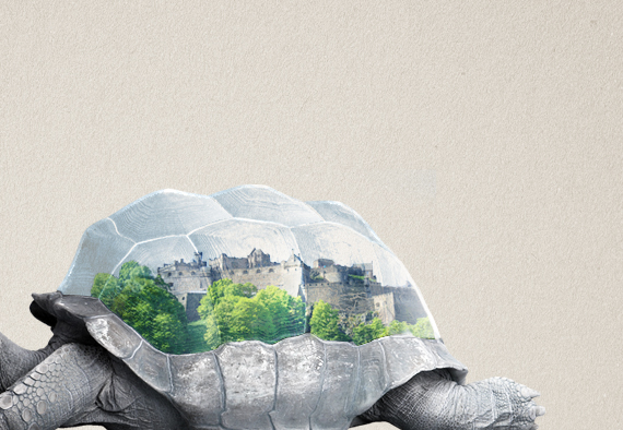
Go to Image > Adjustments > Desaturate (CTRL+SHIFT+U). Set its Blending mode to “Soft Light”.
STEP 31
Open the “Arid land” picture and copy it into our document, just like the “paper” image.
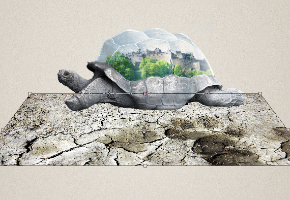
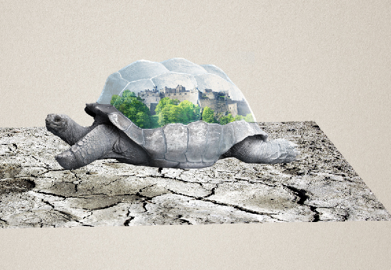
Hit CTRL+T to enter Free Transform mode, hold CTRL+ALT+SHIFT and click-drag one of the corners, like below. Feel free to arrange it like below, so you don’t get those nasty dark tones on your design.
STEP 32
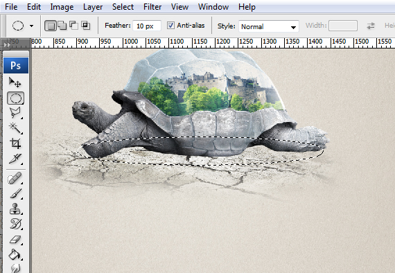
Add a layer mask to it, grab a large, soft brush and mask out the area shown below.
STEP 33
Create a new layer (CTRL+SHIFT+N) and set its Blending mode to “Multiply”. Grab the Elliptical Marquee Tool (M) and click-drag an ellipse like below. Hold “Space” to position it if you don’t get it right the first time.

STEP 34
Grab the Paint Bucket Tool (G), hold the ALT key and pick a dark color from the turtle (a shadow would do just nicely) and fill in the selection. Go to Select > Deselect (CTRL+D) to deselect.

STEP 35
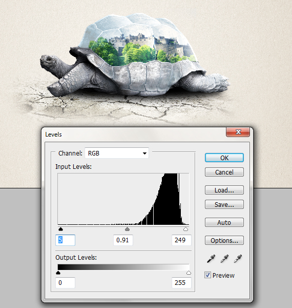
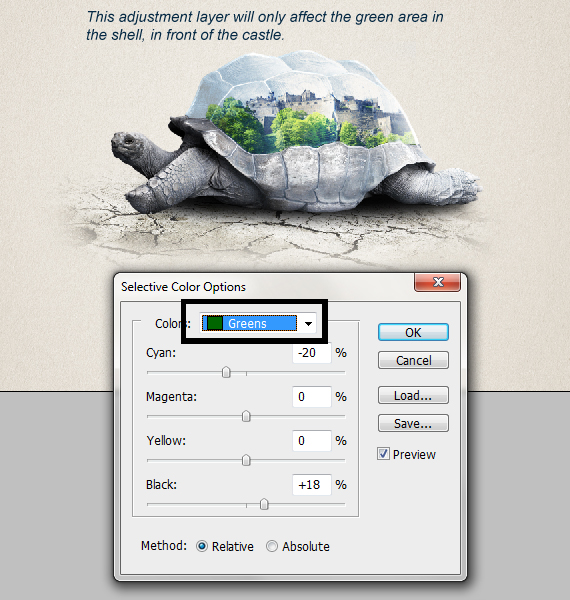
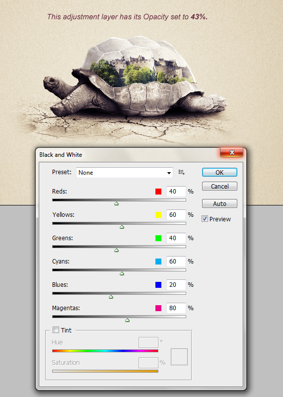
Select the top-most layer and go to Layer > New Adjustment Layer > Brightness/Contrast, Levels, Selective Color, Gradient Map and Black & White. Use the settings below for each.


STEP 36
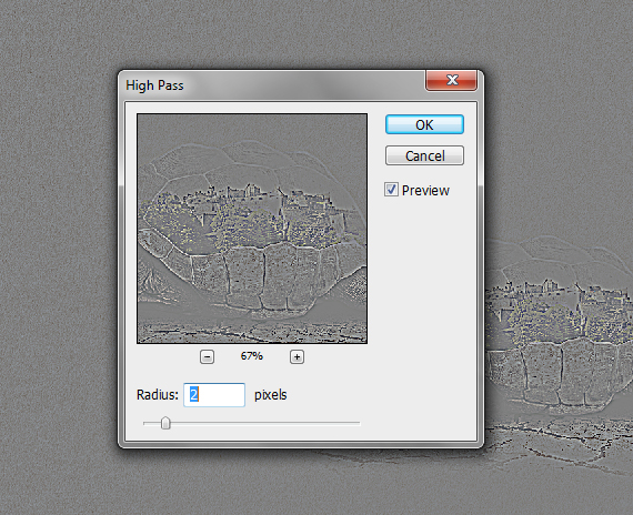
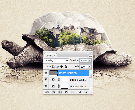
Select the entire artwork (CTRL+A), copy merged (CTRL+SHIFT+C) and paste it. Go to Filter > Other > High Pass. Give it a 2 px setting and hit OK. Set the layer’s Blending mode to “Overlay”.
STEP 37
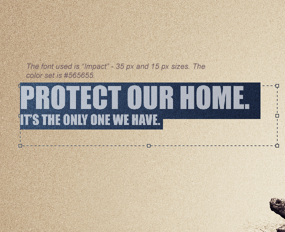
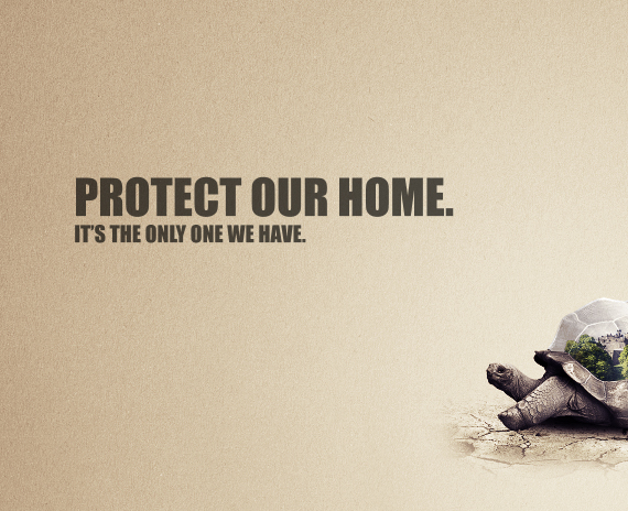
Grab the Horizontal Type Tool (T), draw in a type box and type in a text of your choosing. I used Impact font. Create another text box and type in another text. This time, make the font smaller. This is a pretty cool trick to create hierarchy and make it easier to read.
Done!
Completion time: 30-40 min
Tools: Adobe Photoshop CS3
Resources:
- Turtle
- Castle
- Arid land
- Paper texture by fudgegraphics
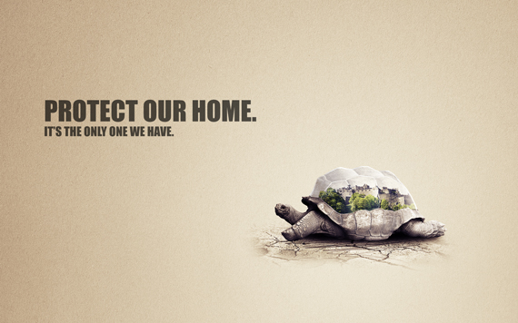
Final Image Preview
I started from the ideas of protection, home and nature, so I started looking for elements fitting this description. If you lack inspiration in finding these, you can always use Google to find images based on these keywords.
For the term of protection, I found a turtle, a symbol of protection, longevity and self preservation. For the home keyword, I wanted to use an actual house, but that only represents a home for a small number of people and I needed something to suggest both a home and a community. And a castle fit perfectly.
Now it’s time to bind these two together in a single scenario!
So how do we make a turtle shell protect a castle? We place the castle in the turtle shell, of course. But now there’s another problem: we must make the audience see the castle inside the turtle shell. So I turned the top side of the shell into a glass dome while preserving its texture and shape.
The secret in finding these connections is to think in a completely different way. Give up common sense, look for the obvious and literal meaning of your keywords and consider the impossible. Think outside the box, like some would say.
Now that we have a plan it motion, let’s begin the execution!
STEP 1
Go to File > New… and create a new document of 1680 x 1050 px in RGB color mode at 72 dpi. Name it “my-concept”.
STEP 2
Open the “turtle” image. Now grab the Path Tool (P), set it on paths and carefully trace the turtle. Make sure you close the path.
STEP 3
Right-click > Make Selection and hit OK. Copy it (CTRL+C), go back to our document (Window > my-concept.psd) and paste it (CTRL+V). Hit CTRL+T to enter Free Transform mode and make it smaller, as in the image below. Hit Enter.
STEP 4
Open the “castle” picture. Go to Select > Color Range and click the sky. Use the settings below and hit OK.
STEP 5
Hit Q to enter Quick Mask mode (there will be a red area over the picture), grab the Brush Tool (B) and paint over the remaining areas. Hit Q again to exit Quick Mask mode.
STEP 6
Go to Select > Inverse (CTRL+SHIFT+I), copy it (CTRL+C), go back to our document (Window > my-concept.psd) and paste it (CTRL+V). Resize it and place it like below.
STEP 7
In the Layers palette, click the “Add Vector Mask” button. Grab the Brush Tool (B), set Hardness to 100% and paint over the extra areas of the castle.
STEP 8
Select the turtle layer. Go to Image > Adjustments > Hue/Saturation (CTRL+U) and Image > Adjustments > Curves (CTRL+M). Use the settings below. Duplicate it (CTRL+J) and set its Blending mode to “Screen” and Opacity to 50%.
STEP 9
Repeat STEP 8 for the castle layer, but with the settings shown below (Image > Adjustments > Hue/Saturation, Image > Adjustments > Selective Color).
STEP 10
Grab the Move Tool (V), CTRL+click on the turtle to make it the current layer and grab the Path Tool (P). Trace the upper side of the shell, right-click > Make Selection, then right-click again > Layer Via Copy.
STEP 11
CTRL+click the newly created layer’s thumb to load a selection, select the layer with the turtle and click the “Add Vector Mask” button (in the Layers palette).
STEP 12
Select the mask of the layer with the castle and clean up the rough areas using the same selection. Go to Select > Deselect (CTRL+D).
STEP 13
Select the top shell cutout and duplicate it twice. Select the original and go to Image > Adjustments > Desaturate (CTRL+SHIFT+U). In the Layers palette (F7), set its Blending Mode to “Soft Light”.
STEP 14
Select the layer above your current one (the first copy), desaturate it (CTRL+SHIFT+U), go to Image > Adjustments > Invert (CTRL+I) and set its Blending Mode to “Screen”. Hit CTRL+U, check the “Colorize” box and use the “Hue” slider to give it a blue tint. Hit OK. Set Opacity to 10%.
STEP 15
Select the second copy. Go to Image > Adjustments > Hue/Saturation (CTRL+U). Use the settings below. Set its Fill to 40% and Blending mode to “Multiply”.
STEP 16
Create a new layer (Layer > New > Layer or CTRL+SHIFT+N). Now grab the Path Tool (P) and trace a part of the shell, as shown below. Right-click > Make Selection.
STEP 17
Grab the Brush Tool (B), hit D, then X, set the brush Hardness to 0% and paint a white spot, like below. Hit CTRL+D to deselect. Set Blending Mode to Hard Light. Feel free to adjust its opacity as needed.
STEP 18
Repeat STEPS 14-15 for the other parts of the shell.
STEP 19
Select all the layers created in STEPS 12-17 and hit CTRL+G to place them in a layer group. Double-click the group’s name and rename it to “shell top”.
STEP 20
Select the layer group and create a new layer (CTRL+SHIFT+N). CTRL+click the layer below it to load a selection of the top shell cutout. Go to Select > Modify > Contract. Use a 4 px setting.
STEP 21
Go to Select > Inverse (CTRL+SHIFT+I).Grab the Brush Tool (B) and paint with white over the edges of the shell. It doesn’t matter if you go over the edge, we’ll clean it up later.
STEP 22
Set its Blending Mode to Linear Light and 15% Fill, then CTRL+click the bottom-most layer in the group, go to Select > Inverse (CTRL+SHIFT+I) and hit Delete.
STEP 23
Grab the Eraser Tool (E), set its Hardness to 0%, hit “4” to set its Opacity to 40% and erase extra areas that seem too bright.
STEP 24
Create a new layer (CTRL+SHIFT+N). Now grab the Path Tool (P), set it on Paths and draw a path through the dents of the shell, like below. Don’t close the path.
STEP 25
Grab the Brush Tool (B), hit D, then X and set the brush size to 3 px. Switch back to the Path Tool (P) and right-click > Stroke Path. Set it to “Brush” and check the “Simulate Pressure” box. Hit OK.
STEP 26
Repeat STEP 25 for the rest of the dents. Erase any bright areas using the Eraser Tool (E), like in STEP 23.
STEP 27
Select the “background” layer and double-click the lock. Hit OK. It will now be “Layer 0”. Grab the Gradient Tool (G), set the gradient shown below, then set it to radial and click-drag it like below.
STEP 28
Open the “paper” picture. Select the entire canvas (Select > All or CTRL+A), copy it (CTRL+C, go back to our document (Window > my-concept.psd) and paste it (CTRL+V).
STEP 29
Hit CTRL+T to enter Free Transform mode and resize it to fit the canvas. Hit Enter to exit Free Transform.
STEP 30
Go to Image > Adjustments > Desaturate (CTRL+SHIFT+U). Set its Blending mode to “Soft Light”.
STEP 31
Open the “Arid land” picture and copy it into our document, just like the “paper” image.
Hit CTRL+T to enter Free Transform mode, hold CTRL+ALT+SHIFT and click-drag one of the corners, like below. Feel free to arrange it like below, so you don’t get those nasty dark tones on your design.
STEP 32
Add a layer mask to it, grab a large, soft brush and mask out the area shown below.
STEP 33
Create a new layer (CTRL+SHIFT+N) and set its Blending mode to “Multiply”. Grab the Elliptical Marquee Tool (M) and click-drag an ellipse like below. Hold “Space” to position it if you don’t get it right the first time.
STEP 34
Grab the Paint Bucket Tool (G), hold the ALT key and pick a dark color from the turtle (a shadow would do just nicely) and fill in the selection. Go to Select > Deselect (CTRL+D) to deselect.
STEP 35
Select the top-most layer and go to Layer > New Adjustment Layer > Brightness/Contrast, Levels, Selective Color, Gradient Map and Black & White. Use the settings below for each.
STEP 36
Select the entire artwork (CTRL+A), copy merged (CTRL+SHIFT+C) and paste it. Go to Filter > Other > High Pass. Give it a 2 px setting and hit OK. Set the layer’s Blending mode to “Overlay”.
STEP 37
Grab the Horizontal Type Tool (T), draw in a type box and type in a text of your choosing. I used Impact font. Create another text box and type in another text. This time, make the font smaller. This is a pretty cool trick to create hierarchy and make it easier to read.
Done!
