Create some patriotic Labor Day badge vectors complete with hand-drawn text, ready for your blog, shop, or social media feed to wish visitors a Happy Labor Day!
Tutorial Details: Labor Day Badge Vectors
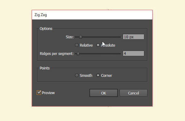
Final Image: Labor Day Badge Vectors Step 1: Labor Day Badge VectorsTo begin our Labor Day badge vectors tutorial, create a New Document, grab the Blob Brush Tool and adjust its options so they’re similar to those below. This is so you can easily draw your text. If you’re using a mouse, you’re best off downloading a font that mimics the look of the text we’re going to draw together. I’ve made sure it’s set to Smooth and enabled pressure for a brush that’s 3 pixels in size.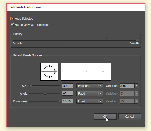 Step 2Using the fill color of your choice, start writing out your word. The style of hand-drawn type like this depends on creating thick and thin lines within script lettering – perfect for some quick Labor Day badge vectors.As you start your letter, ease up on the pressure of your stylus and apply more pressure as you complete your initial stroke. Each letter will have one side that is thicker and another side that is thinner. Play around with creating script and printed letters with thick and thin stroke variations.  Step 3Write out your words, “Happy Labor Day”. Since we’re using the Blob Brush Tool, each word can easily be its own object. Unite letters of a single word together in the Pathfinder panel if you’ve written them separately, or simply Group them together as needed. Step 4The first of our Labor Day badge vectors had a scalloped edge. Draw a circle with the Ellipse Tool and go to Effect > Distort & Transform > Zig Zag to apply the following attributes:
 Step 5Hit Expand Appearance under Object when your circle resembles the one below after applying the Zig Zag effect. Step 6Set the zig-zagged circle’s fill color to red. Draw a cream colored circle in its center and another small navy blue circle in its center. Step 7Place your hand-drawn text in the center of your badge design. Use the Star Tool to draw six small stars in staggered corners of the badge and Group all of your badge components together. Step 8Let’s play with another badge design. Use the Star Tool to draw a large navy blue star. Pull the Live Corners of the object inward toward its center slightly to round the corners out. Step 9Draw a red rectangle with the Rectangle Tool. Place an anchor point on the enter of the bottom edge’s path and use the Direct Selection Tool to pull it inward and create a ribbon shape. Draw three overlapping cream-colored rectangles and Unite them in the Pathfinder panel. Use the Shape Builder Tool to select and delete them from the red ribbon shape. Group these components together. Step 10Place the navy blue star over the striped ribbon. Place some more hand-drawn type over the star, or choose a hand-drawn font instead. Step 11For our final ribbon design, draw two rectangles, both with the same height. The one on the right should be twice as long, or more, than the one on the left. Like the red ribbon before it, add an anchor point in the center of the shorter rectangle’s left side and create an indent. Step 12Use the Direct Selection Tool to select the lower left anchor point of the large rectangle and push it to the right, skewing the rectangle. Repeat on the lower right corner. Repeat again on the smaller ribbon shape. Create a second ribbon shape so it mirrors the first. Arrange them as seen below.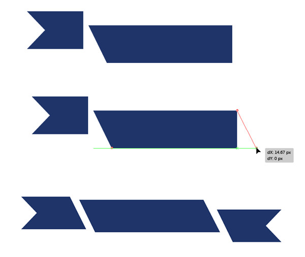 Step 13Place red type on either side of the ribbon and cream-colored type in the center of the design. What sort of type or font style you use is entirely up to you. Conclusion: Labor Day Badge VectorsGreat job, you’re done! Simple, flat Labor Day badge vectors and ribbons ready for web graphic or printed use. Make sure to Expand any text, if you opted for a font rather than hand-drawn type. What fantastic ribbons and badges can you create in this style? What about for other holidays? Share your results in the comment section below and don’t forget to tweet this tutorial out to the world! Happy Labor Day, everyone! Let’s have a fantastic Fall!Author: Mary WinklerMary works under the brand Acrylicana® designing apparel, jewelry, and illustrating for companies like Disney, Jakks Pacific, Envato, and more. Check out Acrylicana.com for more artwork, tutorials, and more. |

Tuesday, November 17, 2015
Create Quick Labor Day Badge Vectors with a Hand Drawn Text Style!
Tuesday, November 10, 2015
Create a Simple Power Button in Adobe Illustrator
In the following Power Button vector tutorial, you will learn how to create a simple power button in Adobe Illustrator. In the beginning you will learn how to set up a simple grid and how to create and center a simple rectangle that will make up your background. Next, using basic vector shape building techniques you will learn how to create the circle and the compound path that will make up your power button. Finally, taking full advantage of the Appearance panel, you will learn how to add color, shading, highlights and depth for your shapes.
Tutorial Details: Power Button Vector
Final Image: Power Button VectorAs always, this is the final power button vector image that we’ll be creating: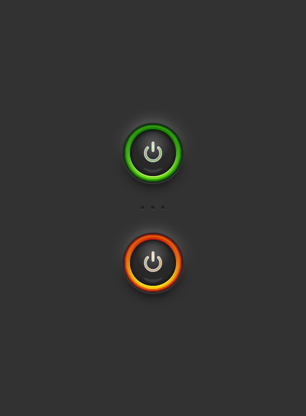 Step 1To begin our power button vector tutorial, hit Command + N to create a new document. Select Pixels from the Units drop-down menu, enter 600 in the Width and Height boxes then click on the Advanced button. Select RGB, Screen (72ppi) and make sure that the Align New Objects to Pixel Grid box is unchecked before you click OK. Enable the Grid (View > Show Grid) and the Snap to Grid (View > Snap to Grid). You will need a grid every 5px, so simply go to Edit > Preferences > Guides > Grid, enter 5 in the Gridline every box and 1 in the Subdivisions box. You should also open the Info panel (Window > Info) for a live preview with the size and position of your shapes. Do not forget to set the unit of measurement to pixels from Edit > Preferences > Units > General. All these options will significantly increase your work speed.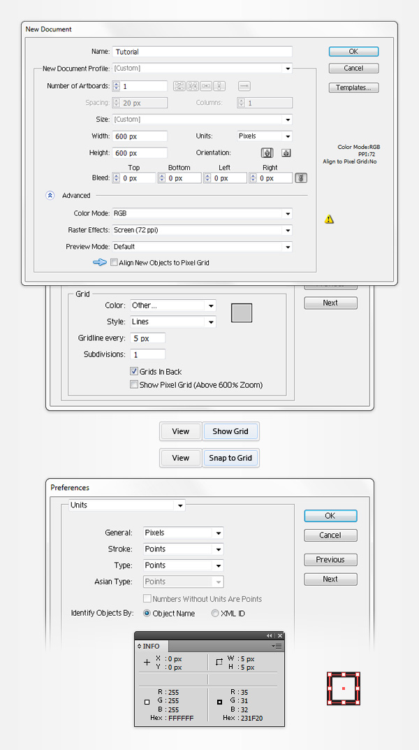 Step 2Pick the Rectangle Tool (M) and focus on your Toolbar. Remove the color from the stroke then select the fill and set its color at R=50 G=50 B=50. Now, simply click on your artboard to open the Rectangle window. Enter 610 in the Width and Height boxes then click the OK button. This should create a 610px square. Next, you will need to center it, so open the Align panel (Window > Align). Set the aligning to artboard (open the fly out menu and go to Show Options if you can’t see the Align To section as shown in the following image), then simply click the Horizontal Align Center and Vertical Align Center buttons. In the end, your dark shape should cover the entire artboard as shown in the following image.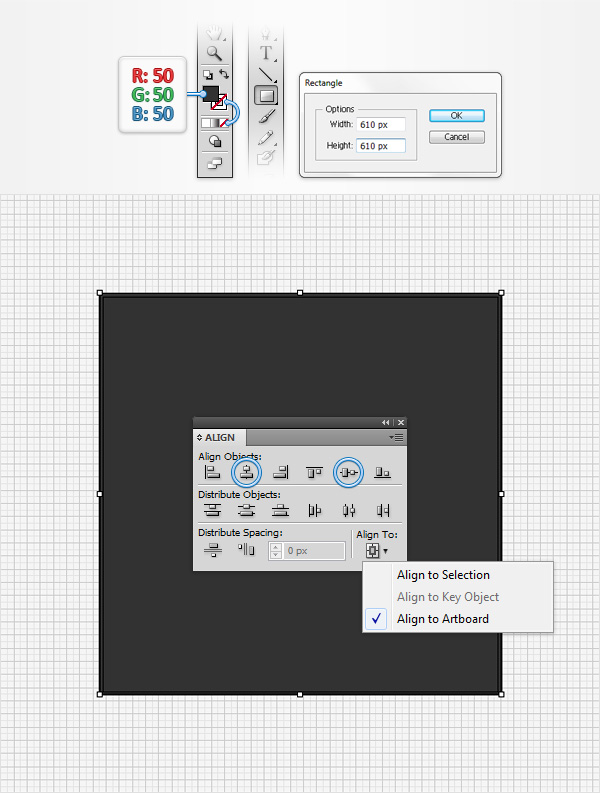 Step 3Return to your Toolbar, set the fill color at R=70 G=175 B=15 and switch to the Ellipse Tool (L). Create a 110px circle and center it using the Horizontal Align Center and Vertical Align Center buttons from the Align panel.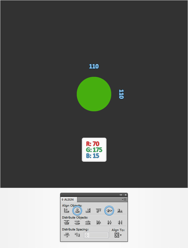 Step 4Make sure that your green circle is selected and your power button vector is off to a great start, go to Object > Path > Offset Path. Enter a -40px Offset and click OK. Select the resulting shape and focus on the Appearance panel (Window > Appearance). Remove the color from the fill, select the stroke, set the color at white and increase the weight to 6pt.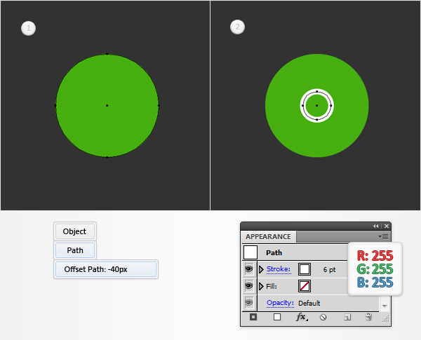 Step 5Select the circle with the white stroke and go to Object > Path > Add Anchor Points. Keep focusing on this shape, grab the Direct Selection Tool (A), select the top anchor point (highlighted in the second image) and simply hit the Delete key from your keyboard to remove it. Make sure that the remaining path stays selected, open the Stroke panel (Window > Stroke) and simply check the Round Cap button. In the end, things should look like in the third image. Pick the Pen Tool (P), create a 15px, vertical path and place it as shown in the fourth image. Add a white, 6pt stroke for this new path, select it and check the Round Cap button from the Stroke panel.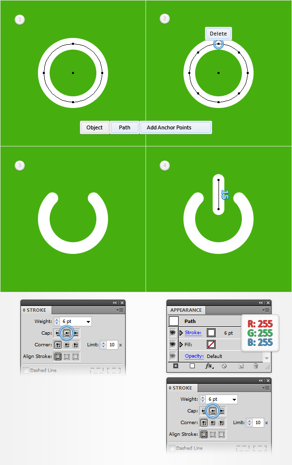 Step 6Make sure that both, white paths are selected and go to Object > Path > Outline Stroke. Select the resulting shapes and hit CTRL + 8 (or go to Object > Compound Path > Make) to turn them into a simple compound path.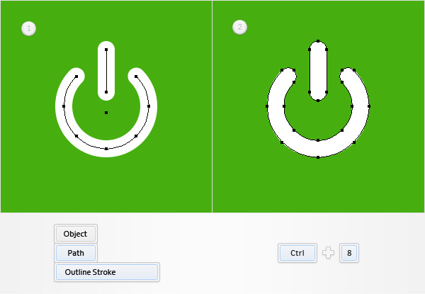 Step 7Make sure that your green circle stays selected, focus on the Appearance panel and add a second fill using the Add New Fill button (pointed by the little, blue arrow in the following image). Select this new fill, open the Gradient panel (Window > Gradient) and simply click on the gradient thumbnail to add the default black to white linear gradient. Keep focusing on your Gradient panel, set the angle at 90 degrees then move to the gradient colors. Select the right slider and set the color at R=0 G=95 B=0 then select the left slider and set the color at R=130 G=225 B=75. Make sure that this second fill is still selected and go to Effect > Path > Offset Path. Enter -8px Offset and click OK.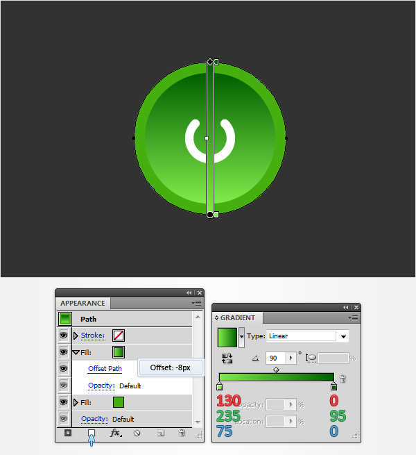 Step 8Make sure that your green circle stays selected, focus on the Appearance panel and add a third fill using that same Add New Fill button. Select this new fill, add the white to black linear gradient and set its angle at 90 degrees. Keep focusing on the Appearance panel and click on the little arrow icon that stands for your top fill. Simply click on that Opacity piece of text to open a fly-out Transparency panel. Change the Blending Mode to Overlay and lower the Opacity to 60% then go to Effect > Path > Offset Path. Enter a -4px Offset and click OK.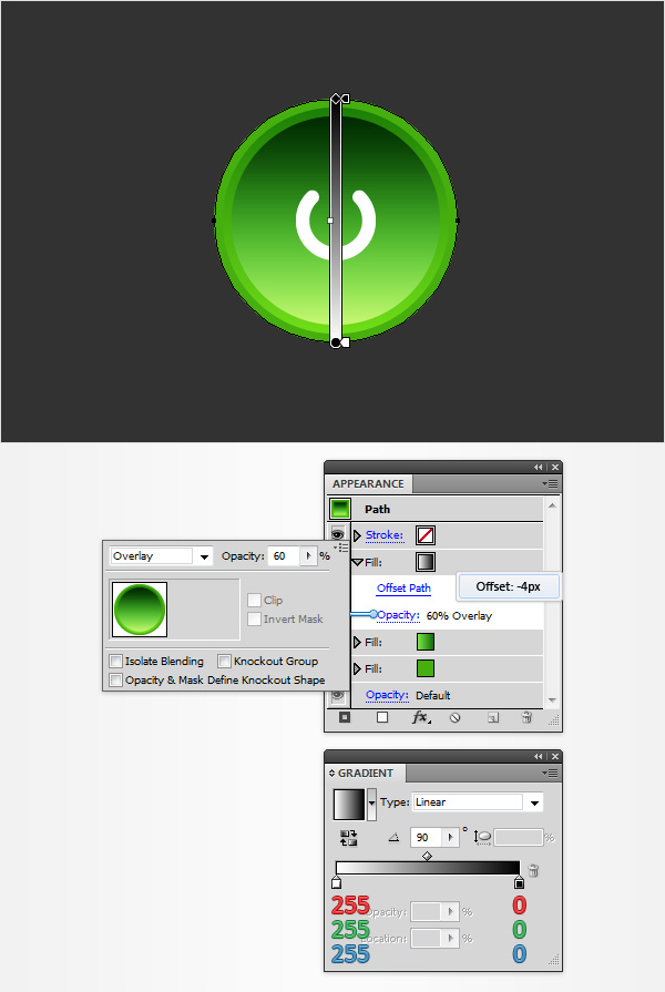 Step 9Make sure that your green circle stays selected, focus on the Appearance panel and add a fourth fill. Select it and add the radial gradient shown below. Make sure that this new fill stays selected, grab the Gradient Tool (G), focus on your Artboard, stretch that gradient roughly as shown in the following image and then go to Effect > Path > Offset Path. Enter a -10px Offset, click OK and go to Effect > Stylize > Inner Glow. Enter the properties shown in the following image and click OK.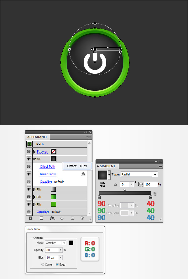 Step 10Make sure that your green power button vector circle stays selected, focus on the Appearance panel, select the existing stroke and set its color at black. Move to the Stroke panel, make sure that the weight is set at 1pt then simply check the Align Stroke to Inside button. Return to the Appearance panel, keep focusing on this black stroke, lower its Opacity to 15%, change the Blending Mode to Soft Light and go to Effect > Path > Offset Path. Enter a -10px Offset and click OK.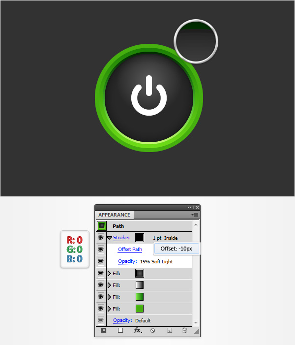 Step 11Make sure that your green circle stays selected, focus on the Appearance panel, select the existing stroke and duplicate using the Duplicate Selected Item button (pointed by the little, blue arrow in the following image). Select this newly added stroke, increase the weight to 3pt and lower its Opacity to 10%. Make sure that this 3pt stroke is selected and duplicate it using that same Duplicate Selected Item button. Select this third stroke, increase the weight to 5pt and lower its Opacity to 5%.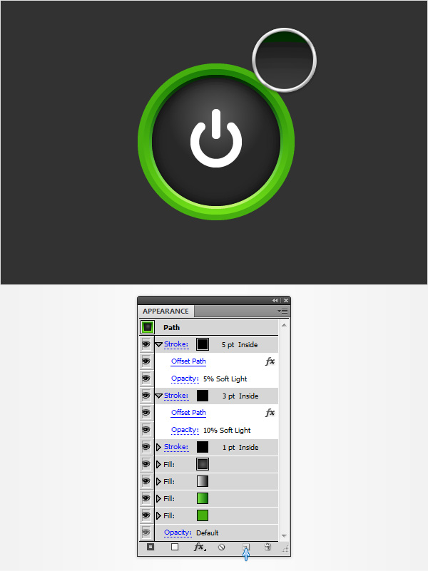 Step 12Make sure that your green circle stays selected and focus on the Appearance panel. Add a new fill, set its color at white and drag it in the top of the Appearance panel. Make sure that this new fill is selected, lower its Opacity to 50%, change the Blending Mode to Overlay and go to Effect > Distort & Transform > Transform. Enter the properties shown in the following image, click OK and go to Effect > Warp > Arc. Enter the attributes shown below and click OK.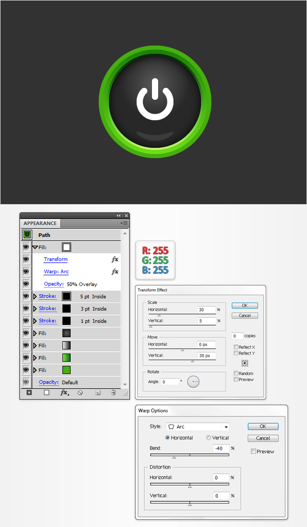 Step 13Make sure that your green circle stays selected and focus on the Appearance panel. Add a new fill, set its color at R=30 G=30 B=30 and drag it in the bottom of the Appearance panel. Make sure that this new fill is selected and go to Effect > Path > Offset Path. Enter a 4px Offset, click OK and go to Effect > Stylize > Drop Shadow. Enter the attributes shown below and click OK.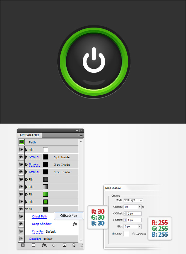 Step 14Make sure that your green circle stays selected and focus on the Appearance panel. Add a new fill, drag it in the bottom of the Appearance panel, add the linear gradient shown below and go to Effect > Path > Offset Path. Enter a 15px Offset, click OK and go to Effect > Blur > Gaussian Blur. Enter a 10px radius and click OK.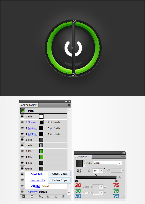 Step 15Make sure that your green circle stays selected and focus on the Appearance panel. Select the bottom fill and duplicate it using that same Duplicate Selected Item button from the bottom of your Appearance panel. Focus on this new fill, open the existing Offset Path effect, decrease the Offset to 10px then open the existing Gaussian Blur effect, decrease the radius to 3px and click OK.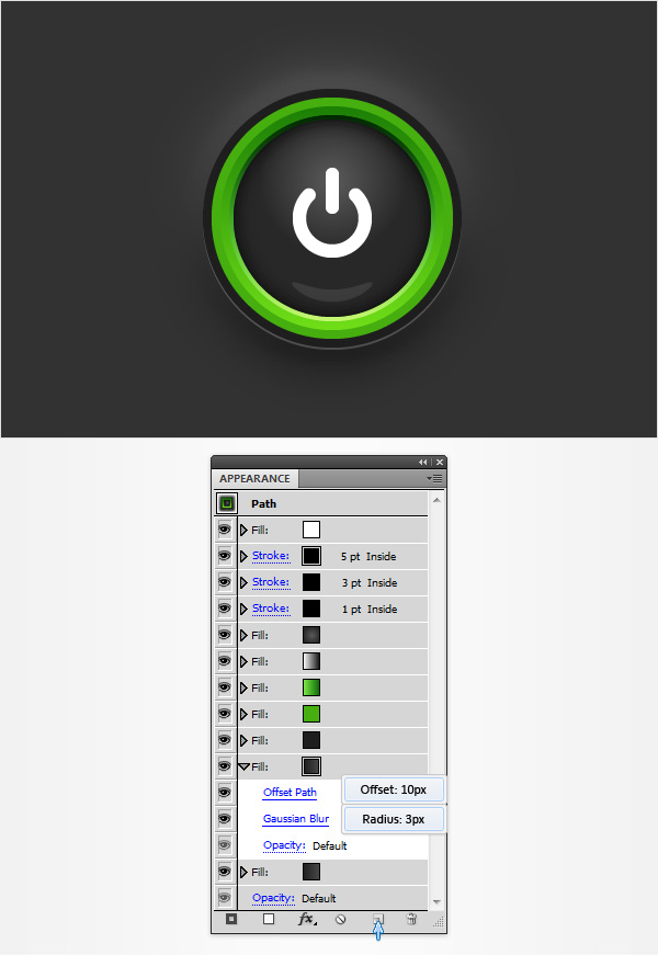 Step 16Make sure that your green circle stays selected and focus on the Appearance panel. Select that green (R=70 G=175 B=15) fill and go to Effect > Stylize > Inner Glow. Enter the properties shown in the following image, click OK and go to Effect > Stylize > Outer Glow. Enter the attributes shown below and click OK. In the end, things should look like in the following image.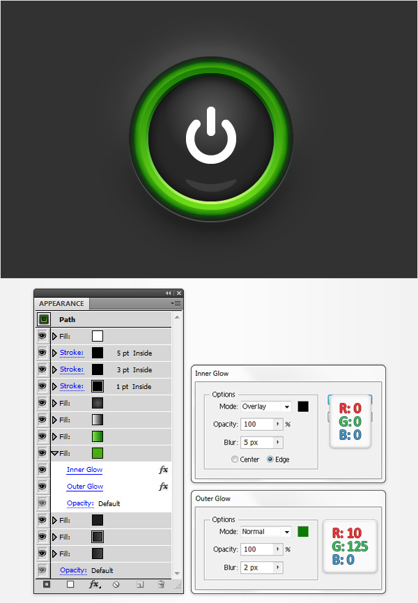 Step 17Make sure that your compound path stays selected and focus on the Appearance panel. Select the fill and replace the existing color with the radial gradient shown in the following image.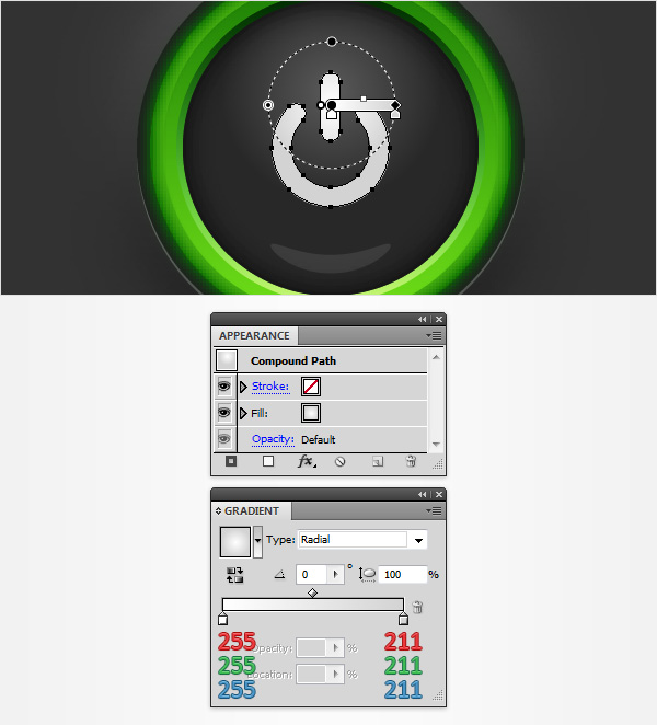 Step 18Make sure that your compound path stays selected, focus on the Appearance panel and add a second fill. Select it, set the color at R=100 G=205 B=45, change the Blending Mode to Multiply and go to Effect > Path > Offset Path. Enter a -2.5px Offset and click OK.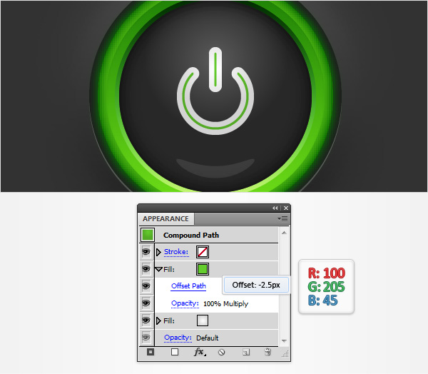 Step 19Make sure that your compound path stays selected and focus on the Appearance panel. Select the existing stroke, set the color at black, lower its Opacity to 15% and check the Align Stroke to Inside button from the Stroke panel. Return to the Appearance panel and add a second stroke for this shape using the Add New Stroke button (pointed by the little, blue arrow in the following image). Select this new stroke, lower its Opacity to 25% and check the Align Stroke to Outside button from the Stroke panel.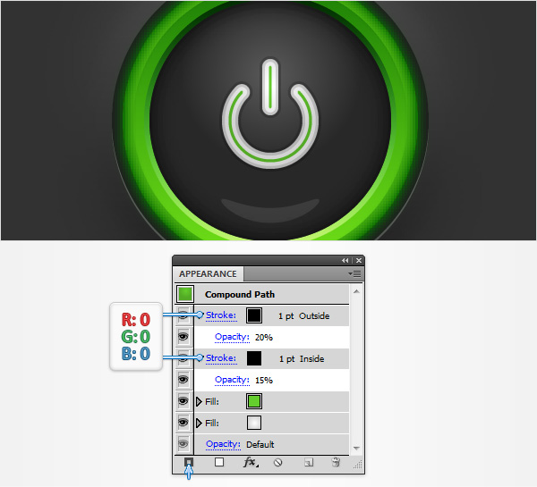 Step 20Reselect the circle and the compound path that make up your power button and duplicate them (CTRL + C > CTRL + F). Select these copies and simply drag them several pixels down as shown in the second image.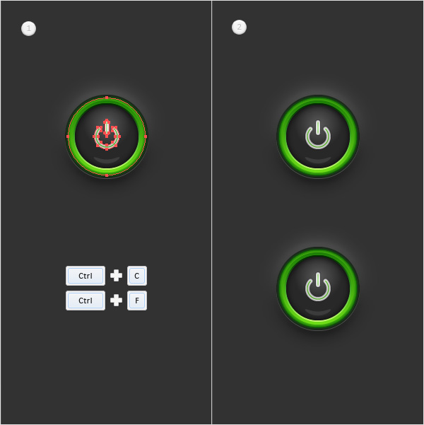 Step 21Select the circle that makes up your second button and focus on the Appearance panel. Select the fifth fill (start the count from the bottom) and simply replace the colors used for the existing linear gradient with the ones shown in the following image. Move down to the green fill and replace the existing color with R=227 G=128 B=10. Keep focusing on this orange fill, open the existing Outer Glow effect and enter the attributes shown in the following image.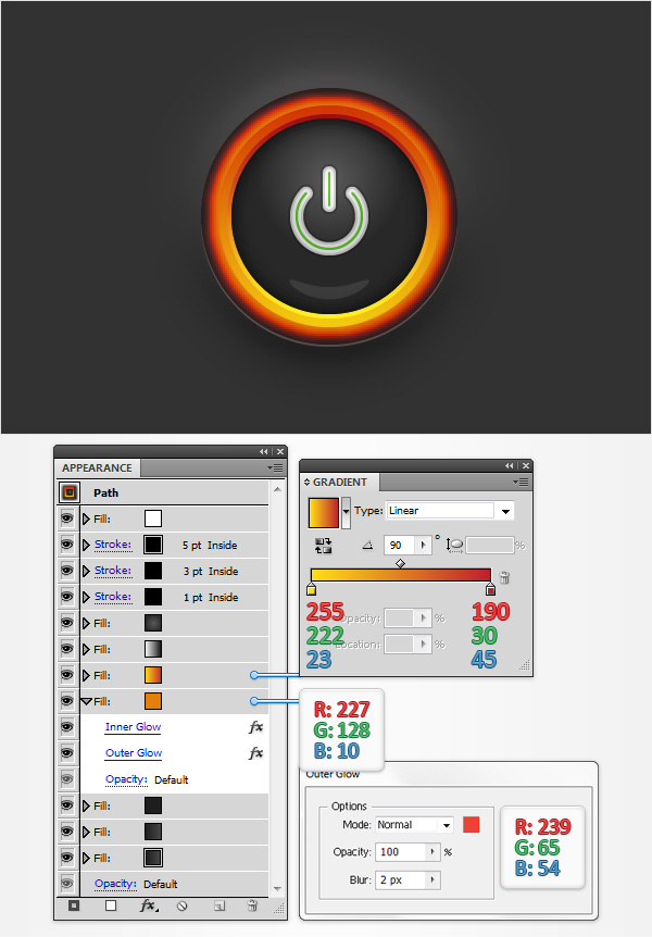 Step 22Select the compound path that makes up your second button and focus on the Appearance panel. Select the top fill and simply replace the green with R=251 G=176 B=64.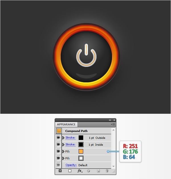 And We’re Done!I hope you’ve enjoyed this power button vector tutorial and can apply these techniques in your future projects. |
Tuesday, November 3, 2015
Turn Your Sketches Into Vectors!
In this tutorial I will show you how to turn your doodles and sketches into vectors! This tutorial uses custom brushes, the Paintbrush tool, Pen tool, and the Live Paint Bucket tool. Even if your not a huge fan of the cuteness, you can use these techniques for other illustrations, logos, and vector elements.
Final ImageBelow is the final image we will be working towards. Tutorial DetailsProgram: Adobe Illustrator CS4Difficulty: Intermediate Topics Covered: Custom Brushes, Paintbrush Tool, Live Paint Bucket tool Estimated Completion Time: 1-1.5 hours Step 1Create a sketch with traditional media or in a design application like Photoshop. Once created, scan in the image and save it on your computer. Step 2In Illustrator, create a new document, go File > Place, find your image, and place it on your document. From the Layers panel, rename the current layer by double-clicking on layer and typing “Template”. Next, press the Lock icon for the “Template” layer from the Layers panel. Step 3Press the Create New Layer button from the Layers panel and rename it “Outline”. Step 4For the outline of the creature we are going to create two custom Art Brushes. For the first one, use the Ellipse tool (L) and create a oblong ellipse. With the Direct Selection tool (A) grab the left anchor point and drag it to left, doubling its width. Next, take off any stroke and fill it with black. Step 5Drag the new ellipse shape into the Brushes panel and choose New Art Brush from the New Brush dialog. With the Art Brush Options dialog open, keep the default options except change the Method to Tints from the Colorization Method drop-down menu. Step 6For the second custom brush, create a very narrow ellipse and fill it with black. Like in the previous step, create a new Art Brush and set the Colorization Method to Tints. Step 7Now that we have our two custom brushes, we can start tracing the sketch, But before we start, there are some tips you should be aware of.Paintbrush tool or Pen toolYou can use the Pen tool (P) or Paintbrush tool (B) to create the paths that you will apply the custom brushes to. I prefer to use the Paintbrush tool (B) because it is quick and your selected custom brush is automatically applied to the path. If you are going to use the Paintbrush tool (B), it is a good idea to set some of the Paintbrush tool’s (B) options. To do this, double-click on the Paintbrush tool (B) from the Tools panel. When the Paintbrush Tool Options dialog opens, change the Fidelity to 10. This creates a smooth line with using the Paintbrush tool (B). If you are going to use the Pen tool (P), simply selected your created path and select the desired brush from the Brushes panel. Avoid Paths with Sharp AnglesWhen creating stroked paths with the custom brushes I try to stay away from creating paths with angle less then 90 degrees. As you can see in the example below, Illustrator tends to add weird remnants in angled paths. To get around this I use two different paths each with minimal anchor points. Curvier paths are usually alright. Use Stroke WeightIf the brush you apply is too thick, you can adjust the Stroke Weight form the Stroke panel. Alternate BrushesUse the different brushes we created to add line variance in the trace. I use the first brush when I want a stroke thicker at one end compared to the other. Change Direction of BrushTo change the direction of the brush stroke, select your stroke and press the Brush Options button at the bottom of the Brushes panel. In the Stroke Options dialog, you can check the Flip Along or Flip Across check-box until you reach the desired direction. This works great for the first brush we created. Depending on the path, you might need to switch the direction so the thick or thin part of the stroke is on the desired side of the path. Step 8With the Paintbrush tool (B) or Pen tool (P) start tracing your sketch making sure you are in the “Outline”layer and you are thinking about the tips in the step above. For the shapes that will be filled black, use the Pen tool (P) to create the shape. You can also use the Ellipse tool (L) or Rectangle (M) for any shapes like the eyes of the creature. Step 9Finish outlining all the dominate lines and shapes of the sketch. Step 10Select all the brush strokes by going Select > Object > Brushed Strokes and the go Object >Expand Appearance. Step 11Now that we are done creating the outlines for the character we can start coloring the illustration with the Live Paint Bucket (K). First select a set of main colors for the creature. I chose pink and white. You can create these colors by mixing them in the Color panel and pressing the New Swatch button in the Swatches panel. Step 12Select all your artwork and choose the Live Paint Bucket (K) from the Tools panel. This will automatically convert the artwork into a Live Paint Group. With the Live Paint Bucket, hover over the open spaces you want to fill. Use the arrows keys to cycle through the colors you want to fill the spaces with. When you cycle to the desired swatch, click in the desired open area to fill it. Step 13Select the Live Paint group and go Object > Live Paint > Expand. Step 14Now that the Live Paint Group is expanded, use the Magic Wand tool (Y), hold down the Shift Key, and select all the colors in the artwork. Once selected, Cut (Command + X) the shapes. Create a new layer from the Layers panel, label it “Color”, place the new layer below the “Outline” layer and Paste in Front (Command + F) the colored shapes. Step 15The creature is looking pretty good, but let’s add some shadows to give it more depth. With the Pen tool (P), create shadow shapes in the “Color” layer. Fill the shadow shapes with darker colors than your original colors. Continue until you have created all the shadow shapes. Step 16To make the colors a little more vibrant, change the fill color of the outlines in the “Outline” layer. I also used one of my custom brushes to add more detail to the eyebrows. This is a good point to touch up or add any more detail you think the illustration is lacking. Step 17We are almost done, but to make the illustration really pop, let’s put it on a colored background. Create a new layer from the Layers panel, label it “Background”, and place it above the Template layer and below the “Outline” and “Color” layers. Step 18With the Rectangle tool (M), create a rectangle, and fill it with a color. Step 19We can also add some depth to the background by creating some bigger brush strokes. Use the Paintbrush tool (B), select a color slightly lighter than your background, set stroke weight very high (around 8 pt depending on the size of your artwork), and create a brush stroke. Create about 15 more brush stroke and mix up the Stroke Weight for some of them. Step 20For the finishing touches create some shadows below the creature with the Paintbrush tool (B) and a darker color than your background. All done! Final ImageBelow is the final image again. These techniques work really great on other illustrations and vector artwork especially for t-shirt designs. |
Subscribe to:
Posts (Atom)