Final Image: Stitched Label Type TreatmentBelow is the final stitched label type treatment we will be working towards. Tutorial Detail: Stitched Label Type Treatment
Step 1: Stitched Label Type TreatmentTo start off this Stitched Label Type Treatment Tutorial, let’s create a new document and without the Type tool (T) and type out some text. Change the font to whatever you like. I suggest using something heavy like the Museo Slab 1000 font I am using. Step 2Before we start adding new fills and strokes from the Appearance panel, it is good to start with a clean slate. Select you text and take off any fill or stroke. Step 3From the pop-up menu of the Appearance panel, select New Fill. Keep the default black color for now, we will be changing it later on in the tutorial. Step 4Again, create another New Fill From the Appearance panel. Select the second fill in the Appearance panel and change the fill to a red color. Step 5Select the red fill in the Appearance panel then go Effect > Convert To Shape > Rounded Rectangle. When the Shape Options dialog opens select the Relative radial button and change the Extra Width and Extra Height to 18 px. These number might be higher or lower depending on the dimensions of you text. Step 6With the red fill selected in the Appearance panel, press the Duplicate Selected Item button at the bottom of the Appearance panel. Change the last red fill in the list to a gray color. With the gray fill still selected, go Effect > Path > Offset and change the Offset in the dialog to 5 px. Just like in the previous step this numerical values might change depending on the size of your text. Step 7Now that we have all the major shapes done, we can start by add some detail and stitching to the text. To start, select the first black fill in the Appearance panel. Change the fill to a liner gradient with the first color stop in the gradient white and the second color stop a light gray. From the Gradient panel change the Angle of the gradient to -90. Step 8With the text selected, choose New Stroke from the pop-up menu of the Appearance panel. Change the color of the stroke to gray, set the Weight to 1pt, check the Dashed Line checkbox, and input 2 pt in the first Dash filed of the Stroke panel. Next, go Effect > Path > Offset and change the Offset in the dialog to -2 px. Step 9Select the main white text linear gradient fill in the Appearance panel and press the Duplicate Selected Item button. Select the second white text gradient, fill it with a light gray and choose Multiply for the Blending Mode from the Transparency panel. Next go Effect > Distort & Transform > Transform. With the Transform dialog open, change the Vertical Move to -2 px. Step 10Select the red color fill from the Appearance panel and change it to a linear gradient. From the Gradient panel, change the first color stop to red, the second to dark red, and change the Location to -90. Step 11From the pop-up menu of the Appearance panel, choose New Stroke. Next, Go Effect > Convert to Shape > Rounded Rectangle, change the Extra Width and Height to 10 px, and change to Corner Radius to 5 px. Change the stroke to a light yellow color, change the weight to 1.5 pt, and change the Dashed Line value to 8 pt. Step 12With the yellow stroke selected, press the Duplicate Selected Item button in the Appearance panel. Make sure you have the second yellow stroke selected and go Effect > Distort & Transform > Transform. In the dialog, change the Vertical Move to -2 px. Next, change the stroke color to a light gray and set the Blending Mode to Multiply. Step 13Select the last fill in the Appearance panel list, change the fill to a linear gradient, change the first color stop a light gray, the second color stop to a gray color, and change the location of the gradient to -90 from the gradient panel. With the last fill still selected, go Effect > Stylize > Drop Shadow. In the Drop Shadow dialog, change the Opacity to 50, X Offset to 0, Y Offset to 5 px, and the Blur to 5 px. Final Image: Stitched Label Type TreatmentNow we have a nice stitched label type treatment. Even better, it is fully editable! You can change the font or even apply it to other vector objects. I suggest creating a Graphic Style to make applying the treatment extremely easy. Simply select your text treatment and press the New Graphic Style button in the Graphic Styles panel. Below are some examples of different text and icons. Have fun! |

Tuesday, August 25, 2015
Create An Editable Stitched Label Type Treatment
Tuesday, August 18, 2015
Create a Set of Download Buttons
In the following tutorial you will learn how to create a set of download buttons in Adobe Illustrator. For starters you will learn how to set up a simple grid. Once your document is set up, you will create the main shapes using basic tools and effects along with some simple vector shape building techniques. Next, you will learn how to take full advantage of the Appearance panel, how to use a built-in pattern and how to edit a small piece of text. Finally, using basic blending techniques you will learn how to easily recolor your buttons.
Tutorial Details
Final ImageAs always, this is the final image that we’ll be creating: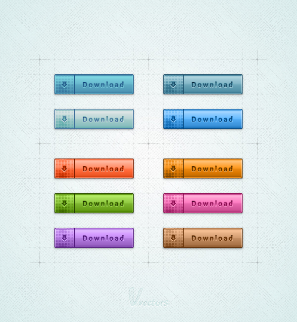 Step 1Hit Command + N to create a new document. Enter 600 in the width and height boxes then click on the Advanced button. Select RGB, Screen (72ppi) and make sure that the “Align New Objects to Pixel Grid” box is unchecked before your click OK. Enable the Grid (View > Show Grid) and the Snap to Grid (View > Snap to Grid). For starters you’ll need a grid every 5px. Simply go to Edit > Preferences > Guides > Grid, enter 5 in the Gridline every box and 1 in the Subdivisions box. You should also open the Info panel (Window > Info) for a live preview with the size and position of your shapes. Do not forget to set the unit of measurement to pixels from Edit > Preferences > Unit > General. All these options will significantly increase your work speed.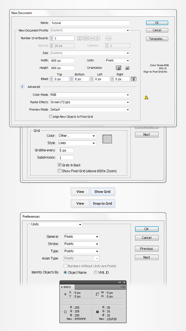 Step 2Set the fill color at black, remove any color from the stroke and pick the Rectangle Tool (M). Create a 160 by 40px shape, make sure that it stays selected and go to Effect > Stylize > Rounded Corners. Enter a 3px radius, click OK and go to Object > Expand Appearance. Move to the Layers panel, double click on this black rounded rectangle and simply name it “main”. This will make it easier for you to find it later. Select “main” and make a copy in front (CTRL + C > CTRL + F), you’ll need it for the next step.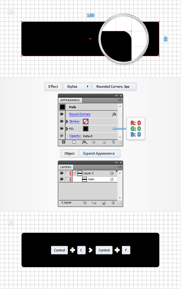 Step 3Pick the Pen Tool (P), draw a 60px, vertical path and place it as shown in the first image. Select it along with the “main” copy, open the Pathfinder panel (Window > Pathfinder) and click on the Divide button. Move to the Layers panel, make sure that the newly created group is selected and simply hit Shift + CTRL + G to ungroup it. In the end you should have two new shapes. Keep focusing on the Layers panel, double click on the smaller new shape and name it “leftPiece”. Move to the other shape made in this step and name it “rightPiece”.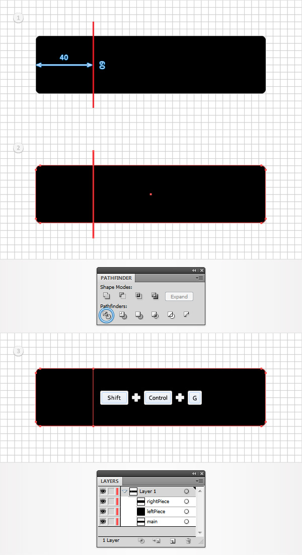 Step 4Select “rightPiece” and replace the flat black used for the fill with the linear gradient shown in the first image. Make sure that “rightPiece” stays selected, focus on the Appearance panel (Window > Appearance) and add a second fill using the Add New Fill button (pointed by the little, blue arrow in the second image). Select this new fill, lower its Opacity to 30% and use the linear gradient shown in the second image. The white numbers from the Gradient image stand for Location percentage while the yellow zero stands for Opacity percentage.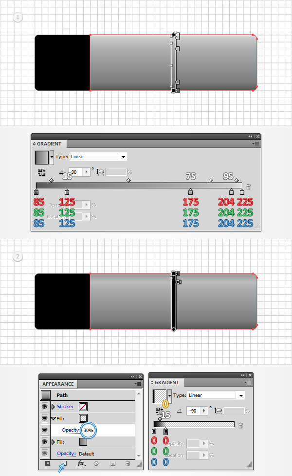 Step 5Select “rightPiece”, make sure that it stays that way and focus on the Appearance panel. Add a third fill for this shape using that same Add New Fill button. Select this new fill, lower its Opacity to 25%, change its Blending Mode to Overlay and use the linear gradient shown in the first image. Return to the Appearance panel and add a new fill for your “rightPiece”. Select it, change the Blending Mode to Difference and use the linear gradient shown in the second image. Get back to the Appearance panel, select the entire path (simply click on that “Path” text from the top of the Appearance panel) and go to Effect > Stylize > Drop Shadow. Enter the properties shown in the left window, click OK and go again to Effect > Stylize > Drop Shadow. Enter the properties shown in the right window and click OK.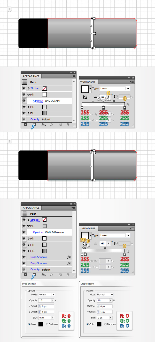 Step 6Next, you need to copy the properties used for “rightPiece” and paste them onto “leftPiece”. Here is how you can easily do it. Go to the Layers panel, focus on the right side and you’ll notice that every shape comes with a little circle, it’s called a target icon. Hold Alt, click on the target icon that stands for “rightPiece” and simply drag onto the circle that stands for “leftPiece”. In the end things should look like in the first image. Select “letPiece”, focus on the Appearance panel, add a new fill, select it and drag it right above the bottom fill. You will need a built-in pattern for this fifth fill. Go to the Swatches panel, open the fly-out menu and go to Open Swatch Library > Patterns > Decorative > Decorative_Modern. A new window with a set of built-in patterns should open. Make sure that the new fill is still selected, add the “Optical Squares 2″ pattern, lower its opacity to 30% and change the blending mode to Color Burn.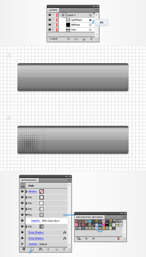 Step 7Focus on the Layers panel, select “main”, make a copy in front (CTRL + C > CTRL + F) and bring it to front (Shift + CTRL + ] ). Make sure that this copy stays selected and focus on the Appearance panel. Remove the color from the fill and add a 2pt stroke. Select it, set the color at white, align it to inside, lower its Opacity to 75% and change the Blending Mode to Overlay. Add a second fill for this new shape using the Add New Stroke button (pointed by the little, blue arrow in the second image). Select this new stroke, make it 1pt wide, align it to inside and set the color at R=55 G=55 B=55.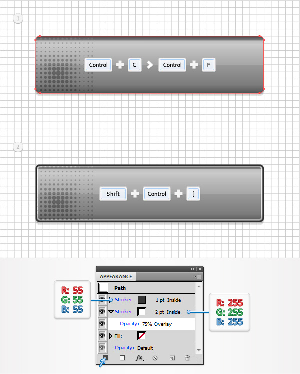 Step 8Disable the Snap to Grid (View > Snap to Grid) then go to Edit > Preferences > General and make sure that the Keyboard Increment is set at 1px. Select “leftPiece” and make two copies in front (CTRL + C > CTRL + F > CTRL + F). Select the top copy and move it 1px to the left using the left arrow from your keyboard. Reselect both copies and click on the Minus Front button from the Pathfinder panel. Select the resulting shape, focus on the Appearance panel and simply hit the D key from your keyboard. This will replace the existing Appearance attributes with the default ones (white fill and black stroke). Remove that black stroke then replace the white from the fill with the linear gradient shown in the following image. Lower its Opacity to 75% and change the Blending Mode to Overlay.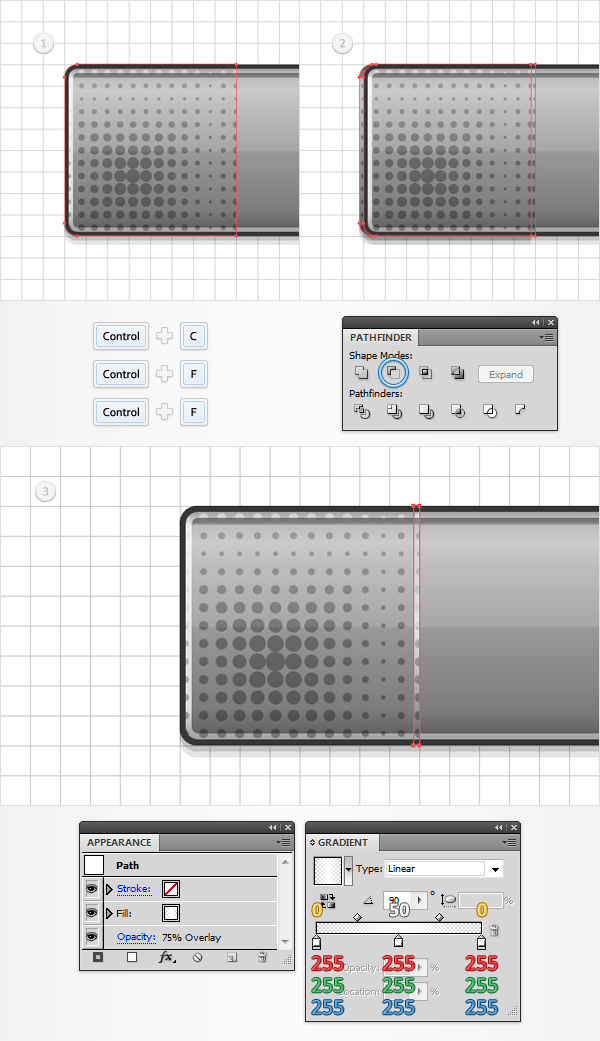 Step 9Select “rightPiece” and make two copies in front (CTRL + C > CTRL + F > CTRL + F). Select the top copy and move it 1px to the right using the right arrow from your keyboard. Reselect both copies and click on the Minus Front button from the Pathfinder panel. Select the resulting shape, bring it to front (Shift + CTRL + ] ), focus on the Appearance panel and simply hit the D key from your keyboard. Remove that black stroke then replace the white used for the fill with R=55 G=55 B=55.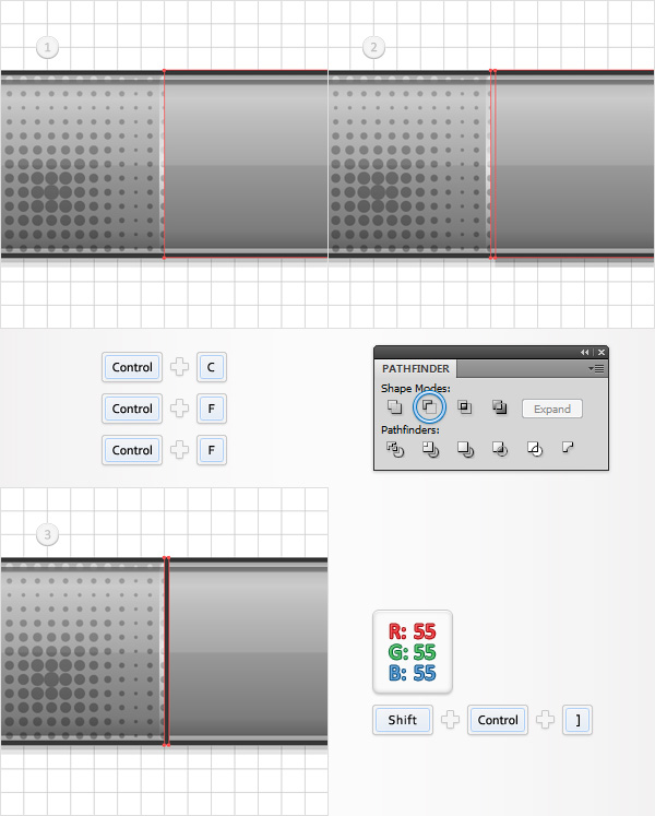 Step 10Enable the Snap to Grid (View > Snap to Grid). For the following step you will need a grid every 1px. So, go to Edit > Preferences > Guides & Grid and enter 1 in the Gridline every box. Set the foreground color at R=85 G=85 B=85, pick the Rectangle Tool (M), create a 6 by 5px shape and place it as shown in the first image. Continue with the Rectangle Tool (M), create a 12 by 6px shape and place it as shown in the second image. Focus on this second rectangle and switch to the Direct Selection Tool (A). Select the bottom anchor points and go to Object > Path > Average. Check the Both button and click OK. This will turn your little rectangle into a triangle. Select it along with the rectangle made in the beginning of the step and click on the Unite button from the Pathfinder panel. Make sure that this new shape stays selected, focus on the Appearance panel and add a second fill. Select it, drag it below the existing fill, add the linear gradient shown below and go to Effect > Path > Offset Path. Enter a 1.5px Offset and click OK.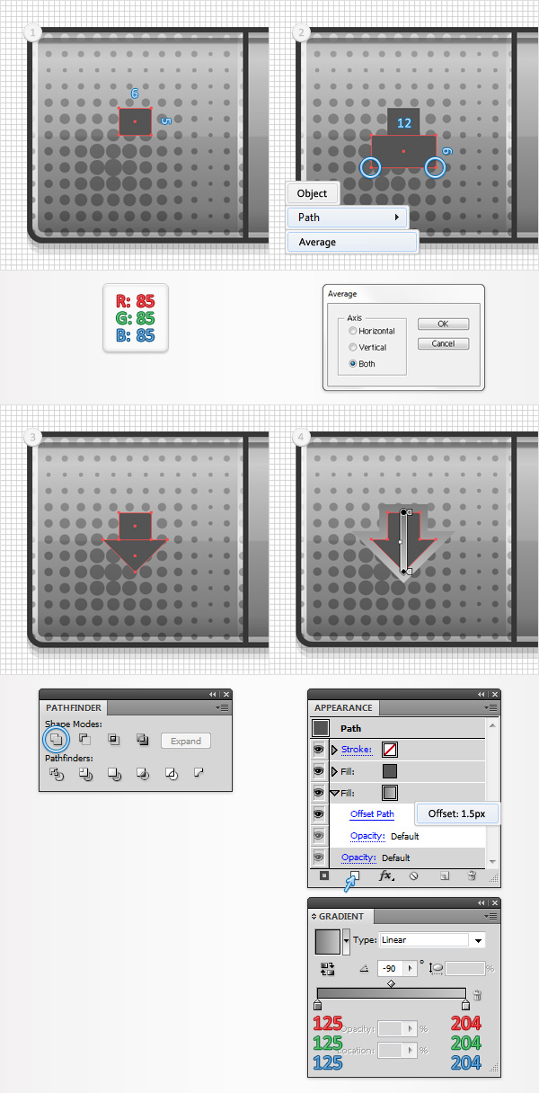 Step 11Make sure that your arrow shape stays selected, focus on the Appearance panel and add a third fill. Select it, add the linear gradient shown below, lower its Opacity to 50% and go to Effect > Path > Offset Path. Enter a -2.5px Offset and click OK. Return to the Appearance panel, add a 1pt stroke, align it to inside and set the color at R=55 G=55 B=55. Finally, select the entire path and go to Effect > Stylize > Rounded Corners. Enter a 1px radius and click OK.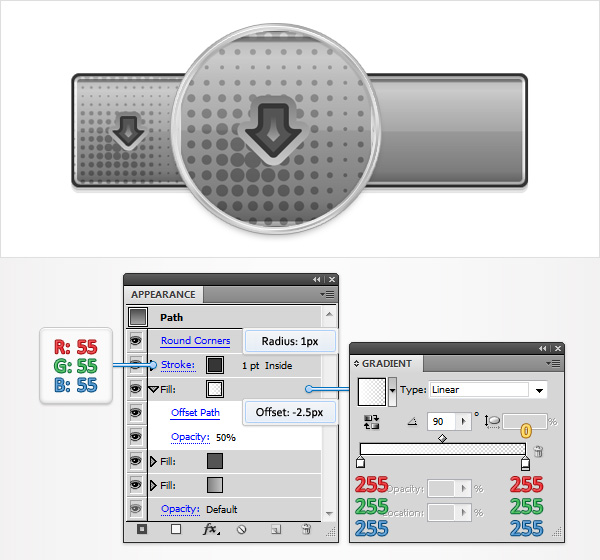 Step 12Using the Type Tool (T) and add your “Download” piece of text. Use the Calibri font, set the size set at 15pt, the leading at 18pt and the tracking at 200 then pick a dark color for the text. Make sure that your piece of text is selected focus on the Appearance panel and hit that Add New Fill button. Select this new fill and use the linear gradient shown in the following image.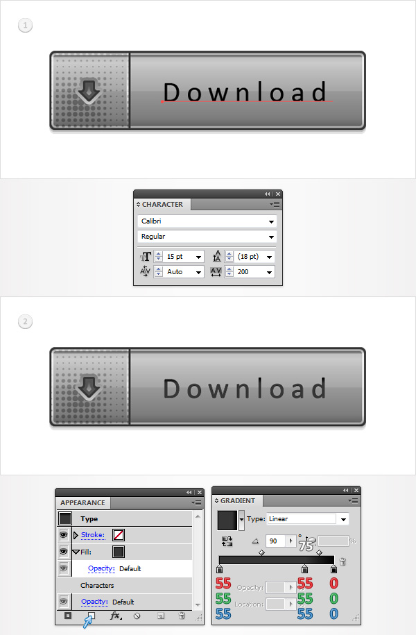 Step 13Reselect your piece of text, focus on the Appearance panel and add a second fill. Drag it below the existing fill, use the linear gradient shown in the following image and go to Effect > Path > Offset Path. Enter a 1px Offset and click OK.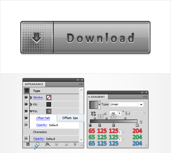 Step 14Focus on the Layers panel, select “main”, make a copy in front (CTRL + C > CTRL + F) and bring it to front (Shift + CTRL + ] ). Make sure that this copy stays selected and focus on the Appearance panel. Replace the black with R=39 G=170 B=225, lower its Opacity to 55% and change the Blending Mode to Hard Light.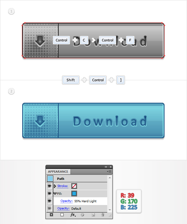 Step 15Focus on the Layers panel, select “main”, lower its Opacity to 15% and go to Effect > Path > Offset Path. Enter a 0.5px Offset, click OK and go to Effect > Distort & Transform > Transform. Enter the properties shown in the following image, click OK and go to Effect > Blur > Gaussian Blur. Enter a 2px radius and click OK.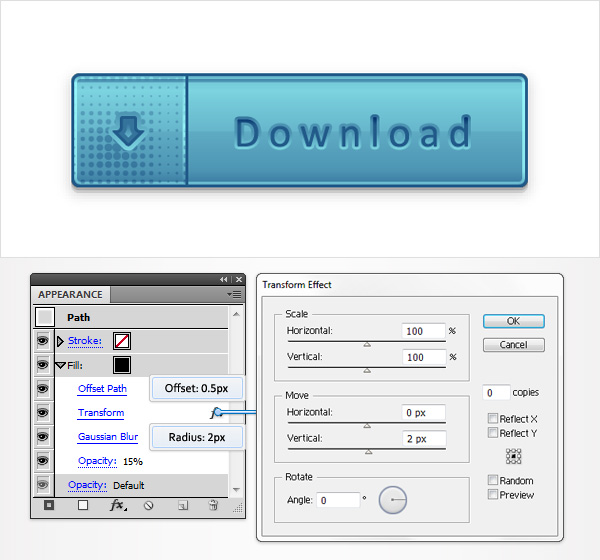 Step 16Finally, here are some other blending modes that you could use to recolor your buttons.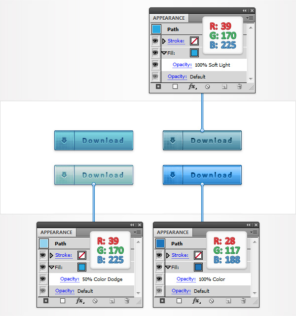 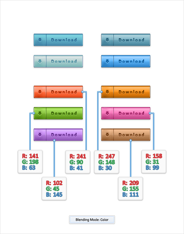 And We’re Done!I hope you’ve enjoyed this tutorial and can apply these techniques in your future projects. Author: Andrei MariusAndrei Marius is a self taught vector artist who is trying to make a living doing something that he likes. He spends most of his time working in Adobe Illustrator, trying to avoid the Pen Tool. You can find most of his vector experiments at this little website dedicate to Illustrator VforVectors. |
Tuesday, August 11, 2015
How to Create Realistic Vector Leaves in Illustrator
In this tutorial, we’ll find out how to create a realistic vector leaves which can be always used in your future projects. This leaf is essentially universal, i.e. you can always change its color and form. It might seem to you that it’s created with the help of the Gradient Mesh. But nope, it’s not the case. I used plain gradient fills. Would you like to learn how to create such leaves? Then put all your businesses aside and let’s draw!
Tutorial Details: Realistic Vector Leaves
Final Image: Realistic Vector LeavesAs always, these are the final Realistic Vector Leaves that we'll be creating: Step 1To begin with, create a new document (File > New…). Dimensions of our artboard are not significant, since we’ll create one vector element which you can use in different artworks in the future. Click on button Advanced and set the RGB color mode, if of course, it is not installed by default.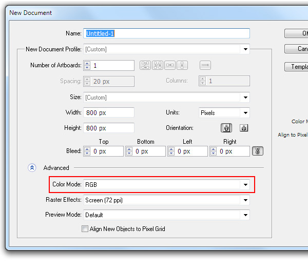 Step 2Take the Ellipse Tool (L) and create an ellipse of any size, which looks similar to the one you see on the figure below.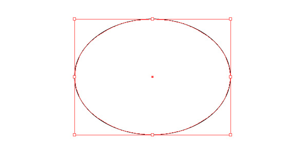 The colors of the fill and the stroke are unrestricted, since first we create necessary forms, which will be colored later. Take the Direct Selection Tool (A) and select point A. Now, while holding down the Option/Alt key, turn one of the handles of point A. 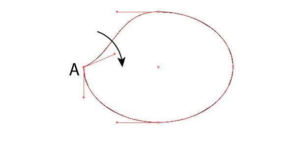 These actions will lead to the transformation of smooth point into a corner one. Step 3Perform the same actions with point B of our object.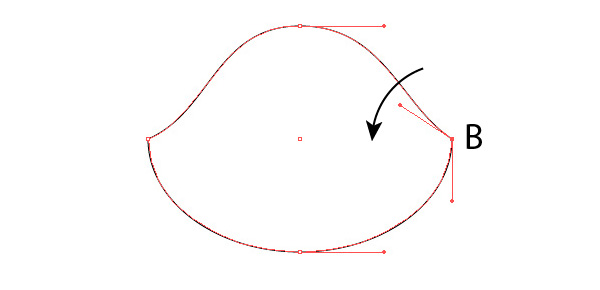 And now while manipulating with the location of the points and its handles, give the object the form of a leaf as it is indicated on the figure below. All the actions are performed with the help of the Direct Selection Tool (A). 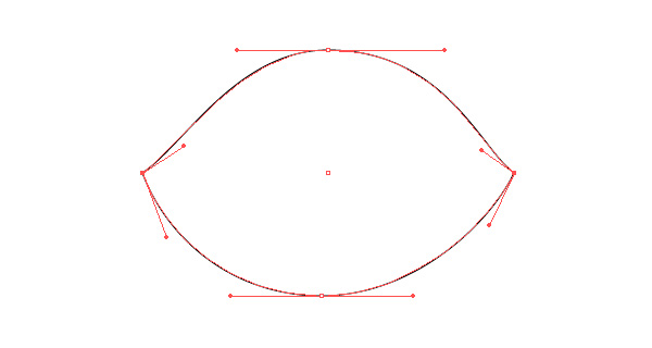 Step 4Take the Pen Tool (P) and create a curved segment that passes though the points A and B.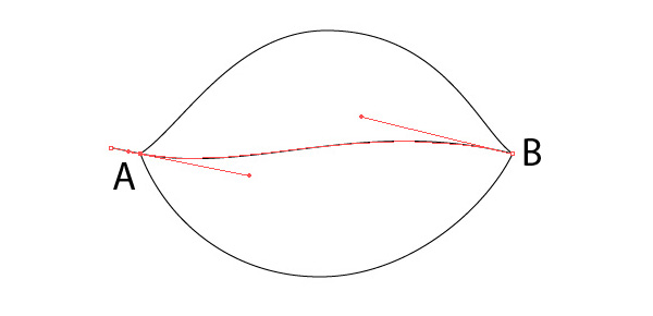 Select all the created objects, then click on Divide in the Pathfinder panel. 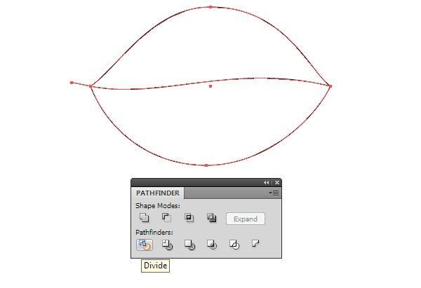 These actions will divide the leaf’s form into two parts. 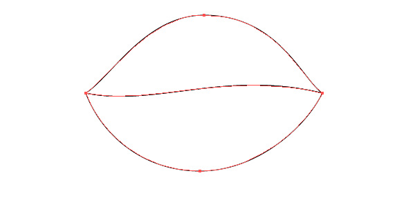 And now we can start coloring its halves. For our convenience, we ungroup them (Shift + Command/Ctrl + G). Step 5Typically, the Gradient Mesh is used to create complex color objects, but a lot of users and even advanced designers try to avoid the usage of this function because of usage complexity and management. I perfectly understand the problem they face–that’s why I suggest another method. And namely, I suggest to use the Appearance panel to create light-and-shade in the halves of our leaf. The work with color is always very challenging to describe since it is a long journey of trials and errors. Therefore, I give you exact designations of colors, and what effect I’m trying to reach. Fill the lower half of the leaf with radial gradient from green (R = 110, G = 194, B = 36) to green (R = 72, G = 163 B = 4). Now using the Gradient Tool (G), shift the center of the radial gradient by clicking and dragging off the center. We need to place the center of the radial gradient in such a way that the left corner of the leaf was lighter in color.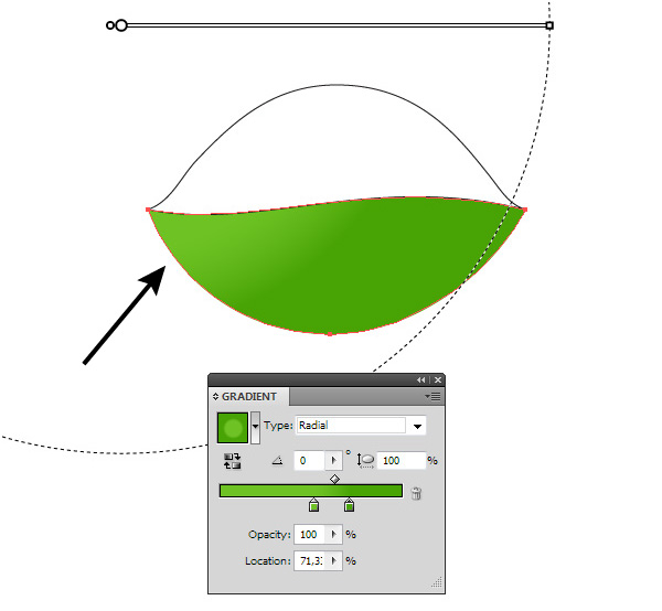 Step 6Open the Appearance panel (Window > Appearance) and click on the Add New Fill button in the bottom part of the panel.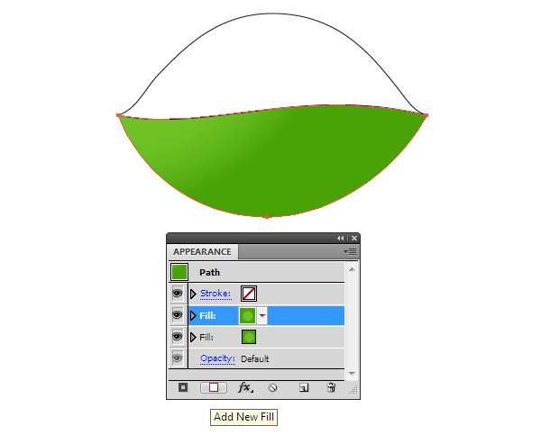 Change the colors of the radial gradient of the new fill to green (R = 37, G = 138, B = 0) for the left slider, and green (R = 81, G = 173, B = 4) for the right slider. For the right slider, set 0% opacity in the Gradient panel. And now shift the center of the radial gradient with the help of the Gradient Tool (G) to darken the middle part of the leaf. 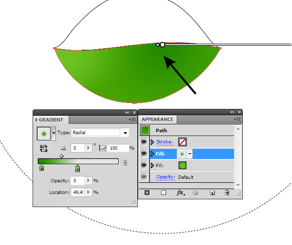 Step 7Create a new fill in the Appearance panel. Radial gradient of this fill has the following colors: green (R = 118, G = 196, B = 37) for the left slider and green (R = 61, G = 130, B = 3) for the right slider. The right slider has 0% opacity. The center of the gradient should be placed to lighten the right corner of the leaf.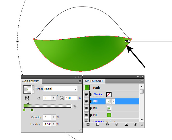 As you can see, the use of the Appearance panel and gradients with transparent sliders allows us creation of complex color transition. 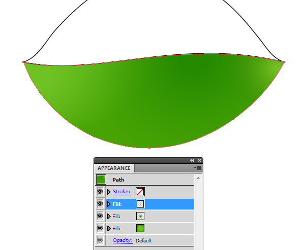 Step 8We worked only in green, but look how different the numbers corresponding to its shades are! Logically, it is clear that numbers of shades of one color should not differ dramatically. Fortunately, there is an intuitive color model which helps to get the right color quickly. This is the HSB color mode. I use this model to mix colors. And if you want to get your own colors and not just copy the colors that I received, then switch the color model in the pop-up menu of the Color panel.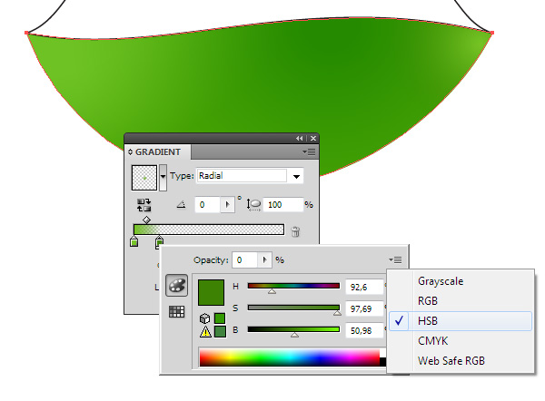 Here I want to note, switching the color model in the Color panel won’t change the color mode of our document. Step 9Using this technique, color the upper part of the leaf. Fill the form with linear gradient from green (R = 7, G = 120, B = 0) to green (R = 68, G = 173, B = 0).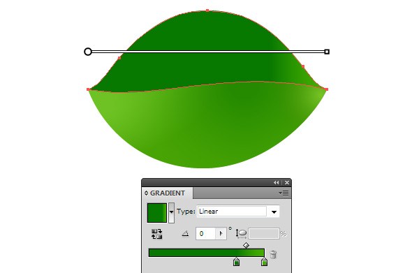 Step 10Add a new gradient fill in the Appearance panel. This radial gradient consists of the following colors: green (R = 81, G = 173, B = 4) for the left slider, green (R = 8, G = 122, B = 0) for the central slider, and green (R = 81, G = 173, B = 4) for the right slider. The central slider has 0% opacity.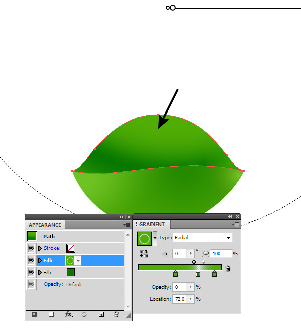 This gradient lightened the central upper part of the leaf. Step 11And finally, we create one more fill in the Appearance panel. The new radial gradient consists of two colors. These are green (R = 9, G = 130, B = 0) with 0% opacity for the left slider, and green (R = 65, G = 140, B = 3) for the right slider. The center of this gradient must be placed so that it darkens the edge of the leaf.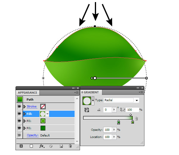 Step 12With the Pen Tool (P), create a form of a stem as it is indicated on the figure below.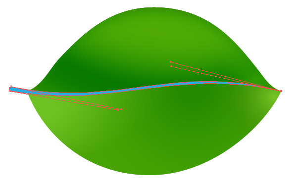 Fill the created form with linear gradient from green (R = 100, G = 176, B = 33) to green (R = 72, G = 163, B = 4). 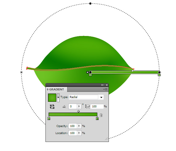 Step 13Copy the stem’s form and then paste it to the front (Command/Ctrl + C; Command/Ctrl + F). Change the location of the points’ handles so it becomes thinner than the original.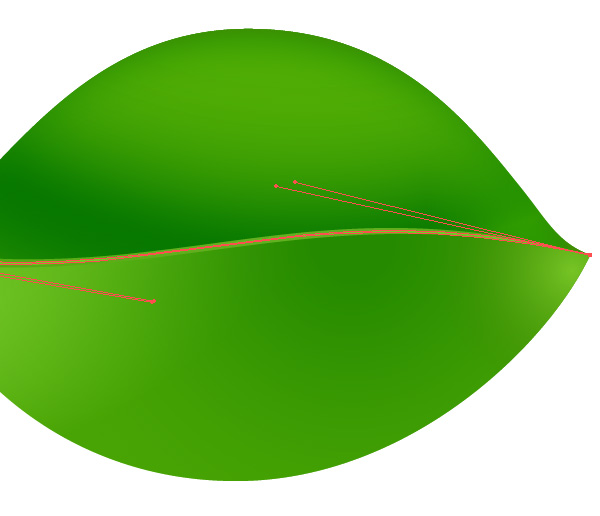 Fill this form with radial gradient from green (R = 114, G = 204, B = 37) to green (R = 72, G = 163, B = 4). The upper object is a gleam on the surface of the stem. 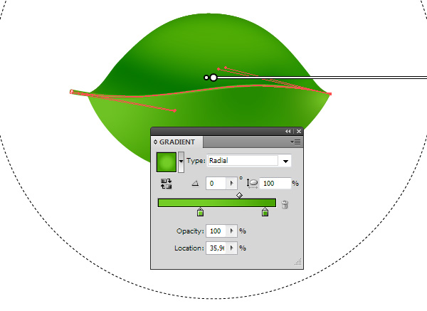 Step 14Create a new form using the Pen Tool (P). It should be a little wider than the stem and should repeat its form. Place the object below the created stem’s elements. Fill this form with linear gradient from green (R = 0, G = 92, B = 40) to green (R = 61, G = 138, B = 3). The object created in this step is a drop shadow for the stem.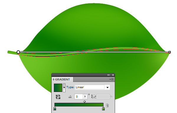 Step 15Let’s work on creation of veins on our leaf. Take the Pencil Tool (N) or the Pen tool (P) and create a wavy line with the black fill.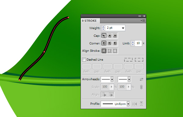 Apply to this path a triangular profile in the Stroke panel. There you can also adjust its width by changing the Weight parameter. 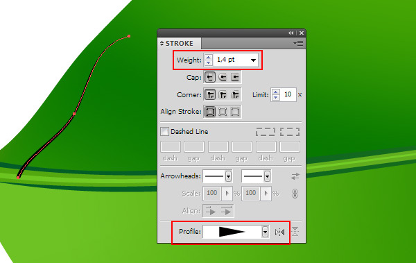 Step 16Create the rest of the veins on the upper part of the leaf, then group them (Command/Ctrl + G). Place the group underneath the stem. Now apply the Screen blending mode in the Transparency panel to the group.  The veins became transparent, but no worries please. We’ll fix it right away. Step 17Turn the Grayscale color mode in the Color panel, then reduce the K value to get the desired intensity of the veins’ color. Hide edges of the paths (View > Hide Edges or use the Command/Ctrl + H shortcuts) so nothing prevents us from color management. Using this technique, create some veins on the lower part of the leaf.  Step 18Under the influence of some environmental factors, some spots can appear on leaves in nature. So to help these look more natural, using the Pencil Tool (N) to create objects which look similar to the ones you see on the figure below. Apply to these objects the Screen blending mode in the Transparency panel, then choose the desired color intensity by controlling the K parameter in the Color panel. 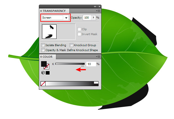 Step 19Select the halves of the leaf and the spot forms, then take the Shape Builder Tool (Shift+M) and while holding the Option/Alt key, click on the parts of the spots which extend beyond the form of the realistic vector leaves, which leads to deletion of these parts.  Step 20With the help of the Pen Tool (P) create dark-grey and white objects. These objects should be placed underneath all of the leaf’s objects. The forms of the objects and their position towards the leaf is indicated on the figures below.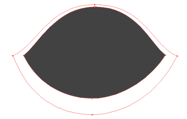  Select both forms, then go to the Object > Blend > Make or use the Command/Ctrl + Option/Alt + B shortcuts. In order to set the desired value of specified steps, go to the Object > Blend > Blend Options… or simply click twice on the Blend Tool (W) icon in the Tool panel.  I usually set it to less than 30 steps since the number of steps enlarges the size of your vector file and slows down the application in process. Step 21Select the blend object and set the Blending mode to Multiply in the Transparency panel. This gives your blend object transparent edges so we can place it on any color background. Step 22The techniques that were used in this tutorial, in fact allowed us to create a universal leaf that can be re-colored very quickly to create additional leaves. To do so, open the Appearance panel, select the fill and edit the gradient. We can change the colors and location of gradients, which gives us an opportunity to control the lighting of the object.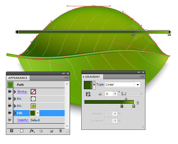 Moreover, we can easily change its form without breaking a complex shading, for example, with the help of the Pencil Tool (N) as in the image below.  Realistic vector leaves are very popular design elements. Check out yourself how they can be used.  I hope you were able to complete this Realistic Vector Leaves tutorial. I’m always ready to help when you have any difficulties. All you need to do is to write your questions in comments to this tutorial.  Author: Iaroslav LazunovMy name is Iaroslav Lazunov, I am a graphic designer from Ukraine. I am glad that I finally found the job in my life that I can share my knowledge and experiments with you in my tutorials. Follow me on Twitter or visit my blog Vectorboom.com. |
Subscribe to:
Posts (Atom)