Stock photos may be indispensable design resources, but they are also very prone to design abuse.
")
Like this.
(And hey, this post will also be adorned with a few stock photos too! Explanation’s in the next paragraph.)
The Pros of Using Stock Photos (and 1 Con)
They’re here to stay because people actually look for them. There wouldn’t be so many stock photo websites, both free and premium, otherwise. Here’s a simple example: if you’re a blogger too, I’m sure you’ve had to resort to them a few times to preface abstract concepts you’re about to talk to your readers about, as well as to break the monotony between walls of text. Add to our number the people, both newbie and experienced, who’ve had to put a face on their website, a cover page for their newsletter, or just the right photo on their slideshow presentation at one time or another, and you’ve got a demand that goes by the millions.
They’re convenient resources for when we need human faces or points of reference in our designs; the kind that can elicit a desired human response from the people we’re designing our creations for. A direct look right into your eyes paired with a winning smile, for instance, coming from just the right kind of person. Chosen based on what we’re looking for and what our general preferences are, as can only be guessed by the demographic we’re classified into. Whether we like it or not, we react to that. In a way that, oftentimes, is exactly how the people using the stock photos want you to.
")
Like this…

Or this.
Unless you’ve already seen that stock photo 14,378 times before.
In other, completely different contexts.
Maybe even on a website, in combination with a drab, simplistic template-based page designs and walls of text full of trite corporate jargon and meaningless generalizations.

Remember these? All of these?
More of the Cons of Using Stock Images
Seeing stock photos used carelessly is like hearing canned lines from awkward pick-up artists, or getting automated voice prompts on the phone when you’re trying to reach a real person. I know those of you who’d rather not waste time choosing a few stock photos among thousands don’t like to hear this, but it’s the uncomfortable truth. That “good enough” stock photo you got in the first set of results may not fit the concept or emotion you’re trying to convey as well as if you searched longer (aside from the great likelihood that many other time-pressed individuals like you, in similar circumstances, may have chosen the
exact same image before, the earlier you see it in the search results). If, at first glance, a person from your target audience looks at what you’ve made and immediately gets a gut reaction screaming “PHONY”, then you did it wrong, dear, you did it very wrong.
It will also royally suck if you later find out that you broke a law or two by using the stock photos you chose ignorantly, and the site you lifted them from is now on your heels. (Hence, you will see that we did not take any chances with our demo image above.)
")
Did you really think you could get away with that?
Fixing the Cons: How Not to Commit Stock Photo Abuse
If you must use stock images,
- Make sure you’re not using clichés. The stock photos used in the collage above are not the only photos you should avoid using in your designs; of course, you should also avoid using stock photos that are similar to them, in the sense that they also convey a similar, generic feel. Granted, sometimes you really have to use a photo of a call center girl, globe in the hand, or skyscraper in your design, but it should have to feel more real. There are other ways to make that image more interesting, but we’ll tackle those ways in another list below.
- Make sure your selected stock photo makes logical sense with the entire intent and purpose of the design. For example, if you’re making – or directing – a website design that you’re saying has to have a globe somewhere in it, is the business it’s representing actually international? Does its customer service come in several languages? If not, and you can’t reasonably justify why the globe should be there… well, maybe the globe shouldn’t be there.
- Check with TinEye to see if they’re already used too often. TinEye is a reverse image search engine that lets you upload your image or enter your image’s URL, and then shows you how many times that image has appeared in other sites. Chances are if you get results as many as – or more than – these:

You need to get another image.
- Search diligently; bookmark a few alternatives to that first image before you choose your final candidate. Give it at least fifteen to thirty minutes to get just the right image. If you weren’t able to find it by that time, you’ll at least have several options on hand to choose from, not just the first one you saw, on some site (or another?), using a search query you barely remember.
- Respect the power of gut feel. Even if you searched for and carefully selected that as-close-to-perfect-as-possible stock image after much time and deliberation, that amount of time may also have helped deafen you against what your gut feel is really saying, as well as given you reason to be biased towards that image because you worked so hard to get it. For the sake of the effectiveness of your design, make absolutely sure your image is giving you the right impression. Have a few unbiased people look at your creation and give you their thoughts of what they think about your chosen stock image within your design.
Here I have to point out, before anyone else raises the issue in the comments, that there is a potential, and relatively popular, argument against making too much effort to make your creation aesthetically pleasing, and it is conversions versus creative standards. Like this post on KISSmetrics or this forum post on a thread debating this same topic demonstrates, there are just some cases where aesthetics does not factor into the effectiveness of your design. And it is here I also point out that in the previous paragraph I said nothing about aesthetics being important when it came to making an impression. Just because we are designers does not mean we always need to make pretty, lovely, aesthetically pleasing things. We design things for certain purposes, whether our own, our clients’, or our employers’, and those purposes don’t always go with being aesthetically pleasing. If you have to produce something awful to get a desired response, then the more awful you get, the more effective you are. (Sorry, Steve Jobs fans.) — You know what, I can already feel some of you raring for a debate after that point of contention from here, so I’ll leave this sentiment here and move on.

Just one example, though: the site Web Pages That Suck has a design that looks like it should nominate itself, and they do get a lot of email saying so. But what they don’t get is that it’s done on purpose.
Also, the stock photo caught in the screenshot is very appropriate, in several ways.
- Make sure you acquire / have permission to use your chosen stock photos legally! I cannot stress this enough. Back when I was still a noob, I’d haphazardly lift images from wherever and use them however I liked, thinking attribution and all that would take care of itself, only to be called to my boss’s office later on and be told that the legal entity that owns the rights to the image I stole is threatening to sue. You do not want to get that feel, trust me!
This is supposing that everything else in the design is of good quality, functional, and makes sense, since if it’s not then you should probably be looking at several other articles too.
If you can afford to use images that are not from stock photo sites,
- Consider taking your own photos – hire someone, ask a friend, or do it yourself. Instead of searching for hours for that perfect photo to represent what you’re trying to convey, why don’t you just grab a camera and capture what’s in front of you yourself? (Stocking, though, is a different thing altogether.)
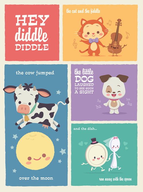
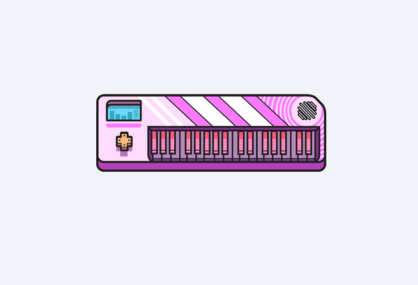
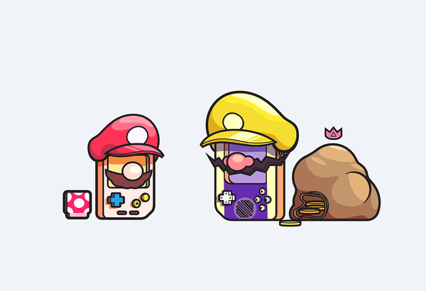
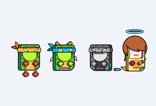
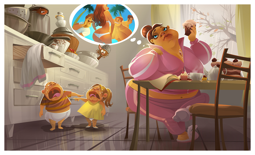
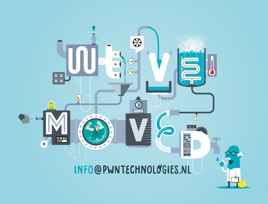
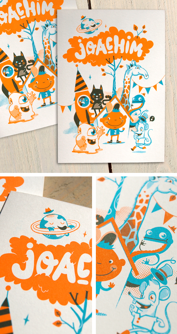
- Illustrate. Many businesses have started catching on that their customers aren’t buying their stock photo splash pages as much as they used to, and have gotten better first impressions when they started using illustrations. Replacing photos of people with illustrations of people, for instance, helps the audience get over any unconscious biases about race, gender, perceived social status, etc., lets them view the overall design more objectively, and lets them appreciate the sentiment/overall concept of the design better.
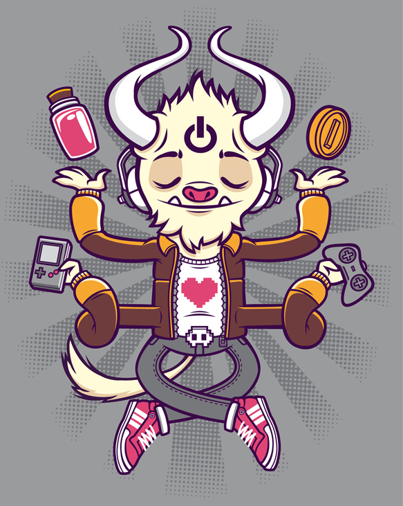
- Stylize. Try a combination of photos and illustrations, play more with typography, or the like to give your audience a more unique experience.

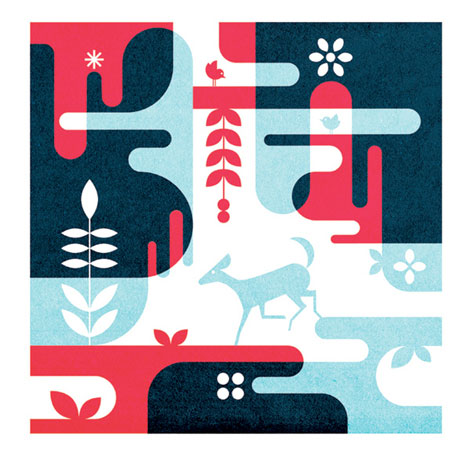
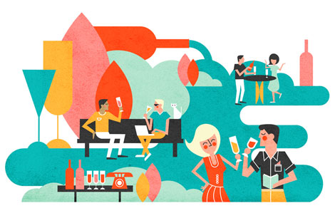
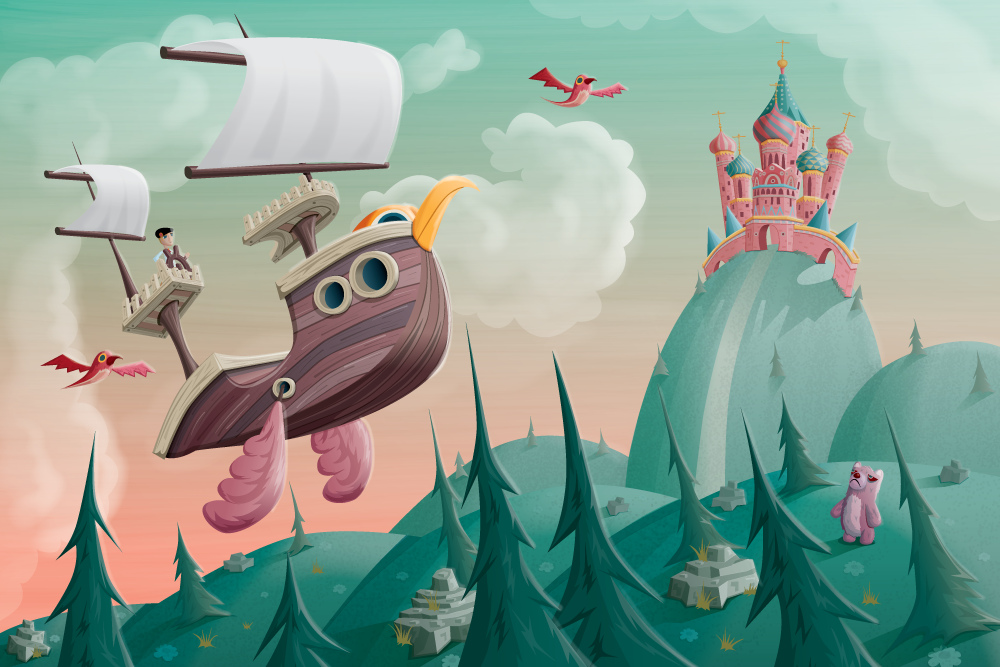
For example, consider our newsletter signup splash page. We could have easily featured stock photos of the prizes
only and left it at that, but since we’re all design-oriented and think creatively, we knew adding that illustration above will make you more interested in signing up, for many internal, creative, designer-type reasons. Yes! Also, you should really
sign up for our newsletter and early-subscriber tablet giveaway if you haven’t already – we’re naming the winner on the 15th. /shameless plug
These articles/blog posts talk more comprehensively about alternatives you can use to stock images, you should check them out:
Now that we got the serious stuff out of the way, uh, what were these stock photographers thinking?
Maybe I’m just not up to date or it’s a secret only cool kids keep, but I don’t know
why these baffling stock photo genres exist or
why we would imagine people in the future to have this kind of eye wear or love their fruits/vegetables this much. The other examples listed
here I can probably understand (“Eating salad is so awesome you can have fun doing it while you’re alone!” or “Technology is SO awesome I want to kiss it silly!”) but I really don’t get the deal about the apples. If you know why these things exist, could you help me – and the rest of us confused public – understand in the comments?
Here are a few more examples here, if you don’t feel like clicking through to the links above right now:

“Heeey, this isn’t Aubercy! Where are the diamonds on this thing?”(Link)

The pursuit of beauty can take you to strange places.

“I am working. Ribbit.” (Link)

“Don’t worry, my lovely pencil, I’ll protect you from people with bad handwriting and amateur doodling skills…” (Link)

“My work is eating me alive!” (Link)