Apple just recently unveiled their latest operating system for mobile devices, iOS 7. It features a more minimalistic and flat look, throwing away the skeuomorphic design of the previous versions with new color palette, typography and new features. It is the “most significant iOS update since the original iPhone” said Craig Federighi, Apple's Senior Vice President of Software Engineering.
 While most are excited and thrilled about the new OS which will be available this fall, the design especially the look and feel of the new set of icons received mixed reviews mostly from designers. The use of gradients combined with minimalist style on the icons making it brighter, flatter and pastel-like is the most notable change that the design world have been conflicting about. A tumblr blog was even made showcasing this aesthetic of Jony Ive, Apple’s Senior Vice President of Industrial Design and what it would look like when applied to various things. With the conflicting thoughts about the iOS 7 design, some designers have done some experiments and created their own take on what the iOS 7 design should look like. One designer who took the challenge is Dmitry Kovalenko. The Ukraine-based designer redesigned the home screen with more emphasis on changing the icons’ graphics and colors. One notable addition is the use of shadows on each graphic for the icons that create depth and unique look. Check out his redesigned iOS 7 GUI below:    Designer student from Paris, Leo Drapeau also took the challenge of redesigning the new iOS. His goal was to make the design more detailed, cleaner and more coordinated using the same design direction and the overall look of the new iOS. The result, a better home screen UI design well applauded by fellow designers.    |

Tuesday, July 16, 2013
iOS 7 Gets Redesigned
Sunday, July 14, 2013
What is Green Graphic Design?
There are loads of designers out there that claim to be environmentally conscious. They tout that they use soy- and vegetable-based inks and print on recycled paper. The truth is, however, that anyone can do that. There’s no question that these efforts are a great first step when it comes to making a design more sustainable but I like to think “green graphic design” goes a few steps further.
Green the Approach  Does the client’s budget only allow for something the size of a postcard? There’s nothing wrong with sending out e-mail blasts instead. In fact, this can save the target audience a few steps. Inviting them to “click here” from an e-newsletter to visit a website is far easier than telling the prospect to visit a site online by typing in the web address manually. If the e-blast is packed with insightful and helpful information, the recipient is likely to hang onto the piece for reference later on, thus giving the client’s business another opportunity for face-time. Printing on the Light-Side  Water-, soy- and veggie-based inks are by far better than their petroleum-based counterparts. But when it comes time for the paper to be recycled, those dyes still have to go somewhere. A graphic designer who keeps the environment in mind thinks about minimal ink coverage when working. Embracing white space as part of the design, avoiding full-bleed printing, and knowing which Pantone colors are on the EPA’s watch-list for hazardous compounds are all eco-conscious ways to use color while balancing sustainability. It’s wise to employ standard paper sizes when possible (8.5×11″, 24×36″ etc.) and work within those dimensions to avoid oddly-sized materials with lots of paper scrap waste. This will not only reduce ink coverage but paper costs as well. Paper Selection  Once pre- and post-consumer papers have been gathered for recycling they go through a de-inking process. This process removes any inks/dyes in the paper so it’s ready for re-use. With this in mind, toxic matter is left behind in landfills often including those toxic inks, chemicals, staples and other inorganic matter. These impurities then leak into water systems and can even pollute our air. In 1998 the EPA set a deadline for paper mills, stating that all U.S. mills should have non-detectable levels of dioxin. While some paper companies have moved to bleaching processes that utilize alternatives to chlorine (such as hydrogen peroxide), others have made great efforts to be completely chlorine free. There are three levels of chlorine-free processes and knowing these and their effects on the environment is essential to creating a sustainable piece. Printing Methods 
|

About the Author
Angela Ferraro-Fanning is an award-winning designer who owns and operates 1331 Design LLC, an eco-friendly graphic and website design business, out of New Jersey. She specializes in working with successful entrepreneurs to design identities that accurately reflect their business while speaking to their intended customer and firmly believes that remarkable graphic design stems from unobstructed, one-on-one relationships between designer and client.Saturday, July 13, 2013
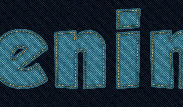
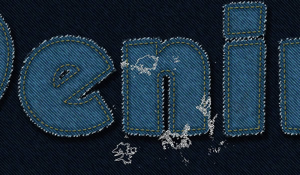
Create a Stitched Denim Text Effect in Photoshop
In this tutorial, we will explain how to combine Photoshop filters,
brushes, and vector shapes to create a stitched denim text effect using
Photoshop CS6. Let’s get started!
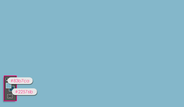
 Set
the Foreground color to #83b7ca and the Background color to #22576b,
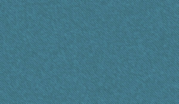
then, fill the “Background” layer with the Foreground color.
Set
the Foreground color to #83b7ca and the Background color to #22576b,
then, fill the “Background” layer with the Foreground color.
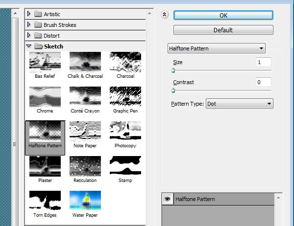
 Next,
we are going to apply some filters to create the denim texture. The
same texture will be used for both the Background and the text. Start by
going to Filter > Filter Gallery > Sketch > Halftone Pattern.
Change the Size to 1, the Contrast to 0, and choose “Dot” from the
Pattern Type drop down menu.
Next,
we are going to apply some filters to create the denim texture. The
same texture will be used for both the Background and the text. Start by
going to Filter > Filter Gallery > Sketch > Halftone Pattern.
Change the Size to 1, the Contrast to 0, and choose “Dot” from the
Pattern Type drop down menu.
 This will create the base for the denim texture.
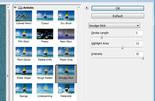
 Go
to Filter > Filter Gallery > Artistic > Smudge Stick. Change
the Stroke Length to 2, the Highlight Area to 12, and the Intensity to
10.
Go
to Filter > Filter Gallery > Artistic > Smudge Stick. Change
the Stroke Length to 2, the Highlight Area to 12, and the Intensity to
10.
 This will create the main denim texture.
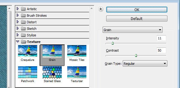
 Go
to Filter > Filter Gallery > Texture > Grain. Change the
Intensity to 11, the Contrast to 50, and choose “Regular” from the Grain
Type drop down menu.
Go
to Filter > Filter Gallery > Texture > Grain. Change the
Intensity to 11, the Contrast to 50, and choose “Regular” from the Grain
Type drop down menu.
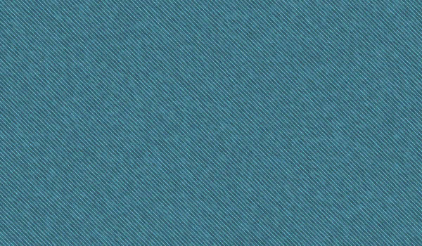
 This will add subtle noise to the denim texture making it look more realistic.
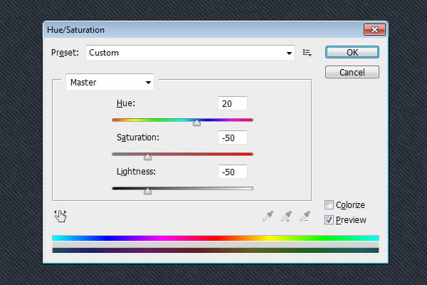
 Select
the “Background” layer once again. Go to Image > Adjustments >
Hue/Saturation, and change the Hue to 20, the Saturation to -50, and the
Lightness to -50 as well.
Select
the “Background” layer once again. Go to Image > Adjustments >
Hue/Saturation, and change the Hue to 20, the Saturation to -50, and the
Lightness to -50 as well.
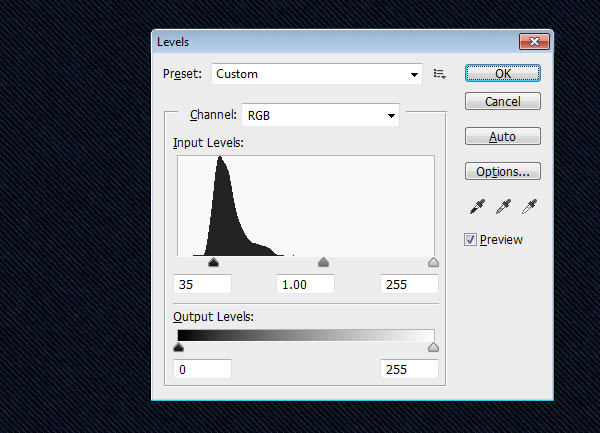
 Go to Image > Adjustments > Levels, and change the Shadows value to 35 to darken the texture a bit more.
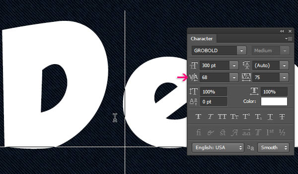
 Notice
that the letter “D” is still a bit close to the letter “e”, which will
cause an undesired overlapping of the edges later on. To fix that, place
the Type Tool cursor between the letters “D” and “e”, then change the
Kerning value to 68.
Notice
that the letter “D” is still a bit close to the letter “e”, which will
cause an undesired overlapping of the edges later on. To fix that, place
the Type Tool cursor between the letters “D” and “e”, then change the
Kerning value to 68.
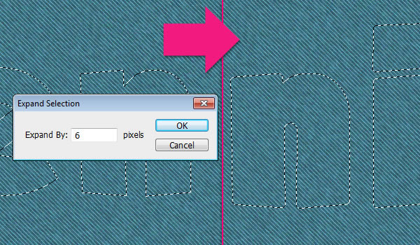
 Go
to Select > Modify > Expand, and type in 6. Larger values will
cause the selection to merge on some parts and we don’t want that. So
make sure to adjust the value accordingly if you are using a different
font size.
Go
to Select > Modify > Expand, and type in 6. Larger values will
cause the selection to merge on some parts and we don’t want that. So
make sure to adjust the value accordingly if you are using a different
font size.
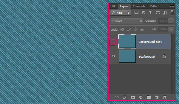
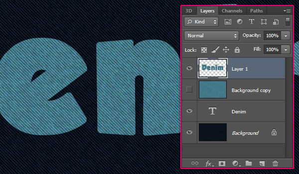
 Select
the “Background copy” layer, then press Ctrl/Cmd + J. This will copy
and paste the selected area in a new layer. Make the “Background layer”
invisible as we don’t need it anymore.
Select
the “Background copy” layer, then press Ctrl/Cmd + J. This will copy
and paste the selected area in a new layer. Make the “Background layer”
invisible as we don’t need it anymore.
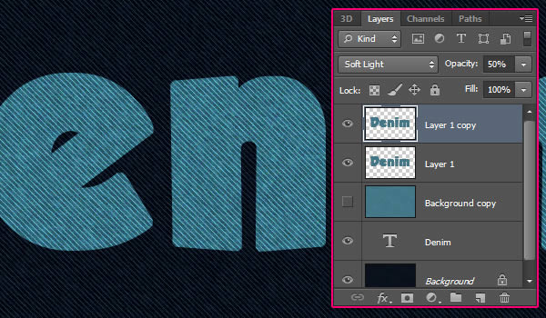
 Duplicate
the layer called “Layer 1″, then change the copy’s Blend Mode to Soft
Light and its Opacity to 50%. This will intensify the colors and the
details of the texture.
Duplicate
the layer called “Layer 1″, then change the copy’s Blend Mode to Soft
Light and its Opacity to 50%. This will intensify the colors and the
details of the texture.
 Double
click “Layer 1″ to apply a simple Inner Shadow effect, by changing the
Opacity to 50%, the Distance to 0, and the Size to 2.
Double
click “Layer 1″ to apply a simple Inner Shadow effect, by changing the
Opacity to 50%, the Distance to 0, and the Size to 2.
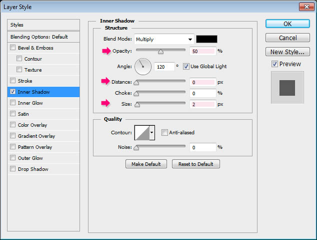 This
will add a very subtle definition to the edges, and it will help blend
them with the stroke brush that will be added later on.
This
will add a very subtle definition to the edges, and it will help blend
them with the stroke brush that will be added later on.
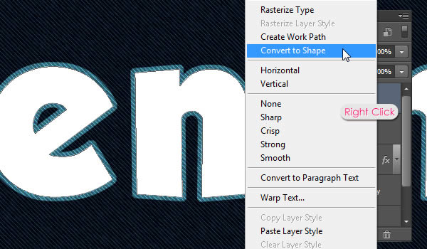
 Right click the duplicated text layer then choose Convert to Shape. The text is no longer editable now.
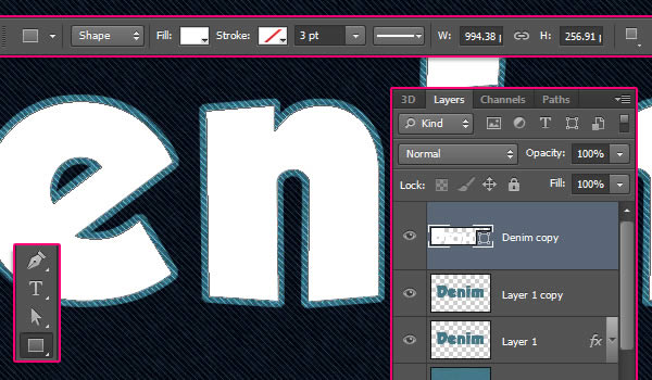
 Pick
any Shape Tool and take a look at the Options bar at the top. There are
some new interesting features introduced in Photoshop CS6 that will
help us create the stitches easily and quickly.
Pick
any Shape Tool and take a look at the Options bar at the top. There are
some new interesting features introduced in Photoshop CS6 that will
help us create the stitches easily and quickly.
 Start
by getting rid of the inner part of the shape by choosing the “No
Color” option under the Fill icon. This value is not the same as the
layer’s Fill value. The first one will get rid of the color inside the
shape but won’t affect the stroke, while the other will affect both the
fill color and the stroke.
Start
by getting rid of the inner part of the shape by choosing the “No
Color” option under the Fill icon. This value is not the same as the
layer’s Fill value. The first one will get rid of the color inside the
shape but won’t affect the stroke, while the other will affect both the
fill color and the stroke.
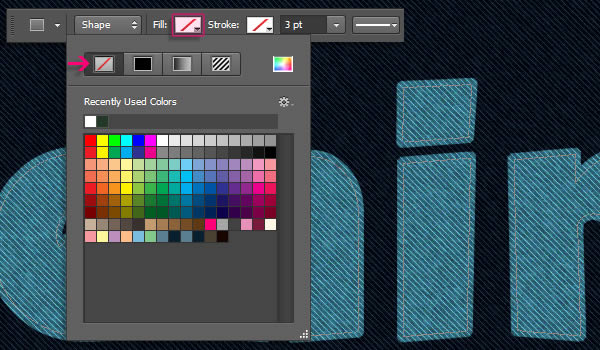
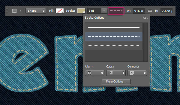
 Type
3 in the stroke width field, then click the shape stroke type icon and
choose the Dashed line preset. To modify some more stroke settings,
click the More Options button down the box.
Type
3 in the stroke width field, then click the shape stroke type icon and
choose the Dashed line preset. To modify some more stroke settings,
click the More Options button down the box.
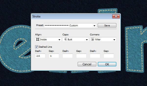
 In
the Stroke window, set the Align to Inside, the Caps to Butt, and the
Corners to Miter. Then, change the first Dash value to 2.5, and the
first Gap value to 1. As you can notice, the Dash value determines the
dash length, and the Gap value determines the distance between the
dashes.
In
the Stroke window, set the Align to Inside, the Caps to Butt, and the
Corners to Miter. Then, change the first Dash value to 2.5, and the
first Gap value to 1. As you can notice, the Dash value determines the
dash length, and the Gap value determines the distance between the
dashes.
Bevel and Emboss: Since the stitches are so small, change the Size to 0, the effect will still add a subtle dimension to the stitches even with the 0 value. Also, change the Highlight Mode color to #bea85a.
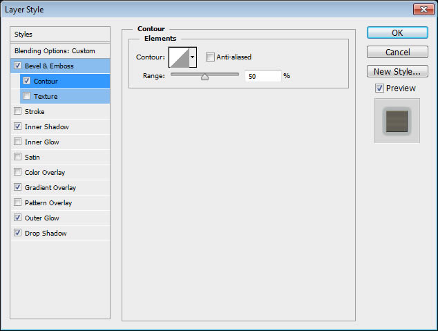
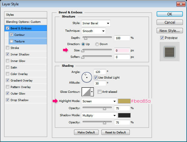 Contour: Use the default values.
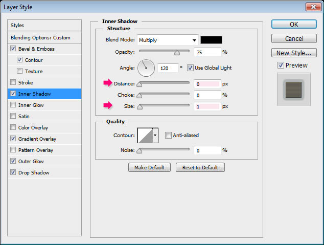
 Inner Shadow: Change the Distance to 0 and the Size to 1.
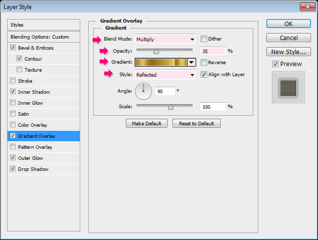
 Gradient
Overlay: Change the Blend Mode to Multiply, the Opacity to 50%, and use
the “Gold Rail G2″ gradient from the “Tracks.grd” file in the gradients
pack, then change the Style to Reflected.
Gradient
Overlay: Change the Blend Mode to Multiply, the Opacity to 50%, and use
the “Gold Rail G2″ gradient from the “Tracks.grd” file in the gradients
pack, then change the Style to Reflected.
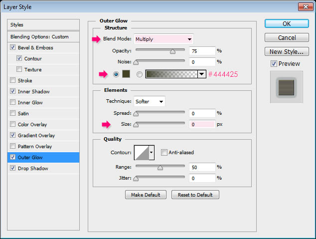
 Outer Glow: Change the Blend Mode to Multiply, the color to #444425, and the Size to 0. This will intensify the shadow effect.
 Drop
Shadow: Change the Blend Mode color to #112d37, the Opacity to 80%, the
Distance to 0, the Size to 7, and the Contour to Cove Deep.
Drop
Shadow: Change the Blend Mode color to #112d37, the Opacity to 80%, the
Distance to 0, the Size to 7, and the Contour to Cove Deep.
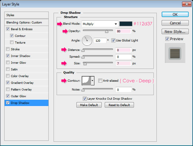 This should add a 3D feel to the stitches.
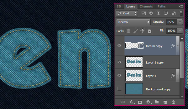
 If you think the stitches are a bit harsh you can decrease their layer’s Opacity to a value around 85%.
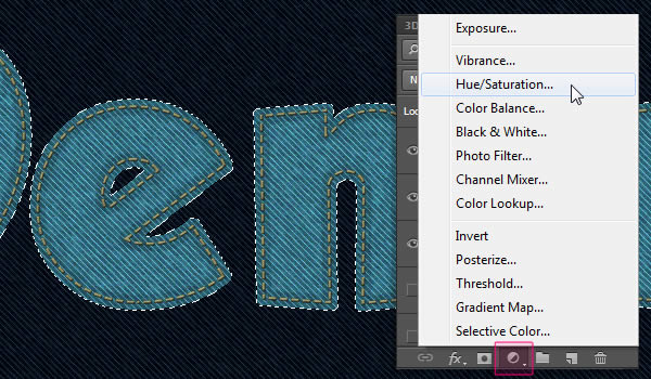
 Click
the ‘Create new fill or adjustment layer’ icon down the Layers panel
and choose Hue/Saturation. The selection will create a mask for the
adjustment layer so that it only affects the texture.
Click
the ‘Create new fill or adjustment layer’ icon down the Layers panel
and choose Hue/Saturation. The selection will create a mask for the
adjustment layer so that it only affects the texture.
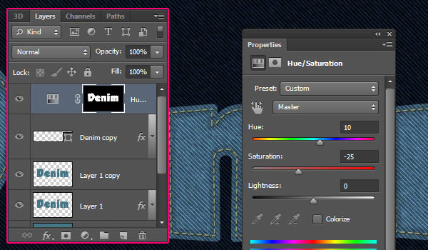
 Change the Hue value to 10, and the Saturation value to -25.
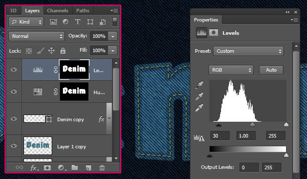
 Create a selection again, then click the ‘Create new fill or adjustment layer’ icon and choose Levels.
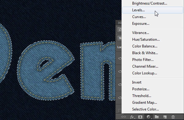 Change the Shadows value to 30 to darken the texture.
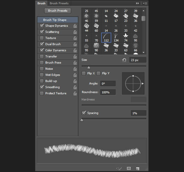
Brush Tip Shape:
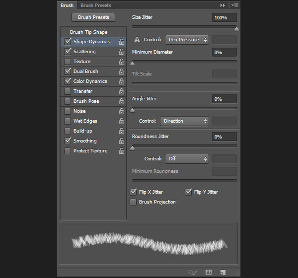
 Shape Dynamics:
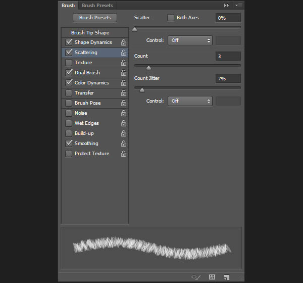
 Scattering:
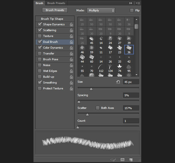
 Dual Brush: Choose the “Chalk 36 pixels” brush.
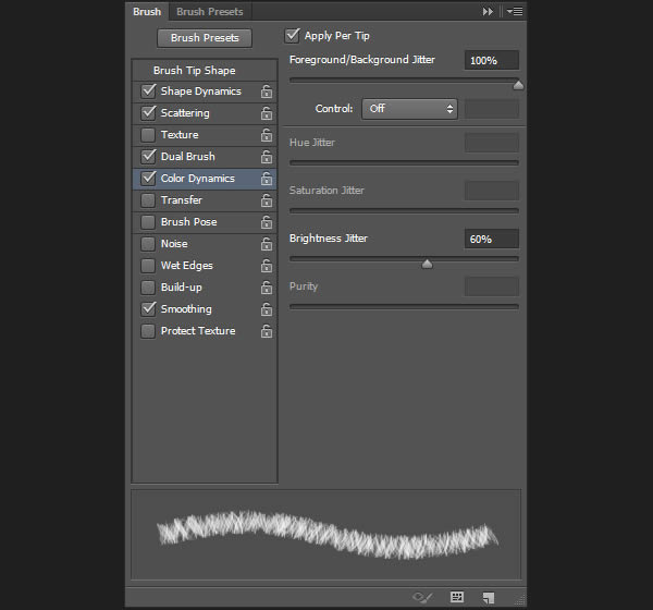
 Color Dynamics:
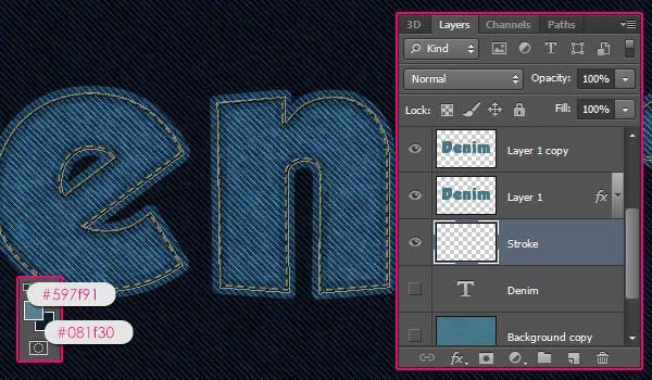
 Set
the Foreground color to #597f91 and the Background color #081f30.
Create a new layer below the two denim texture layers and call it
“Stroke”.
Set
the Foreground color to #597f91 and the Background color #081f30.
Create a new layer below the two denim texture layers and call it
“Stroke”.
 Pick the Direct Selection Tool, then right click the Work Path and choose Stroke Path.
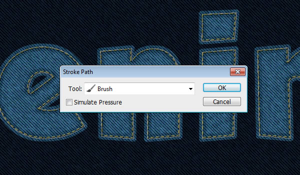
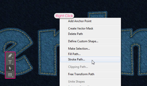 Choose Brush from the Tool drop down menu, and make sure that the Simulate Pressure box is un-checked.
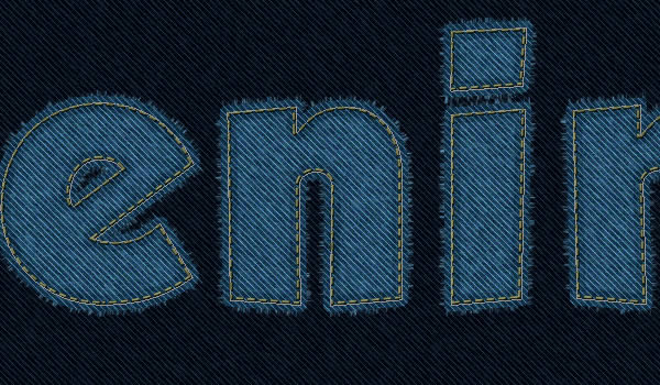
 This
will stroke the path with some frayed edges, but they seem thin and
scattered. To make them more dense, stroke the path two more times.
This
will stroke the path with some frayed edges, but they seem thin and
scattered. To make them more dense, stroke the path two more times.
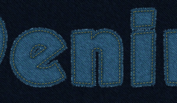
 You should get better and more realistic looking edges now. Hit Enter/Return to get rid of the work path.
 The shadow will add depth to the flat texture.
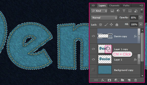
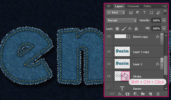
 Ctrl
+ Click a denim texture layer’s thumbnail, then Shift + Ctrl + Click
the “Stroke” layer’s thumbnail to add it to the selection.
Ctrl
+ Click a denim texture layer’s thumbnail, then Shift + Ctrl + Click
the “Stroke” layer’s thumbnail to add it to the selection.
 Use
any of the “Rust ‘n Grunge” pack’s brushes to add some dirt to the
text. It might not be so noticeable, but it will add a nice touch after
the final adjustment layer is added.
Use
any of the “Rust ‘n Grunge” pack’s brushes to add some dirt to the
text. It might not be so noticeable, but it will add a nice touch after
the final adjustment layer is added.
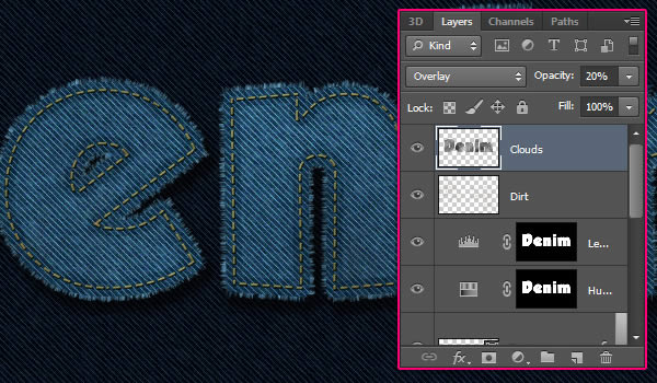
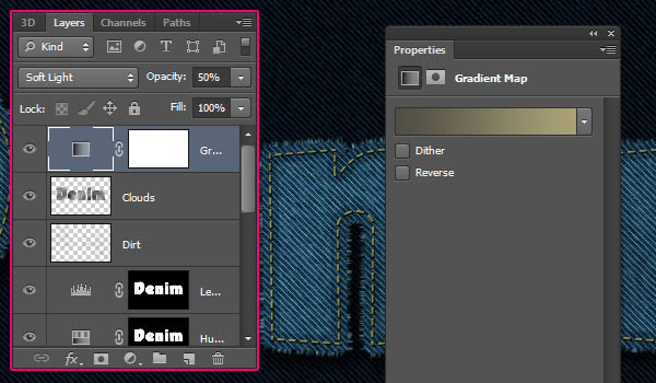
 Change
the “Clouds” layer’s Blend Mode to Overlay, and its Opacity to 20%, or
whatever other value you like. This will add brightness variations to
the texture.
Change
the “Clouds” layer’s Blend Mode to Overlay, and its Opacity to 20%, or
whatever other value you like. This will add brightness variations to
the texture.
 Make
sure that the adjustment layer is on top of all layers then change its
Blend Mode to Soft Light and its Opacity to 50%. This will enhance the
coloring.
Make
sure that the adjustment layer is on top of all layers then change its
Blend Mode to Soft Light and its Opacity to 50%. This will enhance the
coloring.
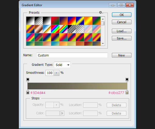
 The gradient is created using the colors #504d44 to the left and #aba277 to the right.
 Bevel
and Emboss: Change the Gloss Contour to Half Round, the Highlight Mode
to Vivid Light and its Opacity to 65%, and check the Anti-aliased box.
Bevel
and Emboss: Change the Gloss Contour to Half Round, the Highlight Mode
to Vivid Light and its Opacity to 65%, and check the Anti-aliased box.
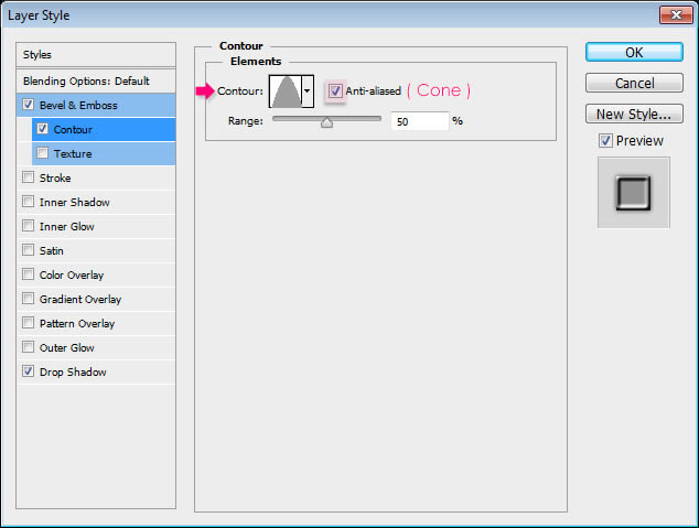
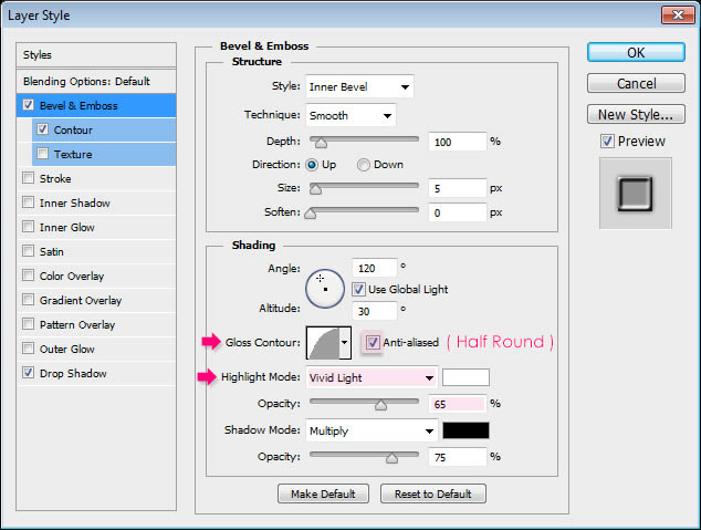 Contour: Choose the Cone contour, and check the Anti-aliased box.
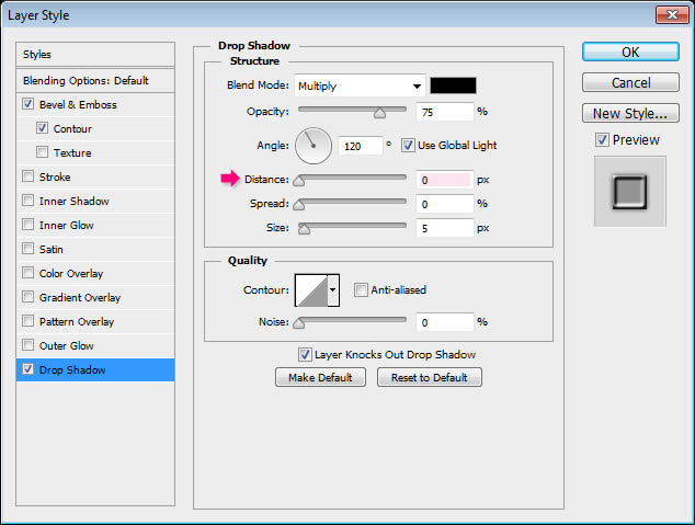
 Drop Shadow: Just change the Distance to 0.
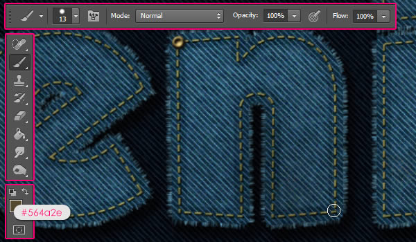
 Set the Foreground color to #564a2e, choose a hard round 13 px brush, and start adding rivets on the corners of the letters.

Tutorial Assets
The following assets were used during the production of this tutorial.- Grobold font.
- gradient-shapes for Photoshop by ilnanny.
- Rust ‘n Grunge by Ryan2006.
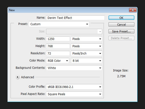
Step 1
Create a new 1250 x 768 px document.Step 2
Duplicate the Background layer then make the copy layer invisible by clicking the eye icon next to it.Step 3
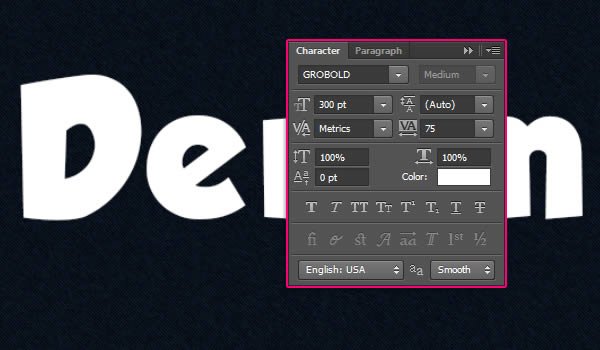
Create the text in white using the font Grobold. In the Character panel (Window > Character), change the Size to 300pt and the Tracking value to 75 to avoid overlapping.Step 4
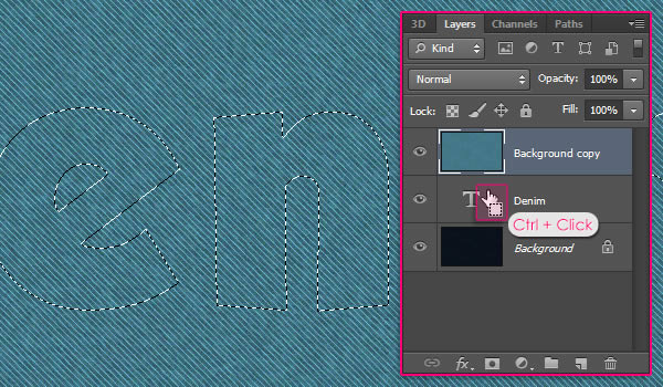
Make the “Background copy” layer visible again by clicking the empty box next to it, and drag it on top of the text layer. Then, Ctrl/Cmd + Click the text layer’s thumbnail to create a selection.Step 5
Duplicate the text layer, then make the original one invisible. Move the copy on top of all layers.Step 6
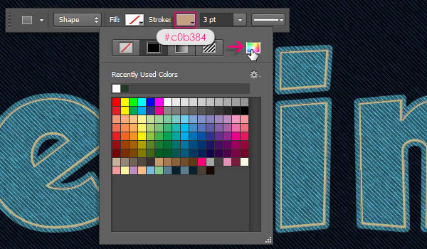
Now we need to add the stroke to the shape. So click the Stroke icon, and choose “Solid Color”. Then, click the Color Picker icon, and get the color #c0b384.Step 7
Double click the stitches (text shape) layer to apply the following Layer Style:Bevel and Emboss: Since the stitches are so small, change the Size to 0, the effect will still add a subtle dimension to the stitches even with the 0 value. Also, change the Highlight Mode color to #bea85a.
Step 8
Ctrl/Cmd + Click a denim texture layer’s thumbnail to create a selection.Step 9
Open the Brush panel (Window > Brush) and choose the “Dune Grass” brush then modify its settings as shown below:Brush Tip Shape:
Step 10
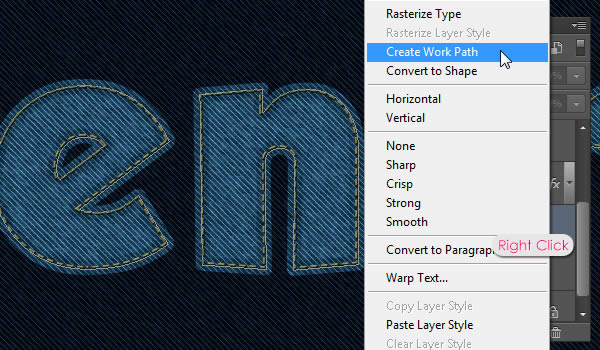
Right click the original text layer and choose Create Work Path.Step 11
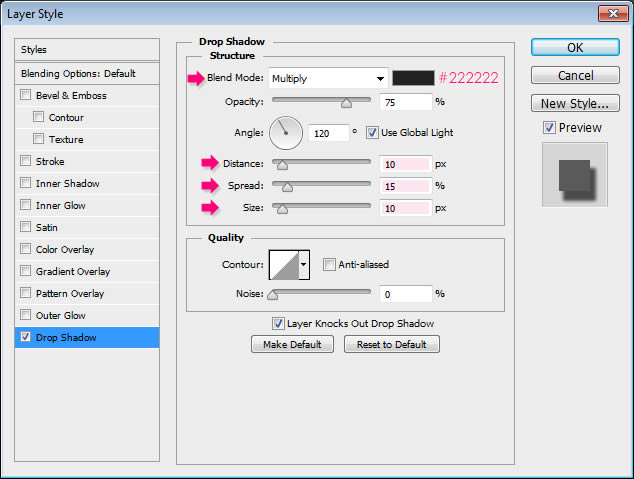
Double click the “Stroke” layer to apply a simple Drop Shadow, by changing the color to #222222, the Distance to 10, the Spread to 15, and the Size to 10.Step 12
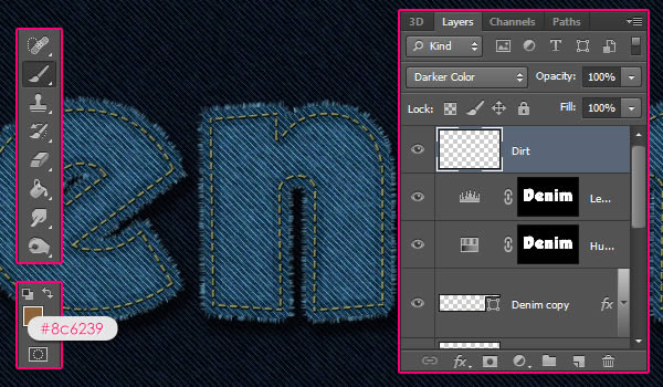
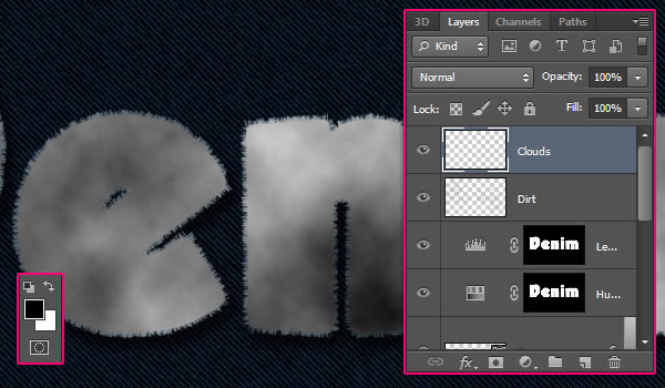
Create a new layer on top of all layers and call it “Dirt”, then change its Blend Mode to Darker Color. Set the Foreground color to #8c6239.Step 13
With the selection still active, create a new layer on top of all layers and call it “Clouds”. Set the Foreground and Background colors back to Black and White, then go to Filter > Render > Clouds. Go to Select > Deselect (or press Ctrl/Cmd + D) to get rid of the selection.Step 14
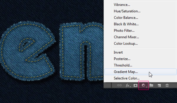
Click the ‘Create new fill or adjustment layer’ icon and choose Gradient Map.Step 15
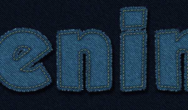
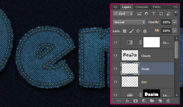
Create a new layer between the “Clouds” and “Dirt” layers and call it “Rivets”. Double click the new layer to apply the following Layer Style to it:Final Image

Subscribe to:
Posts (Atom)