If realism made you speechless, wait until you encounter hyperrealism. It is a genre of painting and sculpting involving an intricate resemblance of a high resolution photograph. The themes and subjects of most hyperrealistic paintings are portraits, still lifes, landscapes and narrative scenes. The term hyperrealism is primarily coined with an independent art movement and art style that has developed since the early 2000s in the US and Europe.
One amazingly talented hyperrealist is Madrid based painter Pedro Campos. Most of his subjects like Coke cans, glass bottles and jars, and fruits wrapped in plastic sheets are painted with exact pictorial details. Huffington Post describes his work as having “an aura of glossy, and sanctified perfection about them”. 
Pedro Campos working an a piece. | Source
Like any other artist, Campos grew his talent at a young age by working on different creative projects like decorating restaurants and as an illustrator in different creative agencies. He studied art restoration in Madrid and began focusing on oil painting at the age of 30. All of his works are truly etraordinary, lets take a closer look at some of them below and be blown away by the precision of each piece. 
oil on canvas 195 x 97 cm (c) Pedro Campos

oil on canvas 100 x 100 cm (c) Pedro Campos

oil on canvas 150 x 150 cm (c) Pedro Campos

oil on canvas 162 x 114 cm (c) Pedro Campos

oil on canvas 100 x 100 cm (c) Pedro Campos

oil on canvas 150 x 150 cm (c) Pedro Campos

oil on canvas 162 x 97 cm (c) Pedro Campos

oil on canvas 130 x 130 cm (c) Pedro Campos
|

Wednesday, February 20, 2013
Hyperrealistic Paintings by Pedro Campos
Tuesday, February 19, 2013
Minimalist Monday – Minimalist Posters of Bands and Music Icons
Hey creatives! It’s Minimalist Monday once again! Today we will showcase a nice collection of minimalist posters featuring some of the most iconic bands and singers in music history.

We’ve seen a lot of minimalist posters around, from movie posters and print ads to pictograms and typography. But the set of music posters of Bizhan Khodabandeh has a different feel and executed in a unique style. Bizhan, an illustrator and graphic designer from United States has created this collection as a present for his wife’s 30th birthday. The theme was Karaoke, so the featured musicians in the posters are mostly his wife’s favorites. Check out some of them below:


Find us on Facebook, Twitter, Google Plus and Pinterest for more design awesomeness! Also, don't forget to subscribe to our blog for the latest design inspirations, stories and freebies. Speaking of freebies, check out our free print templates page where you can download templates for calendars, brochures, business cards and more! Stay awesome everyone!
Read more posts by Kerby Rosanes
Monday, February 18, 2013
Shooting Portraits of Strangers
Street photography is one of the most common variations in the world of photography. You will most probably see street photographs in various projects in the portfolio of a usual photographer either a professional or just a hobbyist. Likewise, taking human portraits is also one of the most common subjects in photography. However, one amazing photographer based in Singapore have come up with the idea of using his love of street photography in capturing portraits of strangers on their most natural state.
 Danny Santos II, a graphic designer and a freelance photographer started taking pictures of strangers few years ago in the streets of Singapore every weekend. His series called “Portraits of Strangers” wherein he took more than a hundred photographs of strangers had gone viral because of it’s unique concept. Aside from having fun in the process, Danny’s goal is to convey the overall image of the beauty and natural energy of Orchard Road through the different characters found in this busy street of Singapore. “The one thing I wanted to capture with every portrait was that 'unguarded' natural look… that look that moved me in the first place when I spotted them in the street… the look that can give even just a little bit of honest yet mysterious sneak peek to who they are without actually knowing them.” - Danny Santos II 
Photographer Danny Santos II | Photo taken by photography hobbyist Paulo Legaspi | Source
Each of the portraits are truly mesmerizing. Each has a unique look that somehow tells the story behind each character. Here are some of our favorites from the series: 
Stranger #94

Stranger #87

Stranger #65

Stranger #67

Stranger #7

Stranger #3

Stranger #17

Stranger #25

Stranger #47

Stranger #34

Stranger #45

Stranger #57

Stranger #56

Stranger #76

Stranger #72
Check out Danny’s Flickr page for the entire collection of the portraits and his website for more info about his amazing projects. Share us your thoughts and suggestions by leaving a comment below. Find us on Facebook, Twitter, Pinterest and Google Plus. And for more design related stories, you can subscribe to our blog using our RSS Feeds. Lastly, please do check out our print templates page and download our amazing set of blank print templates to aide you in your future projects. Stay awesome everyone! Read more posts by Kerby Rosanes |
Sunday, February 17, 2013
Create a Simple Contact Form
In the following tutorial you will learn how to create a simple contact form in Adobe Illustrator. You’ll start with some basic tips on how to create and tweak a simple pattern. Next, taking full advantage of the Appearance panel, you will learn how to create the main contact form shape, the sleek text fields and the subtle send button. Finally, using the Type Tool, some basic fonts and the Drop Shadow effect, you will add the text.
Tutorial Details
Final ImageAs always, this is the final image that we’ll be creating: Step 1Hit Command + N to create a new document. Select Pixels from the Units drop-down menu, enter 600 in the width box and 670 in the height box then click on the Advanced button. Select RGB, Screen (72ppi) and make sure that the Align New Objects to Pixel Grid box is unchecked before you click OK. Enable the Grid (View > Show Grid) and the Snap to Grid (View > Snap to Grid). For starters you will need a grid every 5px, so simply go to Edit > Preferences > Guides > Grid, enter 5 in the Gridline every box and 1 in the Subdivisions box. You should also open the Info panel (Window > Info) for a live preview with the size and position of your shapes. Do not forget to set the unit of measurement to pixels from Edit > Preferences > Units > General. All these options will significantly increase your work speed.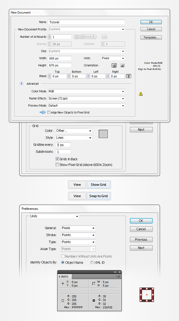 Step 2Pick the Rectangle Tool (M) and focus on your Toolbar. Remove the color from the stroke then select the fill and set its color at R=237 G=237 B=239. Move to your Artboard and simply create a 10px square, the Snap to Grid should ease your work. Make sure that this little shape is selected and go to Effect > Distort & Transform > Transform. Enter the properties shown in the following image, click OK and go to Object > Expand Appearance.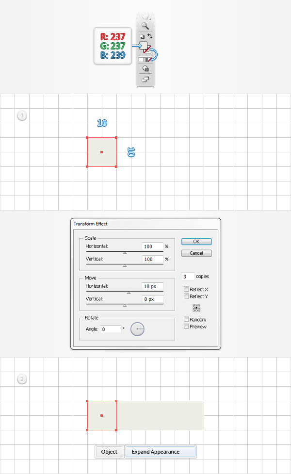 Step 3Focus on the Layers panel (Window > Layers), select the existing group and hit Shift + CTRL + G twice to Ungroup it. In the end you will have four, 10px squares. Select the first one and set the fill color at R=27 G=70 B=112 then select the third one and set the fill color at R=221 G=79 B=91. Reselect all four squares and simply drag these shapes inside the Swatches panel (Window > Swatches) to save them as a pattern. Once you can see that new pattern inside the Swatches panel, you can delete the four squares from your Artboard.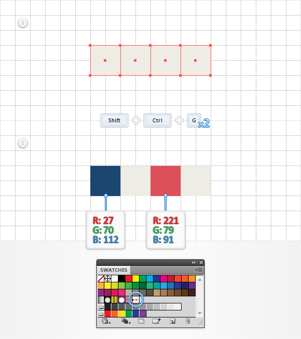 Step 4Using the Rectangle Tool (M), create a 600 x 670px shape and fill it with R=55 G=56 B=57. Next, you need to center this dark rectangle. Select it and open the Align panel (Window > Align). Set the aligning to Artboard (open the fly-out menu and go to Show Options if you can’t see the “Align To” section as shown in the following image) then simply click the Horizontal Align Center and Vertical Align Center buttons. This should center your rectangle.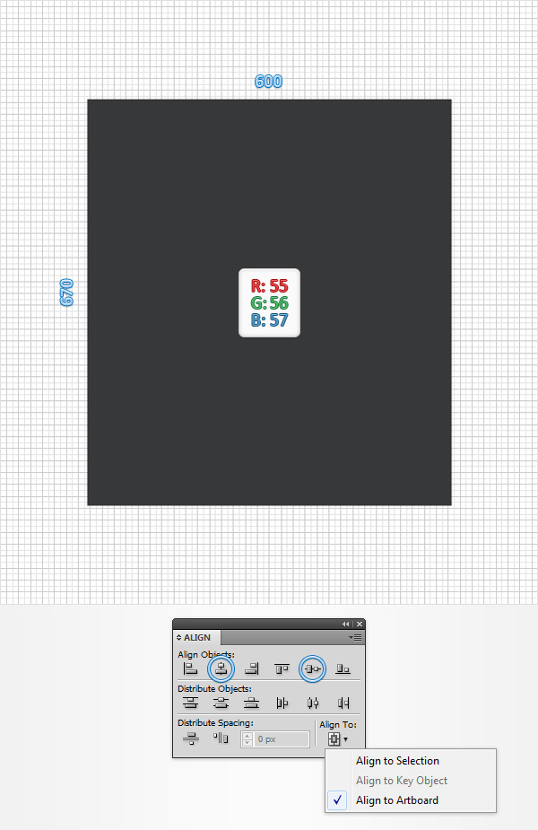 Step 5Make sure that your dark rectangle stays selected, open the Appearance panel (Window > Appearance) and add a second fill using the Add New Fill button (pointed by the little, blue arrow in the following image). Select this new fill, open the Gradient panel (Window > Gradient) and simply click on the gradient thumbnail to add the default black to white linear gradient. Keep focusing on your Gradient panel, open the Type drop down menu and select Radial then move to the gradient colors. Select the right slider and set the color at R=25 G=26 B=27 then select the left slider, set the color at R=55 G=56 B=57 and lower its Opacity to 0%. Make sure that this fill stays selected, grab the Gradient Tool (G), focus on your Artboard and stretch that gradient as shown in the following image. Return to the Appearance panel and add a third fill for your rectangle using that same Add New Fill button. Select it, set the color at black, keep focusing on the Appearance panel and click on the little arrow to see the attributes used for this new fill. Click on that “Opacity” piece of text, change the Blending Mode to Multiply, set the Opacity at 10% and go to Effect > Artistic > Film Grain. Enter the properties shown in the following image and click OK.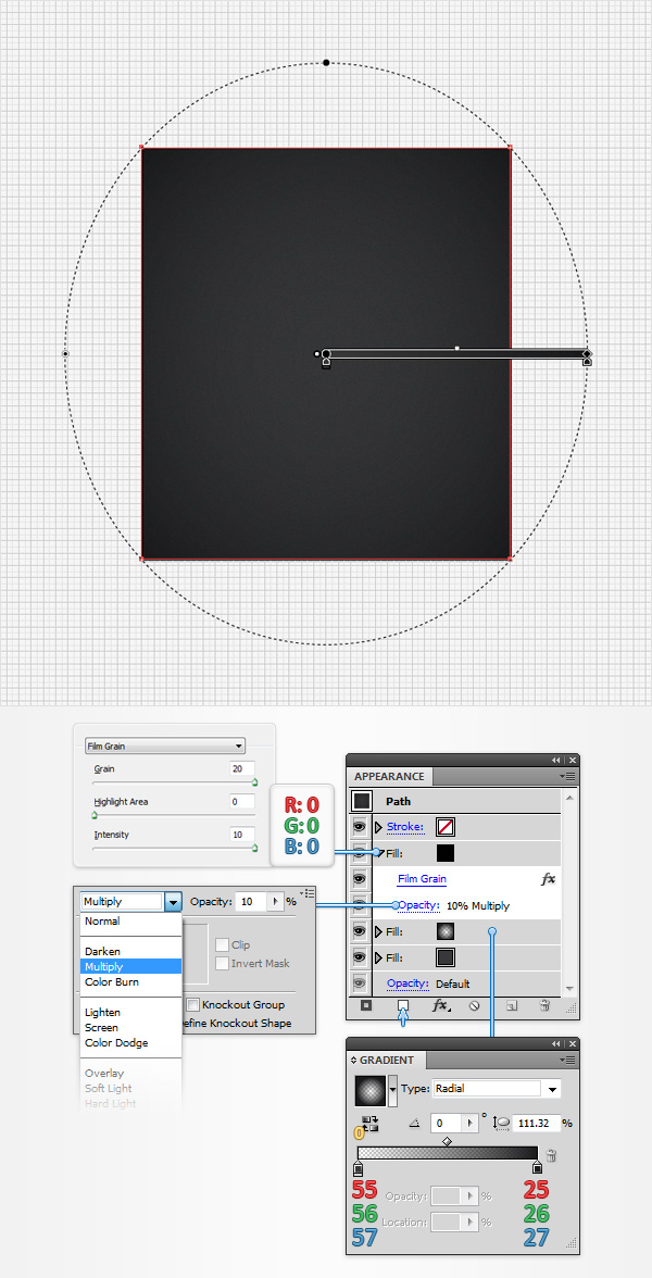 Step 6Using the Rectangle Tool (M), create a 260 x 330px shape, fill it with your saved pattern and center it using the Horizontal Align Center and Vertical Align Center buttons from the Align panel.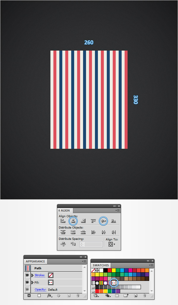 Step 7Make sure that your patterned rectangle is selected, focus on the Appearance panel, select the existing fill and Object > Transform > Rotate. Uncheck the Objects box, make sure that the Patterns box is checked, enter a 45 degrees angle, click OK and go to Effect > Stylize > Drop Shadow. Enter the properties shown in the following image and click OK.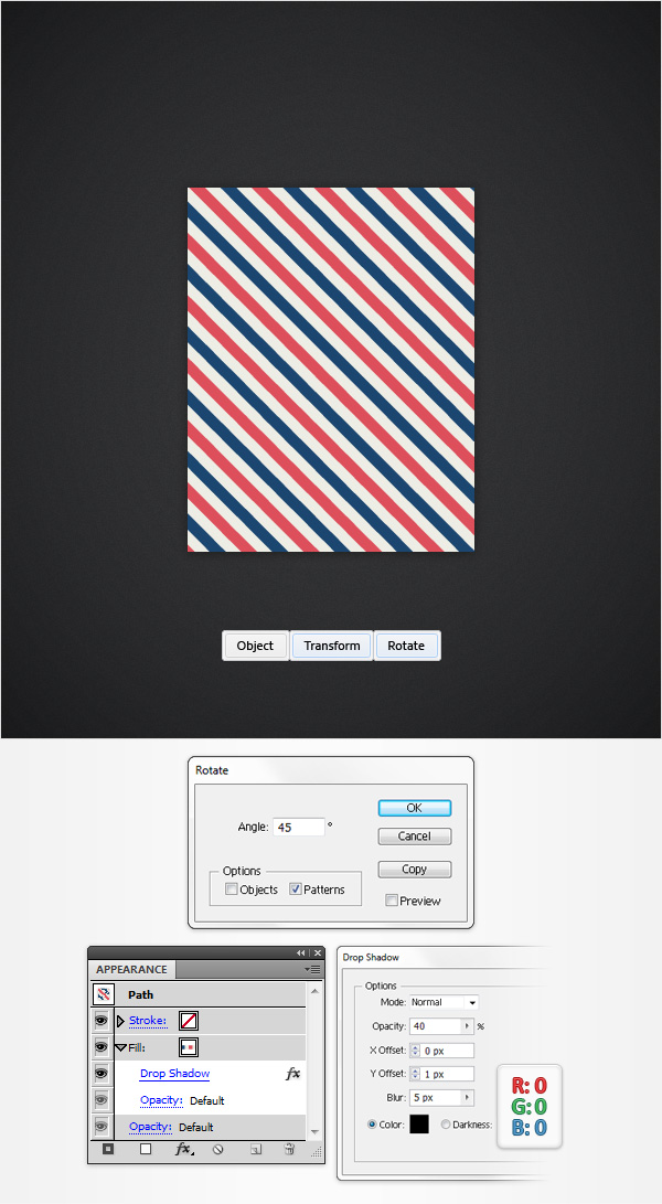 Step 8Make sure that your patterned rectangle is still selected, focus on the Appearance panel, add a second fill and select it. Set the color at R=237 G=237 B=239 and go to Effect > Path > Offset Path. Enter a 10px Offset, click OK and go to Effect > Stylize > Rounded Corners. Enter a 10px radius and click OK.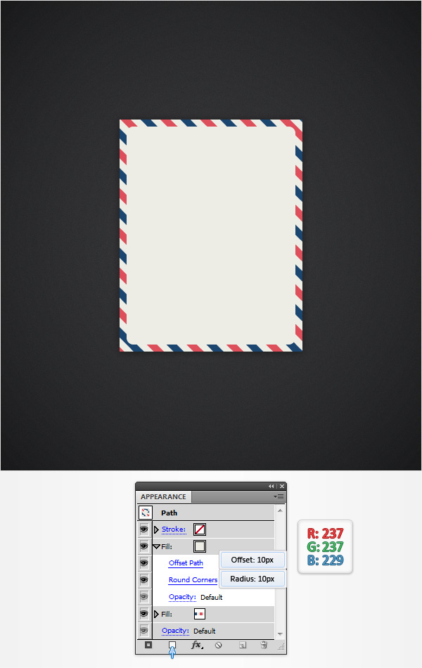 Step 9Make sure that your patterned rectangle stays selected, focus on the Appearance panel, add a black stroke and select it. Set the size at 1pt, align it to outside and lower the Opacity to 20%. Return to the Appearance panel and add a second black stroke for your shape using the Add New Stroke button (pointed by the little, blue arrow in the following image). Select this new stroke, set the size at 1pt, align it to inside, lower the Opacity to 50% and change the Blending Mode to Soft Light. Keep focusing on the Appearance panel and add a third black stroke. Select it, set the size at 2pt, align it to inside, lower the Opacity to 40% and change the Blending Mode to Soft Light. Still inside the Appearance panel, add a fourth black stroke and select it. Set the size at 3pt, align it to inside, lower its Opacity to 30% and change the Blending Mode to Soft Light. Finally, select the entire path (simply click on the “Path” piece of text from the top of the Appearance panel) and go to Effect > Stylize > Rounded Corners. Enter a 10px radius and click OK.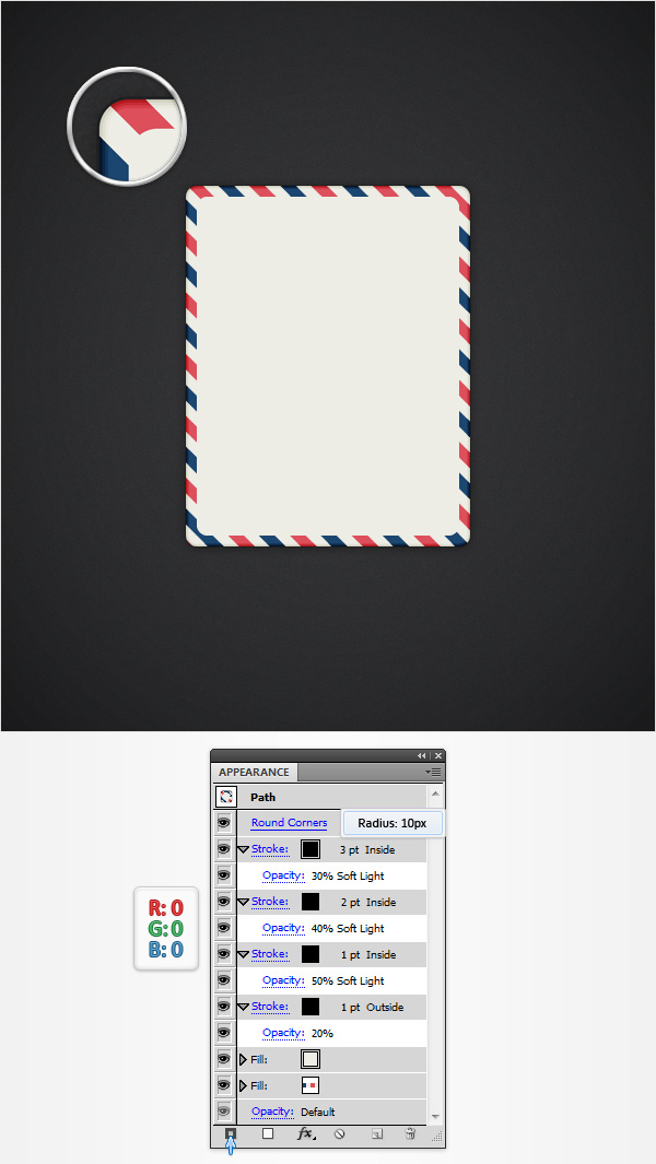 Step 10Using the Rectangle Tool (M), create three, 200 x 25px shapes and a 200 x 75px rectangle. Place these new shapes as shown in the following image and set the fill color at white (for now).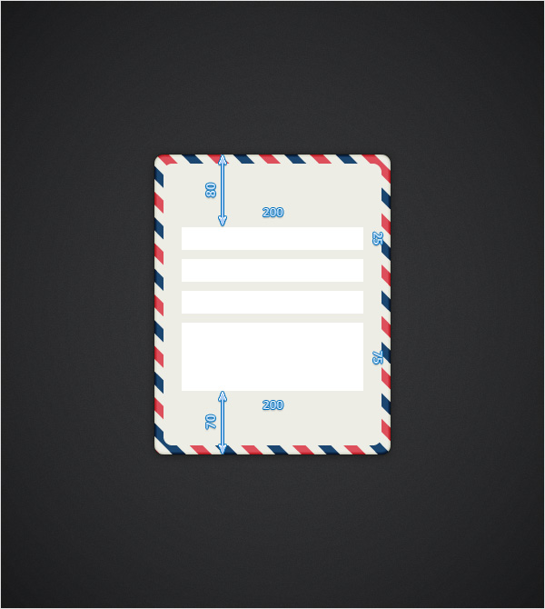 Step 11Select the top, white rectangle and focus on the Appearance panel. Select the existing fill, replace the white with R=227 G=227 B=219 and go to Effect > Stylize > Inner Glow. Enter the properties shown in the following image, click OK and return to the Appearance panel. Add a 1pt stroke, align it to inside and set the color at R=215 G=215 B=207. Keep focusing on the Appearance panel, select the entire path and go to Effect > Stylize > Rounded Corners. Enter a 5px radius, click OK and go to Effect > Stylize > Drop Shadow. Enter the attributes shown in the following image and click OK.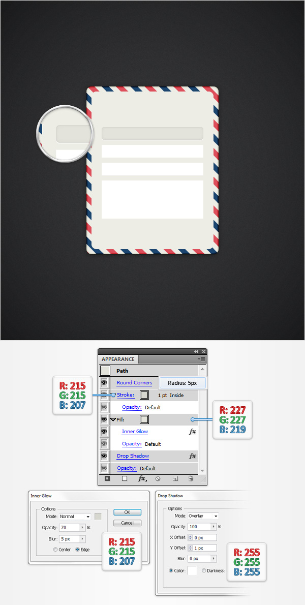 Step 12Next, you need to copy the properties used for the rectangle edited in the previous step and paste them onto the remaining white rectangles. Here is how you can easily do it. Go to the Layers panel, focus on the right side and you’ll notice that every shape comes with a little circle. It’s called a target icon. Hold the Alt key from your keyboard, click on the target icon that stands for the rectangle edited in the previous step and drag onto the target icons that stand for the white rectangles. In the end, things should look like in the following image. These four rounded rectangles will be the text fields.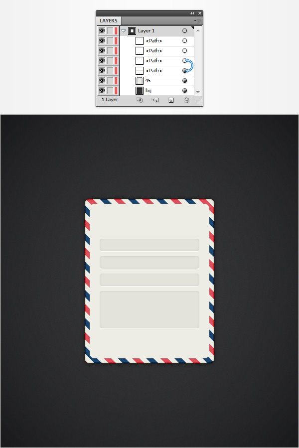 Step 13Select your top text field shape and focus on the Appearance panel. Select the bottom fill and set the color at R=215 G=215 B=207, select the top fill and set the color at R=184 G=184 B=176. Then open the existing Inner Glow effect and enter the attributes shown in the following image. This is how an active text field will look like.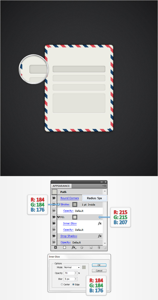 Step 14Using the Rectangle Tool (M), create a 70 x 20px rectangle, set the fill color at R=27 G=70 B=112 and place it as shown in the first image. Make sure that this blue rectangle stays selected and hit Shift + X to transfer the color properties from the fill to the stroke. Move to the Appearance panel, select that blue stroke, align it to inside and go to Effect > Stylize > Drop Shadow. Enter the properties shown in the top, left window (in the following image), click OK and go again to Effect > Stylize > Drop Shadow. Enter the properties shown in the top, right window, click OK and go once again to Effect > Stylize > Drop Shadow. Enter the properties shown in the bottom, left window, click OK and go one more time to Effect > Stylize > Drop Shadow. Enter the properties shown in the bottom, right window and click OK.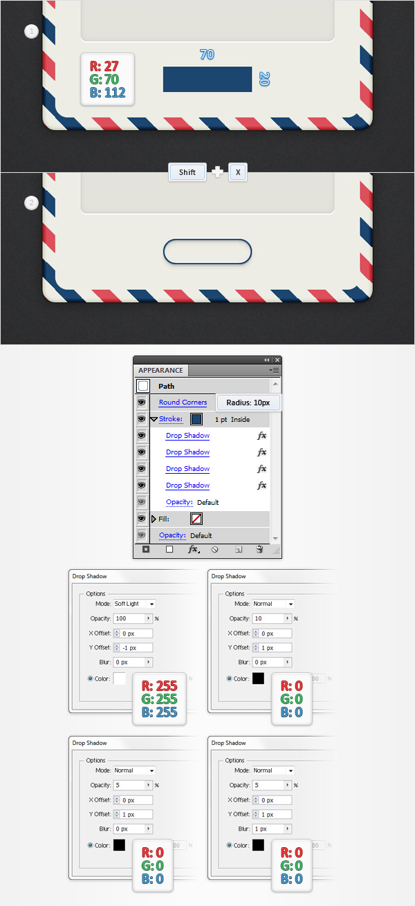 Step 15Using the Type Tool (T), add the “SEND” piece of text, set the color at R=27 G=70 B=112 and place it as shown in the following image. Use the Utsaah font, make it Bold, set size at 10pt and the tracking at 100 as shown in the following image. Then go to Effect > Stylize > Drop Shadow. Enter the properties shown in the following image and click OK.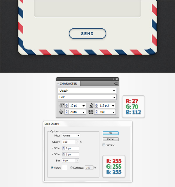 Step 16Make sure that the Type Tool (T) is still active, add the “Contact Us” piece of text, set the color at R=184 G=184 B=176 and place it as shown in the first image. Use the Eras Bold ITC font, set size at 20pt and go to Effect > Stylize > Drop Shadow. Enter the properties shown in the following image and click OK. Finally, add the subtle pieces of text from the text fields. Use the Calibri font, set the size at 9pt and the color at R=185 G=185 B=177.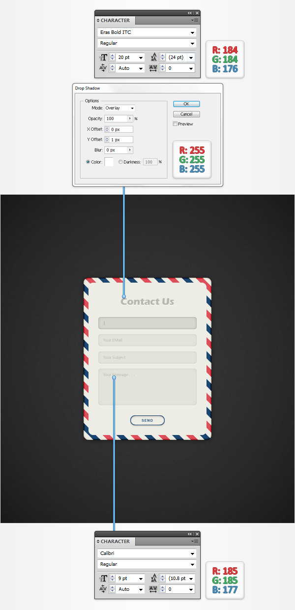 And We’re Done!I hope you’ve enjoyed this tutorial and can apply these techniques in your future projects. Author:Andrei MariusAndrei Marius is a self taught vector artist who is trying to make a living doing something that he likes. He spends most of his time working in Adobe Illustrator, trying to avoid the Pen Tool. You can find most of his vector experiments at this little website dedicate to Illustrator VforVectors. |
Subscribe to:
Posts (Atom)