Choosing a type or font for a design can sometimes be grueling, because there are times where your design and the type you chose falls in exactly the way you want it. But there are times where you have to look for the right type for your design – a typeface that fits properly into your design, thus completing your jigsaw puzzle of a design.
 But as a graphic designer, you're not just dealing with elements of design; you have to deal with external factors such as your deadline, creative block, and, of course, your client. Now, having to choose the right typeface for your design and dealing with what your client wants can be a bit tricky and nasty for you in the long run. So, what do you tell your client that the font you chose is better choice than the one he wants? If you haven't been in this situation yet or you're still figuring out what to say, we've come up with a few things you can use to persuade your client to go with your typeface idea. Legibility Typefaces are meant to be legible along with the design you created. Normally, you, being the designer, have a better grasp of what can easily be read and not on your body of work. But don't tell him that way, educate him of the intricacies of typography – that there are certain typefaces that looks better on certain circumstances.  Professional vs. Unprofessional You can always go on with the professional and unprofessional speech – it's kind of like the good cop-bad cop thing we see on the movies. Except, here you'll be explaining the good elements the typeface you chose bring on the table – It's readable, it complements the shapes and images, it's the best font for your media (print, digital, etc.). You can try to present the typeface you chose and the one your client chose on your design, and point out the differences.  It's not about them, it's about the market Sometimes clients get too attached on a project that you're working on. That's fine; it's theirs in the first place. But sometimes it also gets on your way of developing their projects into full potential. When your client gets too attached or goes overboard on what you have to do on the project, make sure remind him that he's commissioning this project to attract people, to raise awareness, or for the aesthetic pleasure of many. SEE ALSO: Creative Use of Typography in Magazine Covers Explain Your Chosen Typeface's Versatility You can explain to your clients the inherent versatility your chosen typeface. This is suitable for designers who are working on logo projects as typefaces used on logos must be versatile and adaptable when used in different media. You further show the effectiveness of the typeface you chose by creating a presentation where the logo is applied to different media, e.g., business cards, website design, letterheads, magazines, etc. ![CORNELIA and CO [ Brand identity & Packaging ] by Oriol Gil](http://www.youthedesigner.com/wp-content/uploads/2013/02/cor.jpg "CORNELIA and CO [ Brand identity & Packaging ] by Oriol Gil")
CORNELIA and CO [Brand identity & Packaging] by Oriol Gil
 
ORIGAMI by Mohammed Mirza
Final Note Remember that, as a graphic designer, you're not just there to create design for the sake of it. You have to attune yourself of teaching people, including your clients, about the intricacies of graphic design. Because in the end, it'll eventually have an effect on the industry you're working in and your career. |

Thursday, January 31, 2013
How to Tell Your Client That Some Typefaces are Better than Others
Wednesday, January 30, 2013
Fan Art Friday – 20 Illuminating Artworks Featuring Jennifer Lawrence
"It girls" come and go, but there's something about Jennifer Lawrence that separates her from the rest. The current toast of Tinseltown who won the 2013 Academy Award for Best Actress in the film "Silver Linings Playbook," Lawrence combines ever-improving acting chops with a charmingly down-to-earth attitude.

She came into prominence for her head-turning role in "Winter's Bone," a 2010 indie film that scored her first Academy nomination for Best Supporting Actress. However, her star rose to ridiculously new heights when she played Katniss Everdeen in the book-to-film adaptation of "The Hunger Games."
, as Tiffany Maxwell in \"Silver Linings Playbook\" (center) and during the 85th Academy Awards (right).")
Actress Jennifer Lawrence as Katniss Everdeen in “The Hunger Games” (left), as Tiffany Maxwell in “Silver Linings Playbook” (center) and during the 85th Academy Awards (right).
While her performances on film have received universally praised, her awkward and self-deprecating personality has gained equal buzz. She owned the night at the Oscars, from tripping down the stairs on her way to receive the Best Actress award to flipping the bird on her post-Oscars interview. How can you not like this girl?
In tribute to her young, stellar career, we've compiled 20 of the best artworks made by the most talented people on the Internet that show the luminous beauty of this sex symbol.

Jennifer Lawrence as Katniss by MShah123 | Source

Jennifer Lawrence #GoldenGlobes2013 by dankershaw | Source

Katniss by themockingmirror | Source

THE GAMES by Katie Sanvick | Source

Jennifer Lawrence 2 by thewholehorizon | Source

Jennifer Lawrence – Heroes of Alexandria Series by Nina Zivkovic | Source

Jennifer Lawrence portrait by MShah123 | Source

Jennifer Lawrence Digital Painting by Maartje van Hoorn | Source

Jennifer Lawrence by firmacomdesign | Source

Katniss Everdeen: the Mockingjay by Aida-Art | Source

Katniss by alicexz | Source

Katniss by Geofffffff | Source

The Girl on Fire by hanain3 | Source

Jennifer Lawrence by FromPencil2Paper | Source

Jennifer Lawrence by zgirl3210 | Source

Katniss Everdeen by ThreshTheSky | Source

Katniss by WeaponXIX | Source

Jennifer Lawrence by Sidonnia | Source

Katniss by Serena-Kenobi | Source

Katniss Everdeen by Patsie | Source
What' are the best images of Jennifer Lawrence featured above? Let us know by commenting below or posting about it on our Facebook, Twitter, Google Plus and Pinterest. Also, don't forget to subscribe to our blog for the latest design inspirations, stories and freebies. Speaking of freebies, check out our free print templates page where you can download templates for calendars, brochures, business cards and more! Stay awesome everyone!
Read more posts by Cadence Wu
Tuesday, January 29, 2013
Creative Advertising Ideas of the Week
Advertising is one of the many reasons why graphic design is so prevalent today and of course in the coming future. Advertisements generally should be creative, catchy, witty and above all entertaining while its trying to persuade the viewer to try out or to stick with a certain brand. There are tons of advertisements flooding us from a day to day basis but there are only a few of these amazing creative advertising ideas that hits the right spot of entertaining and persuading its audience.
 Since of the majority of the most creative pieces and minds are in the field of advertising we here at You the Designer have decided to bring you guys awesome creative advertisements every week to quench your thirst for inspiration. 1. Fanta: The Tastable Print Ad Fanta is one of the biggest brands that is created by Coca-Cola teamed up with OgilvyOne Middle East to launch a tastable print ad, while not the first at the very least Fanta’s ad tastes pleasant unlike the Edible Ad from Volkswagen. We are eager to have our taste buds try this 
(Source)
2. Amnesty International: Censored Tweets While many of us complain about the rise of mundane posts in Facebook and Twitter there are countries who block and silence people who are trying to share and express themselves online. This simple and interactive ad from Amnesty International with DM9Rio created a campaign wherein users are able to tweet black bars of censorship in their Twitter timeline.   3. Microsoft Outlook: Get Going Windows 8 surely looks amazing but if you haven’t seen the new and improved Outlook then prepare to be amazed! The ad is telling its viewers to get going and do amazing things. The TV spot showcases some of the most stunning features the Outlook.com can do unlike other email services. If Macklemore’s Can’t Hold Us doesn’t get you guys pumped then the hovercraft probably will. 4. Emirates: Share a Smile Everyone has a nightmare story travelling by flight but if there is one airline that many would vouch for its great service its Emirates. Just a few days ago Emirates lunched the campaign Share a Smile wherein their cabin crew members shares to their viewers different light-hearted sayings from around the world in its native language followed by a short explanation. These 14 simple, quirky and funny videos are sure to make people smile and lighten up their day. 5. Big Boss Brewing Company: The Last Barfighter You might never look at beer dispensers the same way again. Big Boss Brewing Company commissioned the McKinney ad agency to create this one of a kind beer dispenser experience. Gamers and beer fans a like are pitted against each other in a classic ala-Street Fighter arcade game entitled: “The Last Barfighter” wherein the winner of the three rounds doesn’t just get the bragging rights but also a cup full of Big Boss Beer. Now that is what we call amazing!  6. UTEC: Water-Generating Billboard Universidad Tecnologica del Centro or UTEC along with Mayo Publicidad DraftFCB showcased its amazing engineering prowess to attract applicants for the upcoming school-year by making a Water-Generating Billboard. Apart from the genius way of creating a billboard, UTEC has also done a exceptional job of inspiring future students by showing that with engineering they will be able to change the lives of many people and make it better. |
Monday, January 28, 2013
Infographic: Mobile Friendly Emails
Most often designers are unable to battle with the rising need of impeccable mobile email design. The significance of mobile email is growing rapidly with the changing times. The key considerations for marketer is to provide the same experience to all the viewers irrespective of the screen sizes of the mobiles and it should not result into sad design views. Marketers are battling out to create and launch successful responsive mobile friendly email communications keeping in mind every small factor this 2013! It would be a treat to watch if 75% of companies who do not optimize emails for mobile start doing it.
As more people tend to respond and read emails over mobile devices, there is a high time marketers should create responsive mobile emails to increase the opens, clickthroughs and responses. The one size fits all approach isn't prevalent any more in the industry. I chanced upon yet another infographic from Email Monks that bring to you the vital mobile email stats, you might have long craved for. Infographic gathers unique stats from many sources and covers the recent vogue of mobile. Some of the staggering stats include: - 43% of Emails are read over the phones and this is expected to rise to more than 50% by the end of 2013! - 73% of the people from USA check their emails on smartphones. - 43% of mobile email users check their emails four or more times per day, compared to only 29% of those who do not use mobile email. - Mobile or Smart-phone usage is more prevalent in the morning and evening hours. |
It was amazing to know that iPhone leads the market share amongst all major email clients. Infographic provides us a brief on the market share of various email clients Calculated from 205 million opens tracked by Litmus Email Analytics in April 2013.
Many of the companies have yet not recognized the importance of responsive mobile email because they don't know what exactly is the talk of the town?
This infographic from Email Monks also defines responsive mobile email in easy yet effective way. According to the infographic, Responsive email design uses CSS3 media queries to display different layouts of an email depending on the size of the viewing screen. You can display or hide elements for a true mobile experience.

 |
About the Author
I am Mathews Johnson and I work as a creative consultant with Email Monks. Email Monks is a superfast yet cost effective mobile friendly email design and coding services provider. Email Monks also converts design to Email HTML in as less as 8 hours.Read more posts by Cadence Wu
Sunday, January 27, 2013
Portfolio Night and the New Look for Flickr
The New Look for Flickr
Photographers and photo enthusiasts rejoice! As Yahoo! finally unveiled the new “awesome” look for Flickr, the once struggling photo sharing website now also offers 1 terabyte of free storage and provides a brand new experience for both of their desktop and android users. With a bigger storage, each user can upload as much as 500, 000 photos in full resolution.

“Flickr was once awesome, and it languished… now we want it to be awesome again,” Yahoo! CEO Marissa Meyer said in a press event at New York City today.

 Earlier today, Yahoo! has also announced its acquisition of social blogging platform Tumblr for $1.1 billion, all of it in cash.
Hosted in more than 20 cities around the world on May 22, the Portfolio Night events are designed to connect aspiring young creatives with renowned advertising creative directors in the hopes of receiving feedback on their work and ultimately, secure career opportunities.

Sponsored by iStockphoto and PANTONE, Portfolio Night brings together thousands of young creatives, hundreds of creative directors, dozens of host agencies in cities around the world, and a select few global partners, all in a "one night only" event across the planet. Now on it’s eleventh year, Portfolio Night has grown to a global event, reaching creative hubs in every continent in an evening where the best of the present meets the best of the years to come.

Check out their official website to know what’s the nearest Portfolio Night event you can take part of.
Who among you guys are going to the nearest Portfolio Night event? What do you think of Flickr’s major makeover? Share us your thoughts by leaving your message in the comment box below. Find You The Designer on Facebook, Twitter,Pinterest and Google Plus for more updates.
“Flickr was once awesome, and it languished… now we want it to be awesome again,” Yahoo! CEO Marissa Meyer said in a press event at New York City today.
Portfolio Night
Hosted in more than 20 cities around the world on May 22, the Portfolio Night events are designed to connect aspiring young creatives with renowned advertising creative directors in the hopes of receiving feedback on their work and ultimately, secure career opportunities.
Sponsored by iStockphoto and PANTONE, Portfolio Night brings together thousands of young creatives, hundreds of creative directors, dozens of host agencies in cities around the world, and a select few global partners, all in a "one night only" event across the planet. Now on it’s eleventh year, Portfolio Night has grown to a global event, reaching creative hubs in every continent in an evening where the best of the present meets the best of the years to come.
Check out their official website to know what’s the nearest Portfolio Night event you can take part of.
Who among you guys are going to the nearest Portfolio Night event? What do you think of Flickr’s major makeover? Share us your thoughts by leaving your message in the comment box below. Find You The Designer on Facebook, Twitter,Pinterest and Google Plus for more updates.
Saturday, January 26, 2013
The Fundamentals of Shape Design in Adobe Illustrator (Lesson 2)
This tutorial is the second in a series of two lessons on how to use basic shapes to create objects. From hearts to perfect spirals, the fundamentals of shape design outlined in this tutorial are used in everyday design but don’t have obvious methods of creation. If you like productivity, tips, and tricks, this tutorial is a must-read! Did you catch the beginning of the series? Take a look at Lesson 1 first.
Tutorial Details
Here are the variety of shapes we’ll create.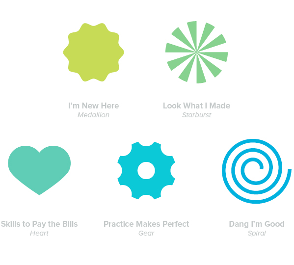 I’m New Here—Medallion Step 1 Very simply, start by using the Ellipse Tool (L.) Hold down Shift while you draw to make a perfect circle. 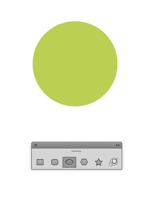 Step 2 Adding the ridges couldn’t be easier. Go to Effect > Distort & Transform > Zig Zag. Change the Size of the ridges and Ridges Per Segment to suit your needs. Click OK. 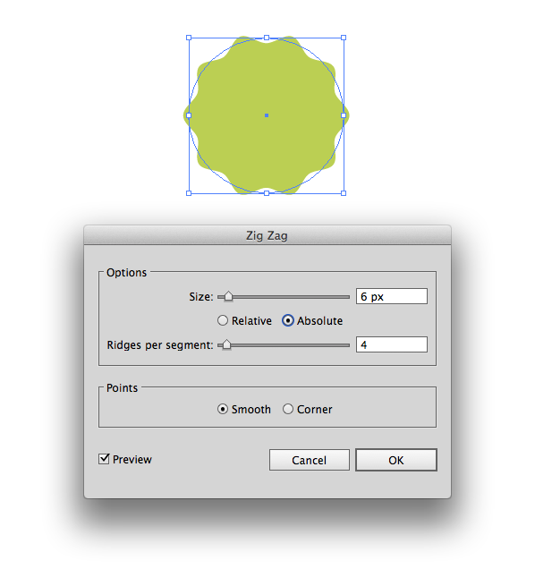 Step 3 Done. If you later decide that you want to alter the number of ridges, just open the Appearance Palette and click the effect. Easy right? Lets move on! 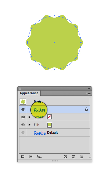 Look What I Made—Starburst Step 1 Using the Ellipse tool (L) draw a circle.  Step 2 Go to the Stroke Palette, click inside the Weight field then press and hold the up arrow to increase the size of your stroke. Increase the stroke until you can no longer see a gap in the middle. 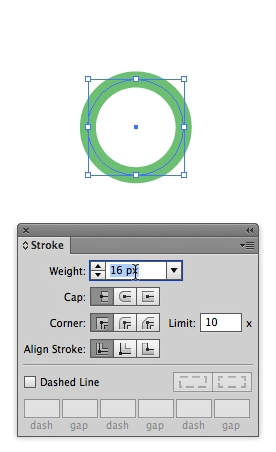 Step 3 If it’s not already visible, double click the word “Stroke” to reveal the other options inside this palette. Check Dashed Line and begin entering different values into the fields in order to create the look you need. If you want your design to be very simple, only enter a value into the first field. That’s all there is to it! 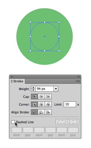 Skills to Pay the Bills—HeartDrawing a free-form heart can be challenging. It’s crazy that Adobe doesn’t hasn’t built a tool for this. Ingenuity to the rescue! The technique I’ve outlined below makes simple work of this common task. Take a look. Step 1 Start by drawing a perfect circle. (Have you noticed a theme yet? A variety of complex shapes can be built using simple shapes.) 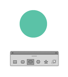 Step 2 Change the bottom point on the circle to an angle. To do this, grab the Convert Anchor Point Tool (Shift+C), then click once on the point. Using the Direct Selection Tool (A) drag the point downwards. 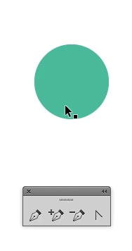 Step 3 Using the Rotate Tool (R) rotate the shape slightly to the left. With a little bit of foresight, you can imagine what the heart will look like when the other half of it has been drawn. Some hearts can be tall, while others are wide. With this in mind, try to rotate the shape into a position that will create the overall heart shape you’re looking for. Generally, the right edge of the shape will be almost vertical. 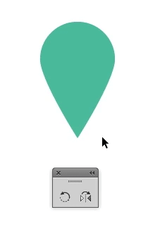 Step 4 Using the Reflect Tool (O) make a copy of the shape. Now, move it to the right but leave a slight overlap where the bottom two points are. I’ve intentionally overlapped them as trying to line up two points exactly on top of one another produces less than desirable results. We’ll take care of the overlap in the next step. 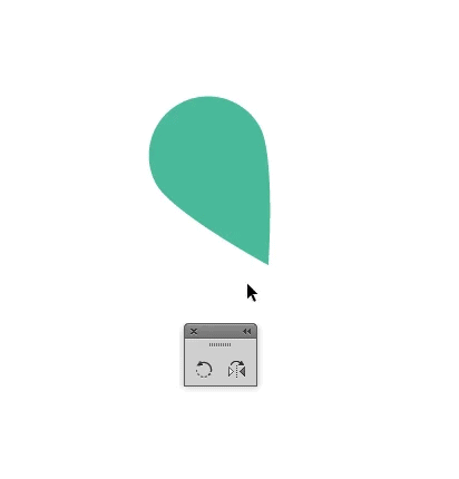 Step 5 Select both shapes. Now, using the Shape Builder Tool (Shift+M) delete the bottom two triangles. 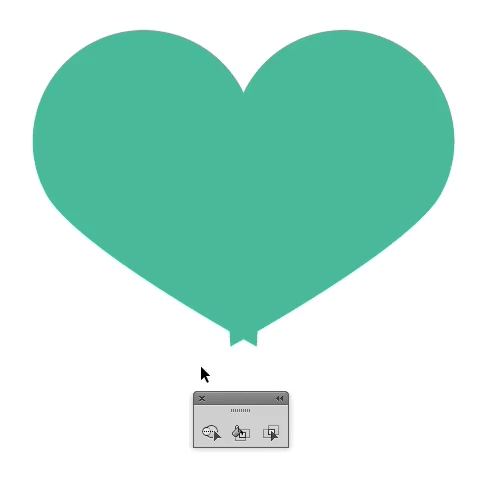
When using the Shape Builder Tool, hold down the Option key to delete.
Practice Makes Perfect—Gear Step 1 Start by drawing two perfect circles. Make sure they’re vertically aligned. Group the two circles before you continue. 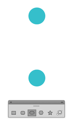 Step 2 Select your newly grouped circles then Copy (Control+C) and Paste in Place (Control+F) the circles on top of each other. Now, you can select the newly pasted grouped circles then rotate them into position. Hold down the Shift key to snap to common angles. Group all of the circles together before proceeding.  Step 3 Draw another perfect circle to create the center of the gear. Give the smaller circles a white fill and bring them to the front of the design (Object > Arrange > Bring to Front.) Next, select everything then vertically and horizontally align the shapes. Continue to fine tune exactly how much of the white circles overlap the center area by scaling them up or down. 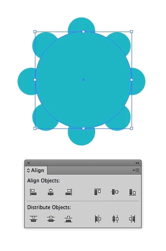 Step 4 To create the center-most area, copy the large center circle then Paste In Place. Scale it down, bring it to the front of the design, and change its fill to white. That’s all there is to it!  Dang I’m Good—SpiralThe spiral shown on the left is what we’ll create. Notice, the right spiral has a distinctly different look. That one was created with Adobe Illustrator’s built-in spiral tool. While that may be what you need in some cases, if you want to create a truly perfect spiral follow the technique below! Step 1 To begin, use the Pen Tool (P) and draw a line. 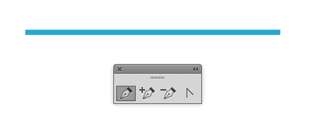 Step 2 Turn on your grid (Command+apostrophe.) Align your stroke so that first point starts at one of the thick grid lines, and the second is aligned to the next thick grid line. 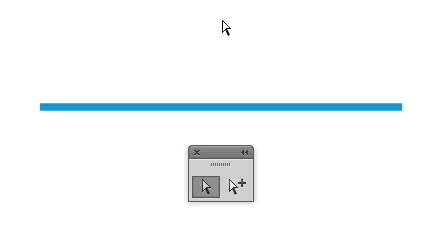 Step 3 Duplicate the shape, making sure that all the lines are spaced equal distances from one another. The top of one line should be where the bottom of the next line starts. 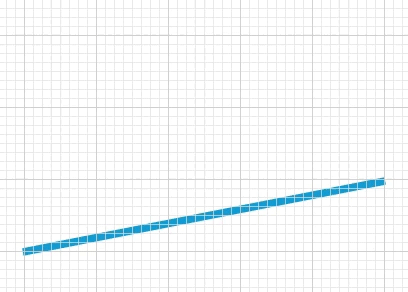
Altering the spacing in between the lines determines how tight the spiral will be.
Step 4 Drag all 3 lines, at the same time, into the Brushes Palette (Window > Brushes.) 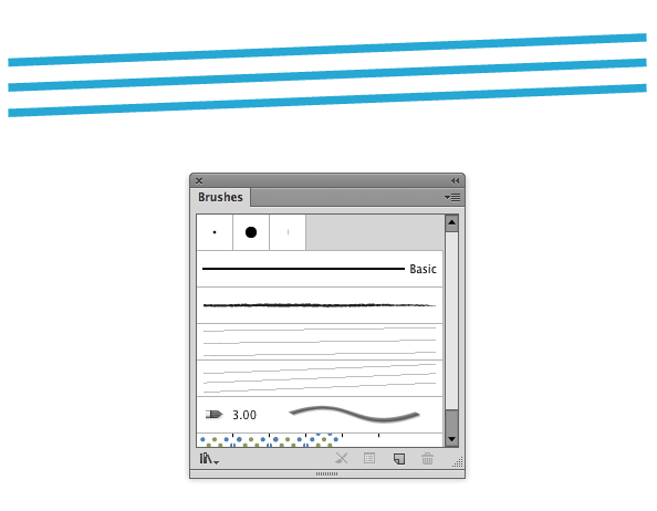 Step 5 Select Art Brush and click OK. 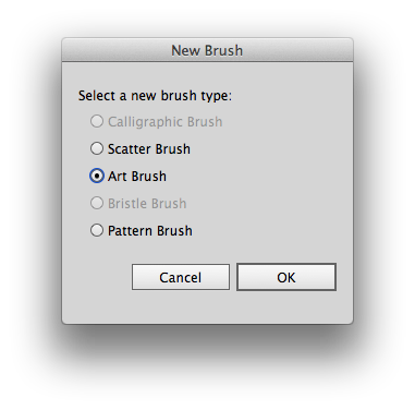 Step 6 You won’t need to change any options here, just click OK. 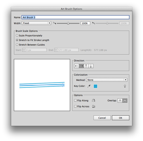 Step 7 To test out your spiral, draw a perfect circle then click on the brush you just created. You now have a perfect spiral! 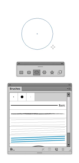 That’s all! I hope you picked up some new tips. Jonathan Patterson’s Social Profiles |
Subscribe to:
Posts (Atom)