In this tutorial I will show you how to create a grimy text treatment utilizing Illustrator’s Blog brush, Live Paint, and a pen tablet. You can easily apply these techniques to other illustrates, type treatments and logos.
Final ImageBelow is the final type treatment we be working towards.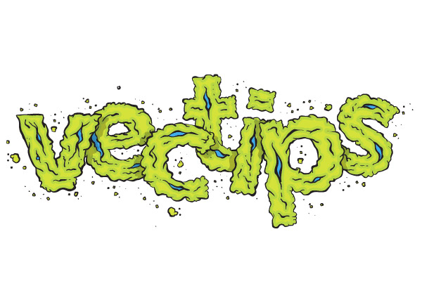 Tutorial Details
Step 1Create a new document and type out some text with the Text tool (T). Change the fill of the text to a light gray.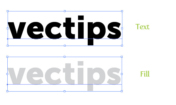 Step 2In the Layers panel, rename your layer to “Template” by double-clicking on the layer and changing the name in the Layer Options dialog. Next, lock the layer. Create a new layer by pressing the Create New Layer button from the Layers panel and rename this layer to “Artwork”.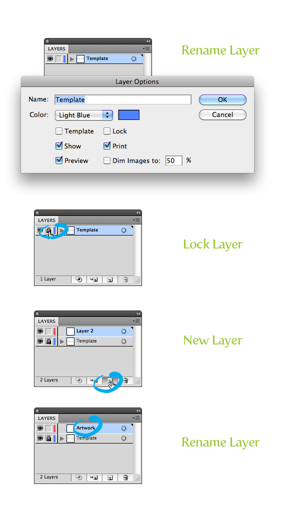 Step 3For drawing the outlines and contours of the treatment, we are going to use the Blob Brush(Shift + B) and a pen tablet. First, you need to set up the Blob Brush (Shift + B) to use the pressure sensitivity of the tablet. To do this, double-click on the Blob Brush (Shift + B) in the Tools Panel. In the Blob Brush Tool Options, you really only have to change: the Fidelity to 1, Smoothness to 0, Size to 2, select Pressure from the size drop-down menu, and change the Variation to 2. Now with these settings, the Blob Brush will utilize the pen tablet’s pressure sensitivity. Moreover, adjusting the Fidelity and Smoothness creates a brush stroke with a hand-drawn feel.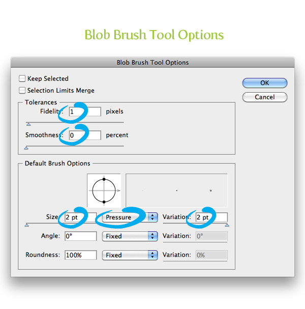 Step 4Zoom in really close to you first letter and start tracing it with the Blob Brush (Shift + B). When tracing, vary the pressure on your pen tablet to get a hand-drawn type of stroke. Also, use multiple brush strokes in your trace, don’t just trace the whole letter with one brush stroke. I also like to start each brush stroke very light and end very light, creating tapered lines.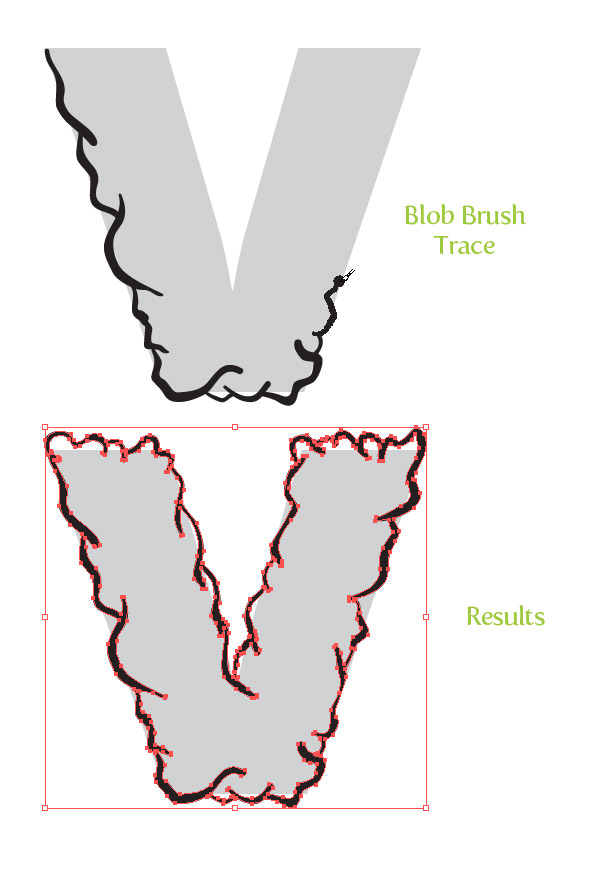 Step 5Once you are done tracing the first letter, create some more Brush strokes within the letter making it more grimy!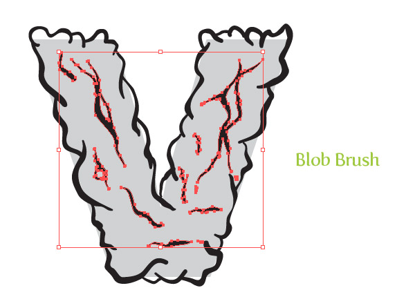 Step 6Now that we have our brush strokes, we can add some color to the letter. First, select all the letter artwork and select the Live Paint Bucket (K) from the Tools Panel. The Live Paint Bucket (K) converts the artwork to a Live Paint object. Now you can simply hover over the area you want to fill, cycle through your swatches with your arrow keys, and click the areas to fill.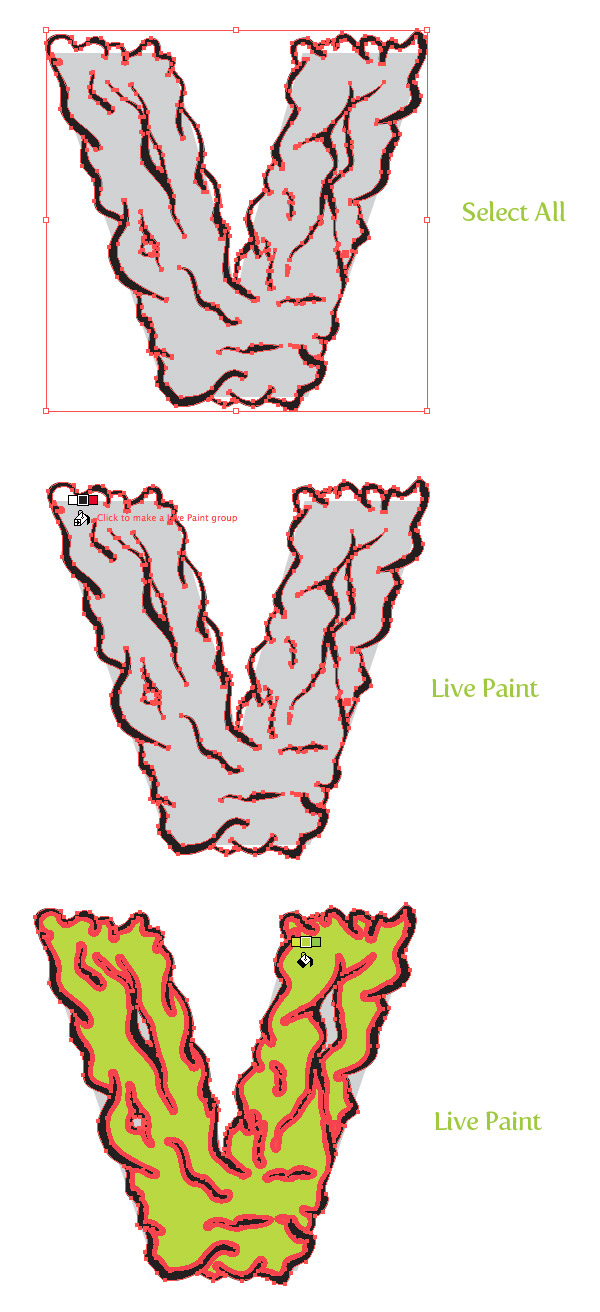 Step 7Select your Live Paint object and go Object > Live Paint > Expand. Next, ungroup the object (Command + Shift + G) a couple of times.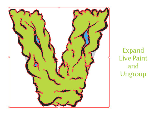 Step 8Select your main letter color and go Object > Path > Offset. In the Offset Path dialog, change the Offset to -3 px. This value might be larger or smaller depending on the original size of your artwork. Fill the offset with a lighter shade of color from the original.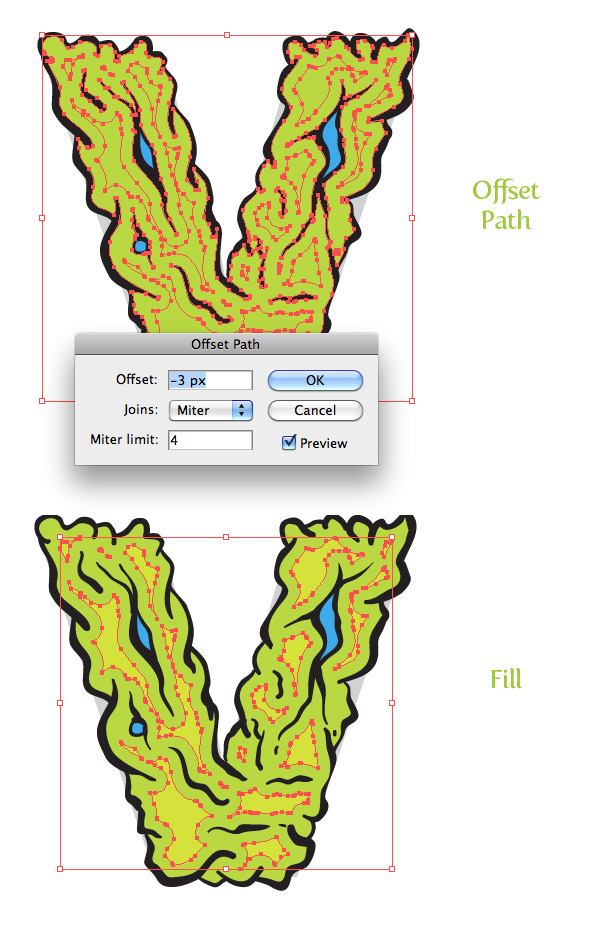 Step 9We are done with the first letter! Now, repeat Steps 4-8 for each letter. It might take some time, but you will start to get quicker once you have done it a couple of times.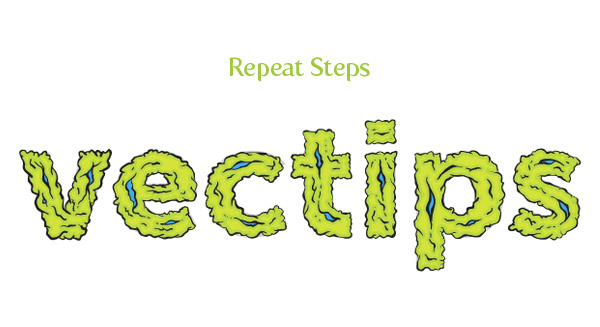 Step 10Now that we have all the letters, we don’t need the “Template” layer anymore. Simply press the Visibility icon in the Layers panel to hide it. Next, Group (Command + G) each individual letter’s artwork. It makes it easy to modify the letters in the coming steps.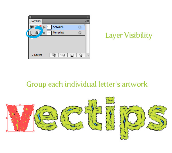 Step 11Use the Selection tool (V) to move and rotate each letter. Use the Illustrator’s Arrange functions to bring some of the letters to the front and some to the back by Going Object > Arrange.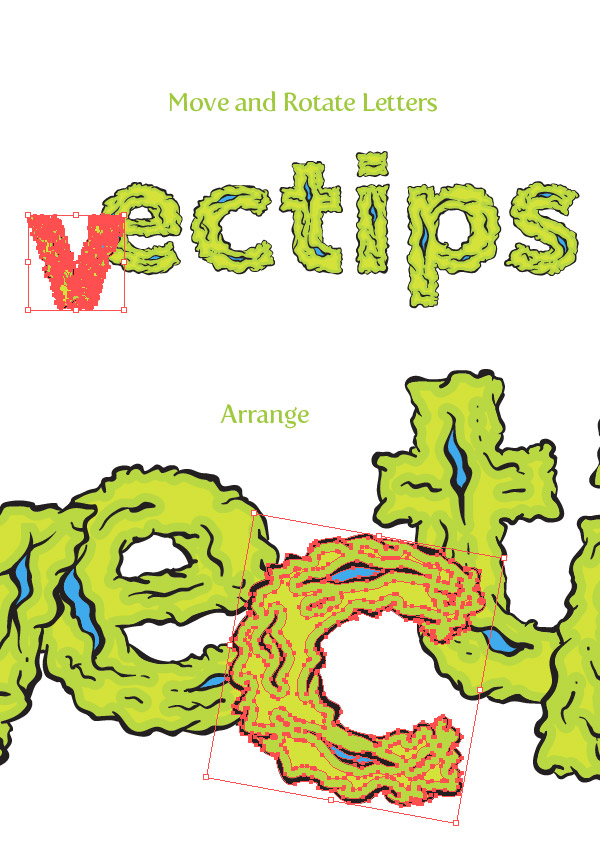 Step 12To give the treatment a little more depth, we can create some shadows. To start, select the first two letters, Copy (Command + C), and Paste in Front (Command + F). Select the first letter’s copy and press the Unite button from the Pathfinder panel. Select the second letter’s copy and again, press the Untie button from the Pathfinder panel. Select the first letter’s copy and move it down and to the right. Select both copies and press the Intersect button from the Pathfinder panel. Change the fill of the new shape to a light gray, set the Blending Mode to Multiply from the Transparency panel, and Arrange the shape so it is behind the first letter, but in front on the second. Step 13Repeat the previous step for each letter’s shadow.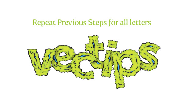 Step 14To make the treatment a little more grimy, use the Blob Brush and create little specs around the text. Use the same Live Paint techniques as discussed before to fill in the speck shapes. That is it, done!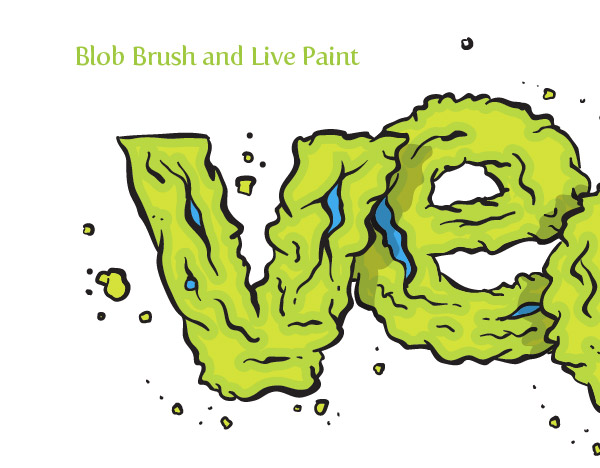 Final ImageBelow is the final type treatment again. Try using the Blob brush and pen tablet on other illustrations and type treatments, it’s fun! Alternate Tutorial MethodsCalligraphic BrushIf you don't have CS4 but you do have a pen tablet, you can use a Calligraphic brush instead of the Blob Brush (Shift +B) for the outlines of the type treatment. If you have CS3, you can use the Live Paint technique or you can just create shapes of color with the Pen tool (P), Pencil tool (N), or another tool of your choice. To set up a Calligraphic brush with the same settings as the Blob Brush settings in this tutorial, click the New Brush Icon in the Brush panel. When the New Brush dialog opens, choose New Calligraphic Brush. In the Calligraphic Brush Options, change the Angle to 0, the Roundness to 100%, the Diameter to 2 pt, select Pressure from the Size drop-down menu, and change the Variation to 2 pt. Now you can outline the image with the same pressure sensitivity as the Blob Brush.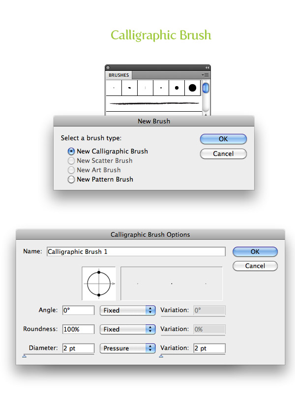 Art BrushesIf you don’t have a pen tablet, you can always use an Art brush for the outlines instead of the Blob Brush (Shift +B) . Art brushes are still very versatile, but they will not use you pen tablets pressure sensitivity. Still, you can find a brush that has similar tapered lines. My previous article Create Sketchy-Style Vectors will help in finding and creating Art brushes.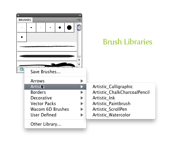 The post Create a Grimy Text Treatment with a Pen Tablet appeared first on Vectips. |
|
Posted: 28 Jul 2015 04:16 PM PDT
 Looking through some of my past work, I noticed I used the font Myriad a lot. At first I wondered why, then I came to the realization, it might be because Myriad is the default font in Illustrator. After that, I changed my default font for new documents. It is really easy to do, so read on to find out how. Looking through some of my past work, I noticed I used the font Myriad a lot. At first I wondered why, then I came to the realization, it might be because Myriad is the default font in Illustrator. After that, I changed my default font for new documents. It is really easy to do, so read on to find out how.Step 1Chose File > Open and navigate to the folder Username/Library/Application Support/Adobe/Adobe Illustrator CS4/New Document Profiles (Mac) or Documents and Settings/User/Application Data/Adobe/Adobe Illustrator CS4 Settings/New Document Profiles (Windows). Here, you can open one of the default document profiles you want to change the default font of (Basic CMYK, Basic RGB, Mobile and Devices, Print, Video and Film, or Web).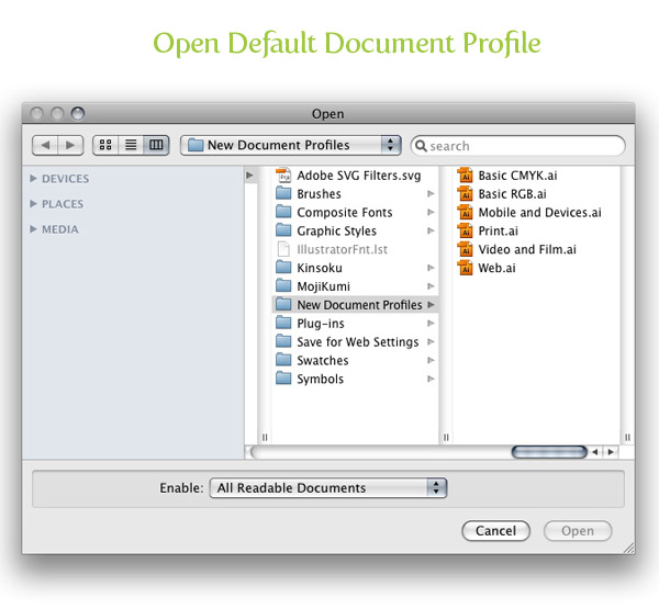 Step 2For this step you will have to open the Character Styles panel by choosing Window > Type > Character Styles. Select the Normal Character Style in the Character Styles panel, choose Basic Character Formats from the panel menu, choose the desired font from the Font Family menu, and press OK.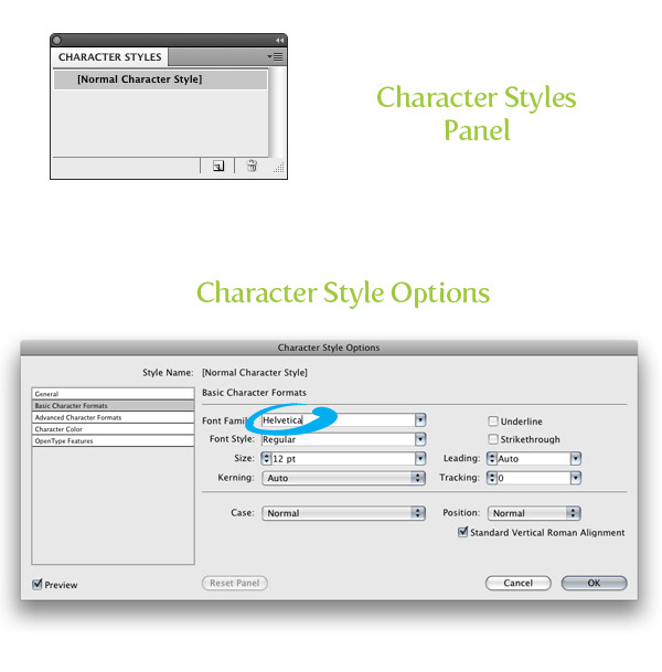 Step 3Save and close the file. To use the new template, choose File > New and select the default document profile you changed.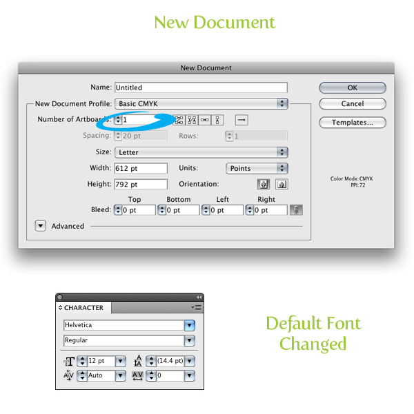 This tip originally appeared in the March/April 2009 issue of Layers: The How-To Magazine for Everything Adobe. |
