
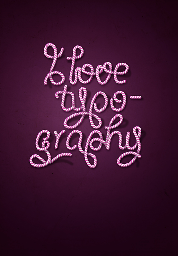
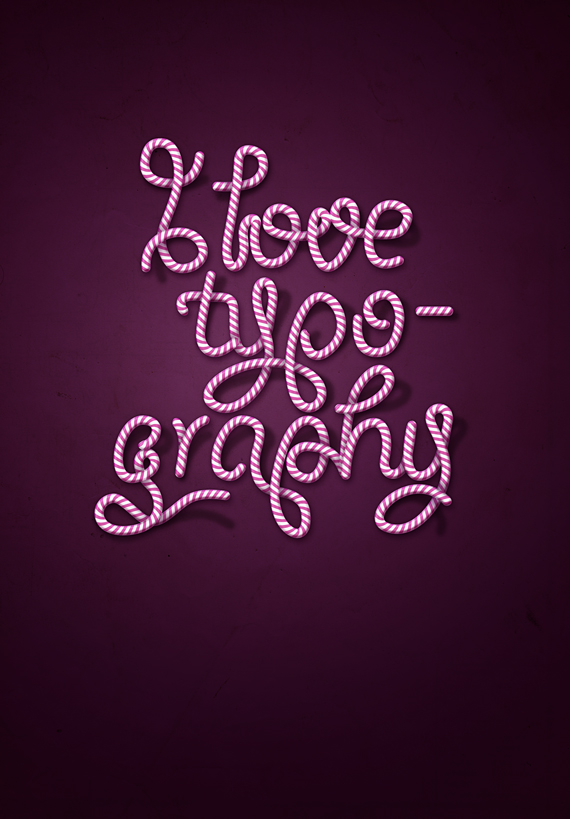
In this tutorial we will create a superb candy cane type design using Illustrator and Photoshop. Apply this effect to your own text and create cool and unique cards!
Along with creating this, you will learn how to:
- create advanced vector pattern brushes
- customize blending modes in Photoshop
- create shading and lighting
- retouch photos to fit the same scenario
- create backgrounds for your image
- use adjustment layers
Difficulty: Intermediate – Advanced
Completion time: 1 hour
Tools: Illustrator CS3, Photoshop CS3

NOTE: If you want to change colors, simply go to the shapes created, change their colors and create a new brush. My color choice was light gray with pink. The black background if for the pics to be more clear, adding this is not compulsory.
Tip: CTRL+click the text layer and go to Layer > Layer Mask > Reveal All.
Along with creating this, you will learn how to:
- create advanced vector pattern brushes
- customize blending modes in Photoshop
- create shading and lighting
- retouch photos to fit the same scenario
- create backgrounds for your image
- use adjustment layers
Difficulty: Intermediate – Advanced
Completion time: 1 hour
Tools: Illustrator CS3, Photoshop CS3
Resources:
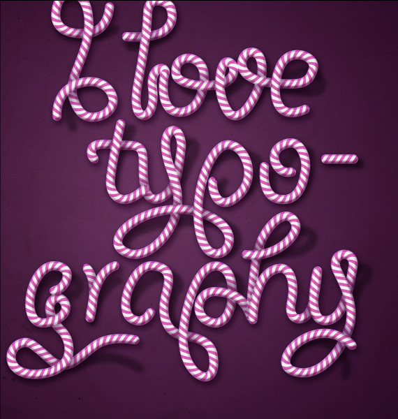
- paper texture from bashcorpoCandy Cane Typography Final Image
STEP 1
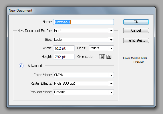
Open Illustrator and create a new document of “Letter” setting in CMYK color mode at 72 dpi.STEP 2
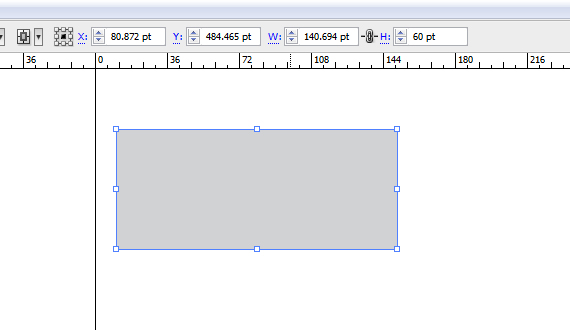
Grab the Rectangle Tool (M) and draw a gray rectangle like below.STEP 3
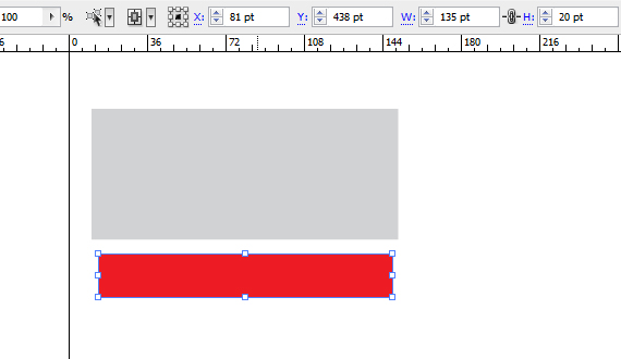
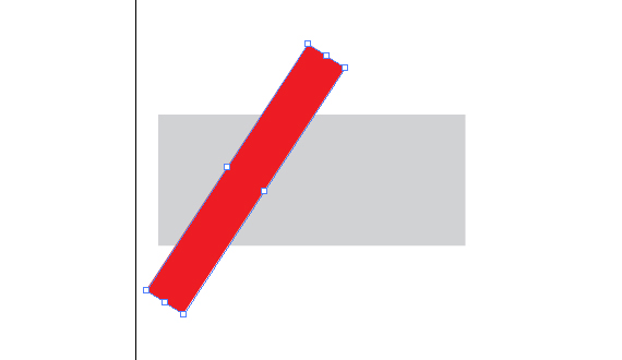
Draw another rectangle, but make it a lot thinner than the previous. Also change its color to red or another color contrasting the first.STEP 4
Grab the Selection Tool (V) and rotate the second rectangle. You don’t have to be very precise with it, just follow your artistic sense.STEP 5
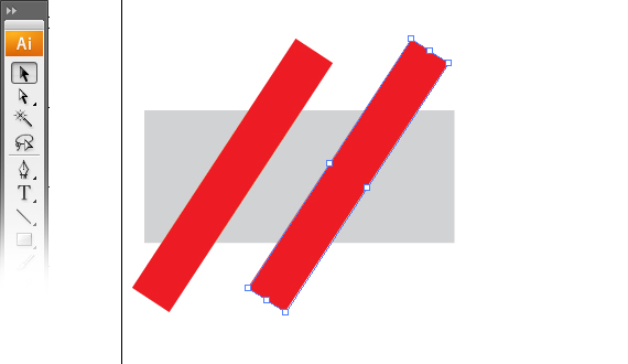
Hold the ALT key and click-drag the red rectangle to the right. Hold SHIFT key while dragging to move it orthogonally.STEP 6
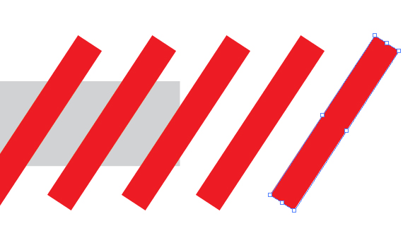
Hit CTRL+D three times. This will duplicate your last command input – in this case, copying a shape.STEP 7
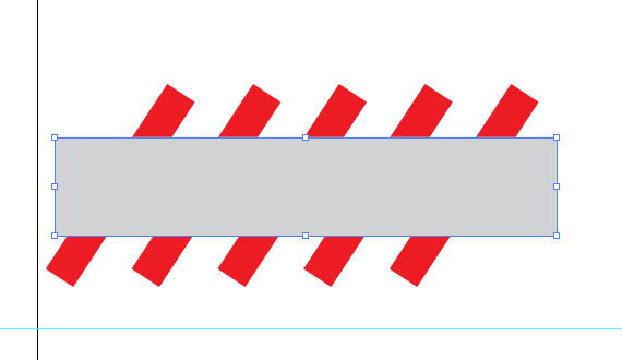
Select the gray rectangle lengthen it a bit, copy it (CTRL+C) and paste it to front (CTRL+F). Hit CTRL+SHIFT+] to bring it in front of the other shapes.STEP 8
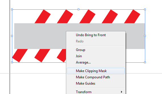
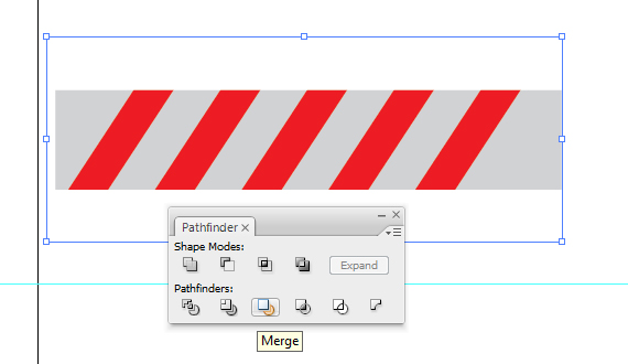
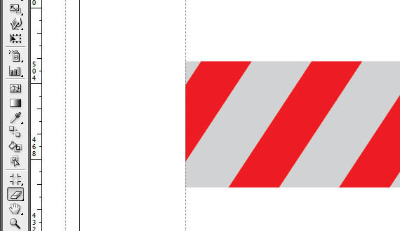
Remove its Fill, select all the red rectangles and right-click > Make Clipping Mask. Select all artwork (CTRL+A) and hit the Merge button. Then paste in front a copy of the merged shape (CTRL+C > CTRL+F). Grab the Eraser Tool (SHIFT+E), hold the ALT key and erase the left side, along with a part of the red stripe.STEP 9
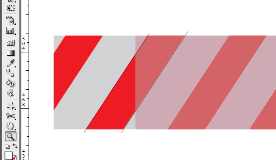
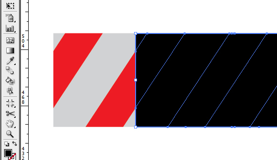
Move the copied shape to the right until the first red stripe aligns with the second stripe from the shape below it. Reduce Opacity to see it better. Now select the shape above and set its Fill color to black.STEP 10
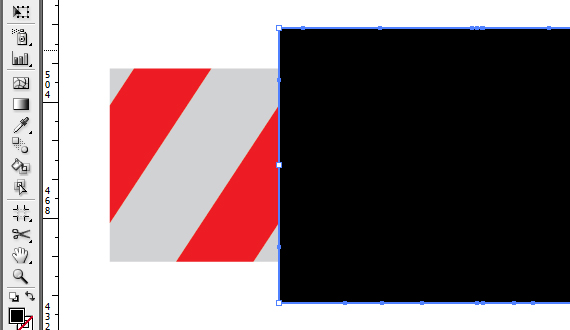
Grab the Selection Tool (V), select the black rectangle, hold the ALT key and click-drag the middle distortion point, like below.STEP 11
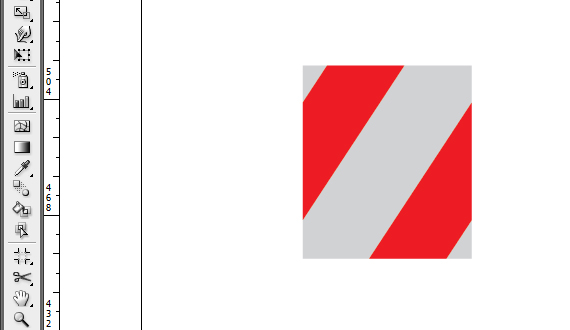
In the Pathfinder window (Window > Pathfinder), click the Merge button. Then select all artwork and hit Merge again. Grab the Direct Selection Tool (A), select the black rectangle and hit Delete.STEP 12
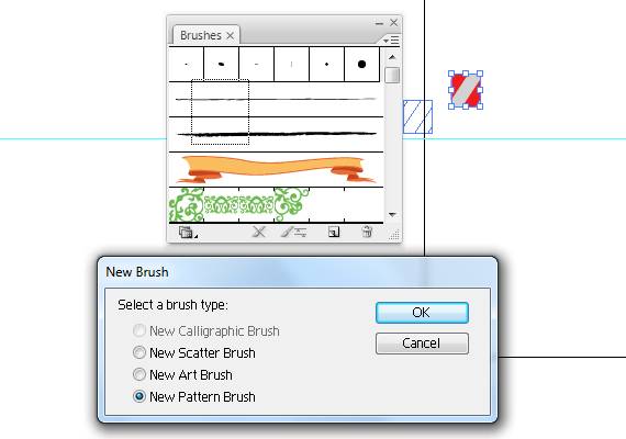
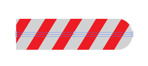
Select all artwork and click-drag it into the Brushes palette (F7) Set it to “Pattern Brush”. Grab the Path Tool (P) and draw a long straight path. Then click the brush you just created. This is a good way to check if your pattern is correct.STEP 13
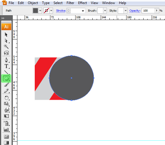
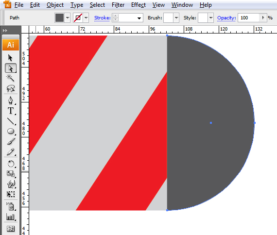
Click the Grab the Ellipse Tool (L) and draw a circle. Hold the SHIFT key while click-dragging to make it perfect.STEP 14
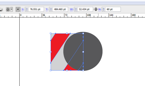
Click the rectangular shape and copy the Height value from the top menu bar. Select the circle and paste this value to Width and Height.STEP 15
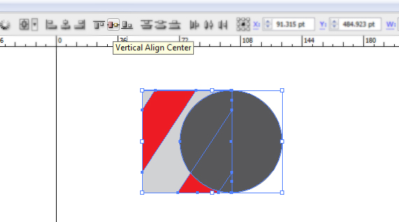
Select both shapes and align them to horizontal axis. CTRL+click near the design to deselect, then grab the Direct Selection Tool (A) and select the left side anchorpoint of the circle and hit Delete. AlignSTEP 16
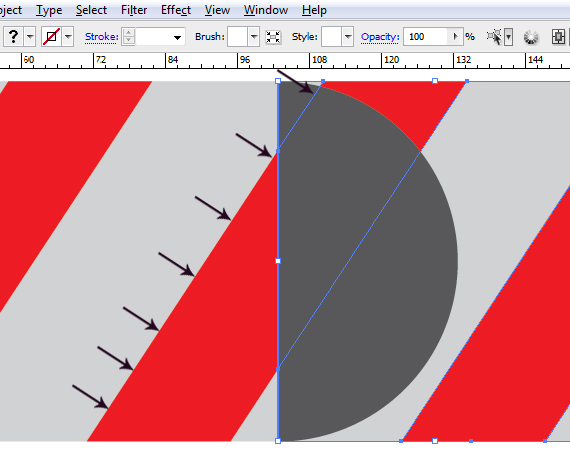
Grab the Selection Tool (V) and align the resulting shape like in the image below. Slect the rectangle and ALT+click-drag to create a copy. Realign the copy with its original, just like in STEP 9.STEP 17
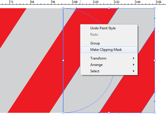
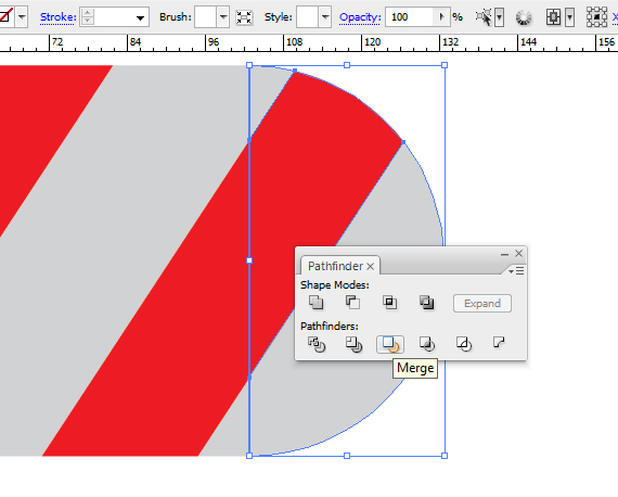
Select the half-circle, remove its Fill, hold SHIFT and click the rectangle behind it. Now right-click > Make Clipping Mask. In the Pathfinder window (Window > Pathfinder), click the Merge button.STEP 18
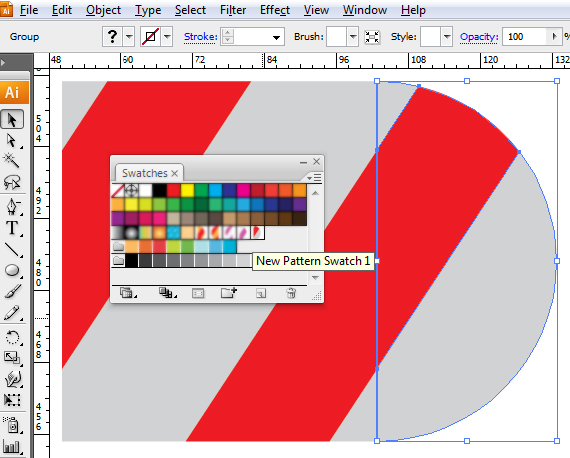
Open the Swatches palette (Window > Swatches) and click-drag the resulting shape into the palette. Name this “candy-end”. In the Brushes palette (F5), select our brush. Make sure you have everything deselected (CTRL+click in a blank area).STEP 19
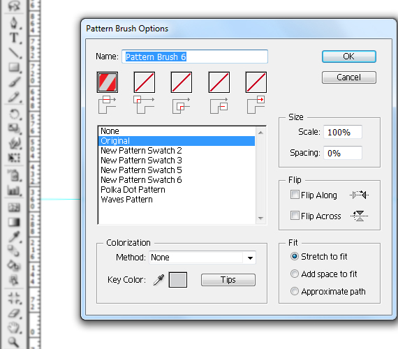
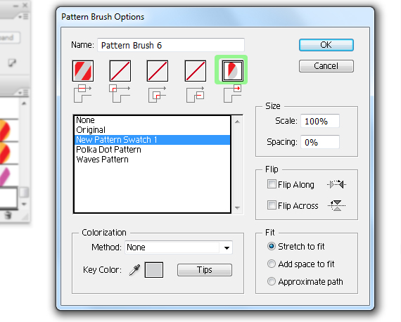
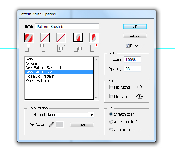
Open the dropdown menu and select Options. Click the last box and select “candy-end” from the list. Hit OK. Select the practice path and click the brush again. See how it looks.STEP 20
Do the same for the other end of the path.STEP 21
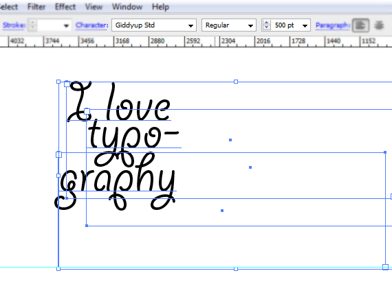
Now that we have a candy-like pattern brush, lets create the text. I used “Giddyup Std” font as reference. Grab the Horizontal Type Tool (T) and type the text below. Use multiple rows.STEP 22
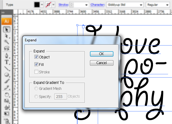
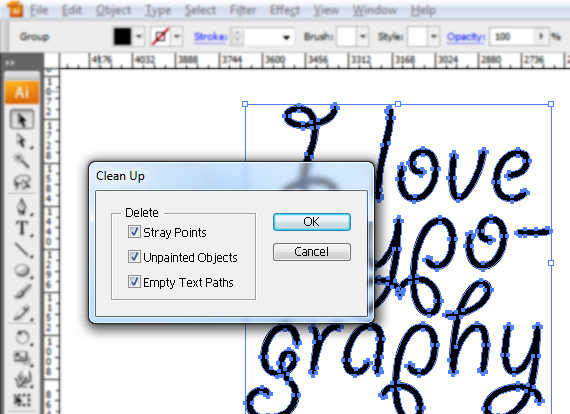
Select all text and go to Object > Expand, then go to Object > Path > Clean up.STEP 23
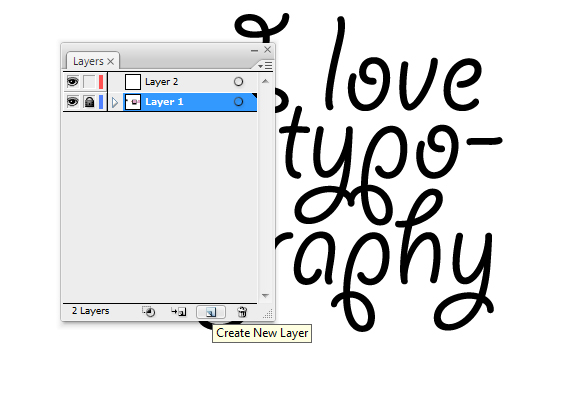
In the Layers palette (F7), click the “Create New Layer” button and lock the layer below it. Select the newly created layer.STEP 24
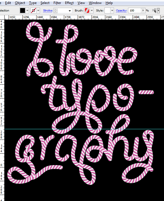
Grab the path tool and trace the text, but do not follow it entirely, feel free to connect words, add loops and cool knots. When you’re done tracing, select all these paths. Get creative!NOTE: If you want to change colors, simply go to the shapes created, change their colors and create a new brush. My color choice was light gray with pink. The black background if for the pics to be more clear, adding this is not compulsory.
STEP 25
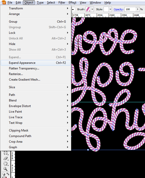
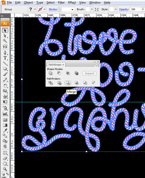
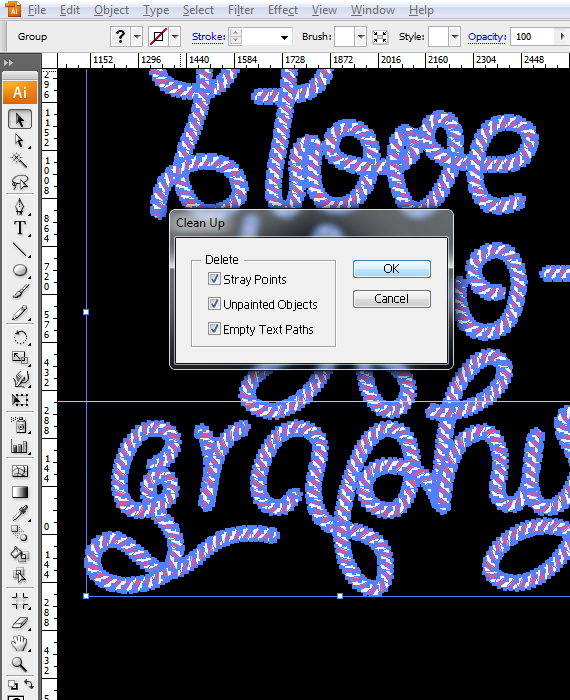
Go to Object Expand Appearance, then go to the Pathfinder window and hit “Merge”, then go to Object > Path > Clean up.STEP 26
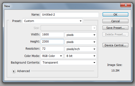
Open Photoshop and go to File > New to create a new document of 1600 x 2300 px in RGB color mode at 72 dpi.STEP 27
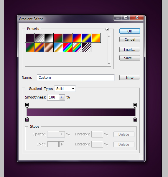
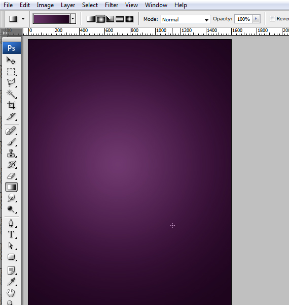
Grab the Gradient Tool (G) and apply the gradient shown below to the background layer.STEP 28
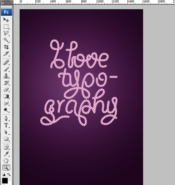
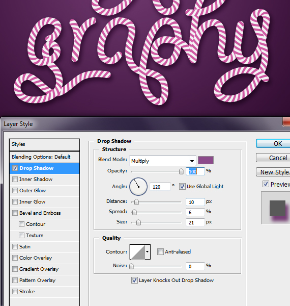
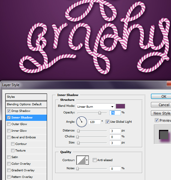
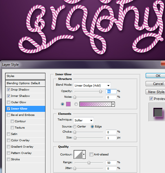
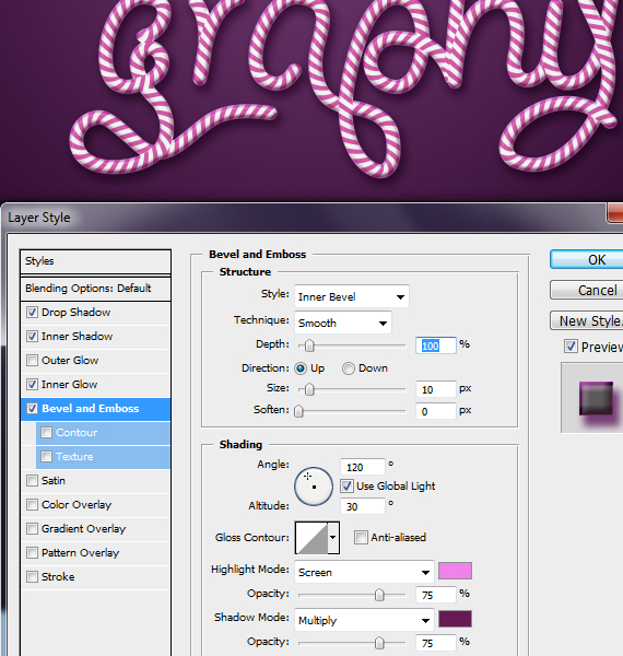
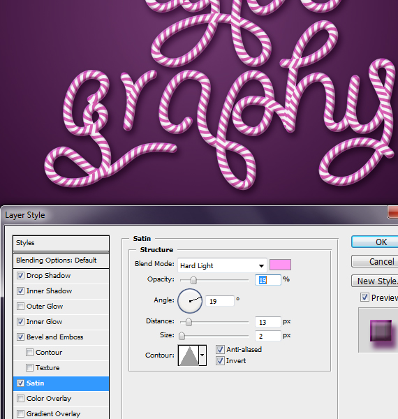
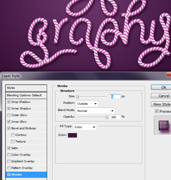
Click-drag the vector text from Illustrator to Photoshop resize it a bit and hit enter. Right-click near the layer thumb, select “Rasterize Layer”, then click the “fx” button and select Blending Options. Use the settings below.STEP 29
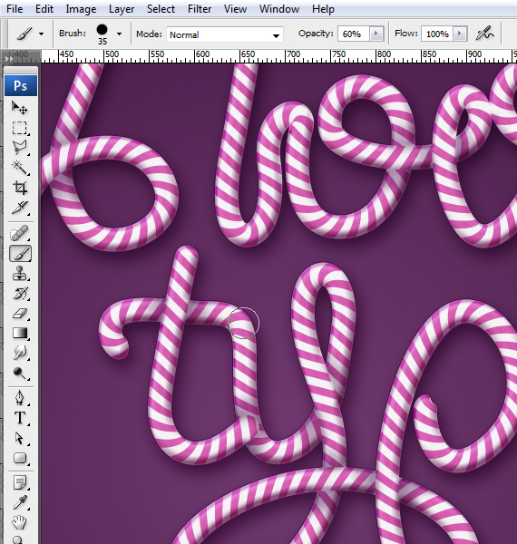
Create a new layer (CTRL+SHIFT+N), set Blending mode to Multiply, grab the Brush Tool (B), set Hardness to 0% and remove any extra setting from the Brushes palette and paint some shadows to give it a more 3D look. Use a dark purple color.Tip: CTRL+click the text layer and go to Layer > Layer Mask > Reveal All.
STEP 30
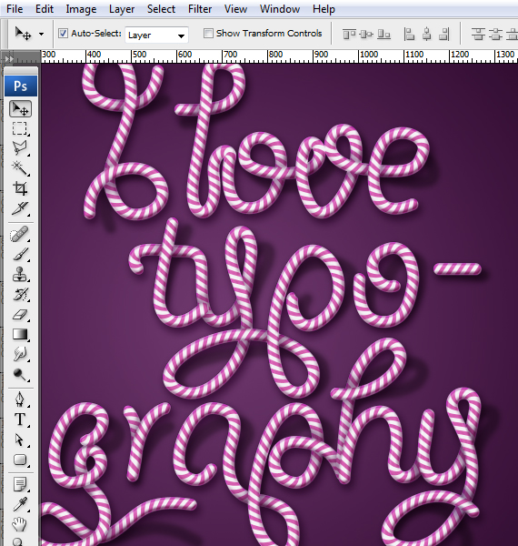
Create a new layer (CTRL+SHIFT+N) and place it below the text layer, grab the Brush Tool (B), set Hardness to 0% and remove any extra setting from the Brushes palette and paint some shadows, as if parts of the text bend away from the wall.STEP 31
Open the “paper texture”. Select all (CTRL+A), copy it (CTRL+C) and paste it into our document (CTRL+V).Place the layer above the background layer. Resize it to fit the canvas and hit Enter. Set Blending mode to Multiply.STEP 32
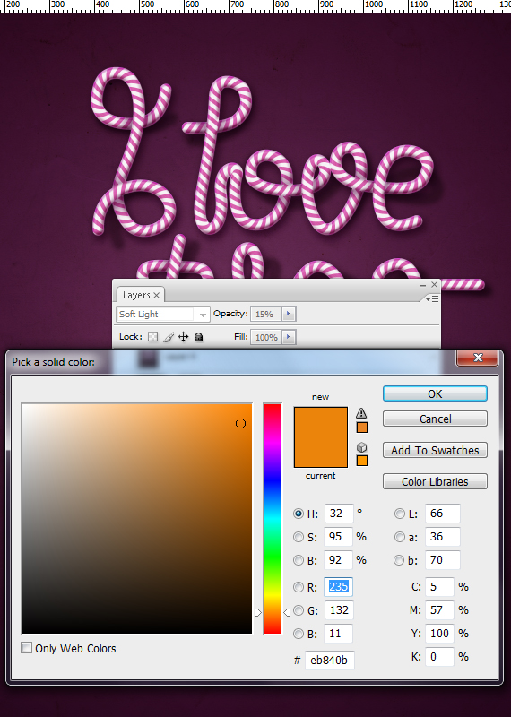
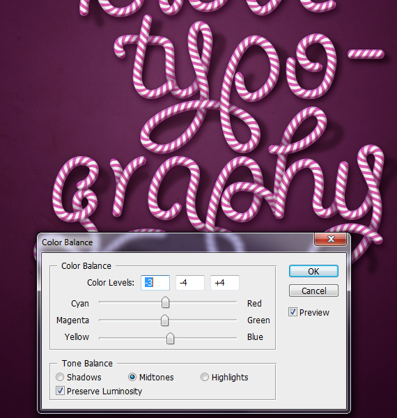
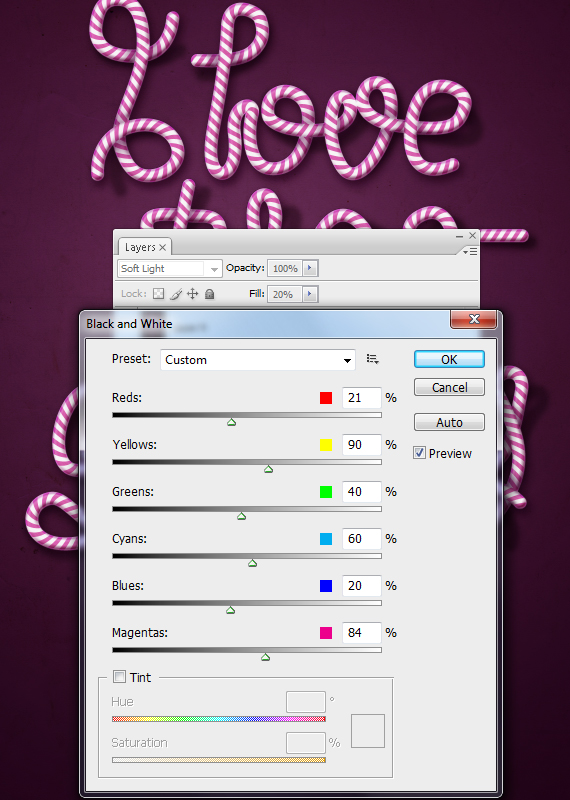
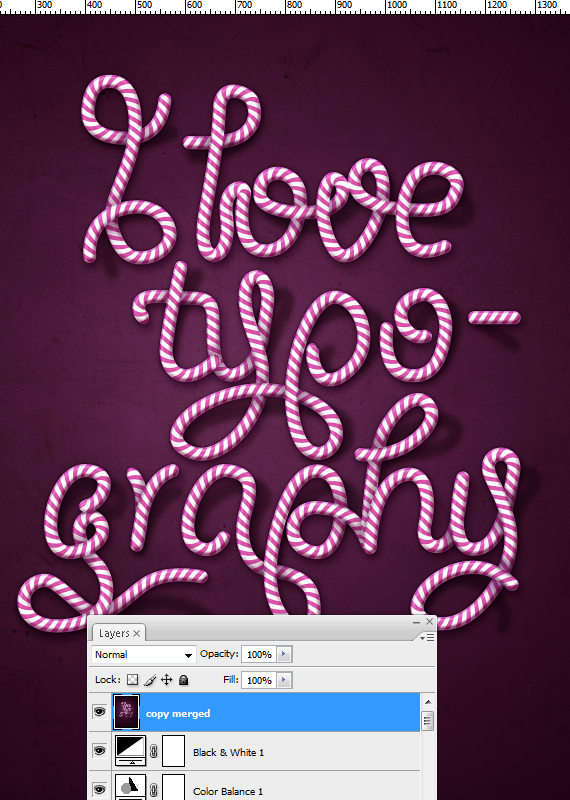
Go to Layer > New Fill Layer > Solid color… and Layer > New Adjustment Layer > Color Balance, Black & White. Use the settings below for each.STEP 33
Select all artwork (CTRL+A, copy merged (CTRL+SHIFT+C) and paste it. Go to Filter > Sharpen > Unsharp Mask. Hit OK.Done!




 I find that striving to be as unique and innovative as possible while still following the current trends, ensures a fresh and creative way of thinking. I often look through magazines, sketch, browse the internet, and listen to music to get creative inspiration. Occasionally, I’ll look for previously designed materials a client has created, just to see where their graphic design and/or branding stands. Sometimes this helps spark a new idea or concept. Making thumbnails and rough sketches helps me work through my ideas. I also tend to ask friends and colleagues about what they think to me get a different perspective on the design. I’m most creative when I’m relaxed, so I make sure that I am comfortable, otherwise I find it very hard to keep focused. If I’m stuck on an idea then I go for a walk to clear my head because forcing an idea won’t result in a good design. This is just my method, everyone has their own way of getting in to that “creative zone”.
 It took me a while to realize that less is really more and that there are big advantages of using more open space in any design. It helps with contrast and clarity and the overall message of the design comes through clearer. If there is too much going on, and my design starts to get cluttered, then I’ll take a step back and really look at how the whole piece looks as a whole. If there’s something that looks awkward or doesn’t need to be in the design, then I remove it. I think paying attention to the negative space throughout the design process inevitably points me in the right direction and saves time with revisions or alterations later on.
 As a closing note, I’d like to say that graphic design really is a driven industry led by people who truly are proud and passionate about it. I have a hard time separating myself from my designs, and when an idea gets shot down I’d be lying if I said it didn’t bother me a little. So, what do I do? I push myself harder, because It really does reflect in the design. I’d say some of my best work came from ideas that were the result of constructive criticism.