Tutorial Details
- Program: Illustrator
- Difficulty: Beginner
- Completion Time: 1-2 hours
Final Product What You'll Be Creating

Step 1
Create a document that is 8.5 inches by 11 inches. Choose a typeface for the type treatment (I used Helvetica Bold) and type out what you want. Next, Outline the text by going to Type > Create Outlines.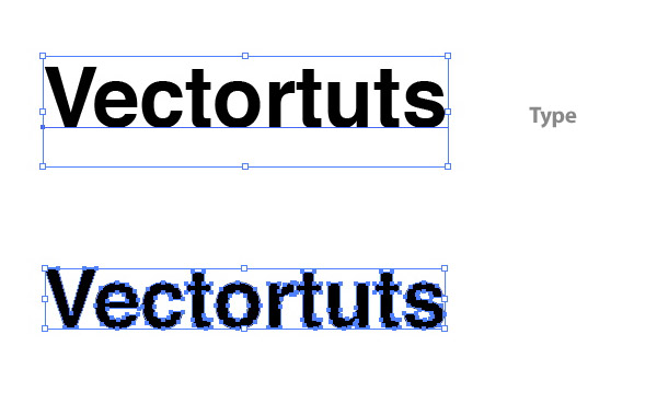
Step 2
With the text selected, create a Linear Gradient from the Gradient Panel. Change the color of the first swatch on the Gradient Slider (left swatch) to a light green (I used these CMYK values: C=40, M=0, Y=100, and K=0). Change the second swatch on the Gradient Slider to a darker green (C=60 M=16 Y=100 K=0). Use the Gradient Tool (G) to adjust the gradient by clicking at the top of the type and dragging to the bottom of the type so the dark part is at the bottom.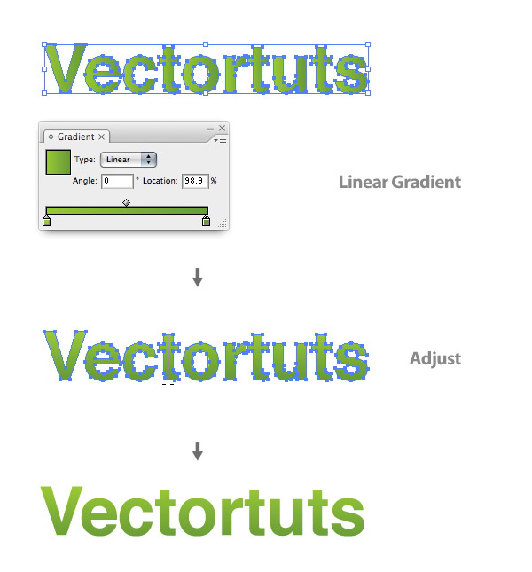
Step 3
Now we’re going to create some leaves. Start by drawing a leaf shape with the Pen Tool (P). Again, with the Pen Tool (P), draw a line that starts at the tip of leaf and ends in the middle of the bottom part of the leaf. After selecting the line and the leaf shape, press the Divide button in the Pathfinder Panel, located on the bottom left side of the panel. Ungroup (Command+Shift+G) the objects so you have two separate shapes.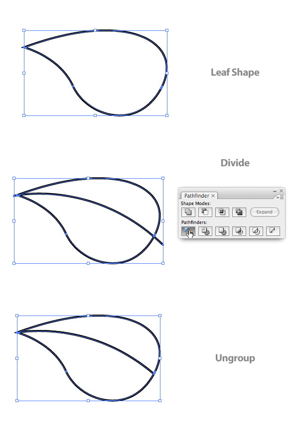
Step 4
Select both shapes and create the same colored Linear Gradient as the Text. Next, select one shape and use the Gradient Tool (G) to click and drag at a 45 degree angle across the leaf half shape. Do this again for the other half of the leaf.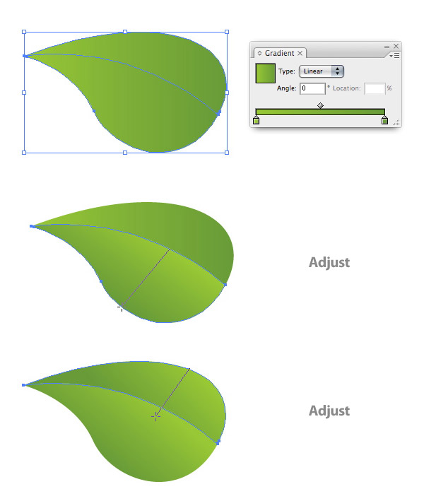
Step 5
With the Pen Tool (P) draw a highlight shape on the top leaf half. Change the highlight shape to a Radial Gradient. Change the left swatch to white and the right swatch to your green color (C=40 M=0 Y=100 K=0).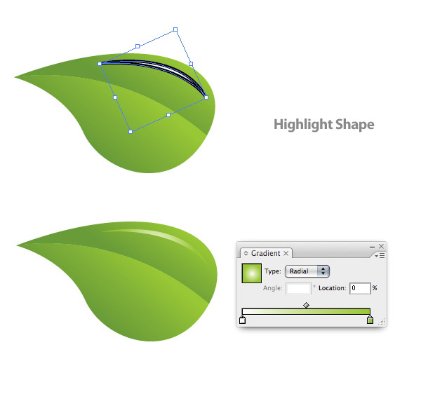
Step 6
With the Pen Tool (P), create a stem shape and send it behind the leaf shapes. Create a Linear Gradient, make the gradient the same colors as the leaf shapes, and adjust the gradient so the darker green is at the top of the stem.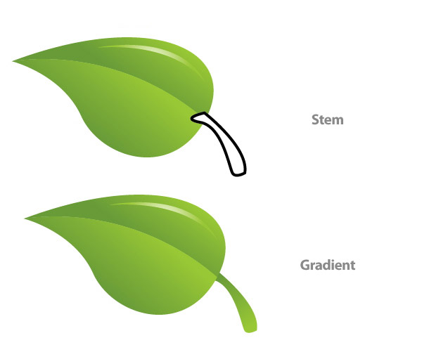
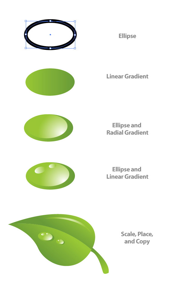
Step 7
Next come the water droplets. Create an oblong ellipse with the Ellipse Tool (L). Then create a Linear Gradient using the same colors as the leaf and text. Adjust the gradient so the dark side is on the bottom left.Create another ellipse on top of the previous ellipse and create a Radial Gradient with the same swatches as the highlight gradient. Adjust this gradient so the light part of the gradient is coming from the bottom left.
Create two more smaller ellipses with Linear Gradients matching the highlight gradient. Once you are done, group all the ellipses, scale and place them on the leaf shapes. You can easily copy the droplet by holding down Alt and dragging a copy.
Step 8
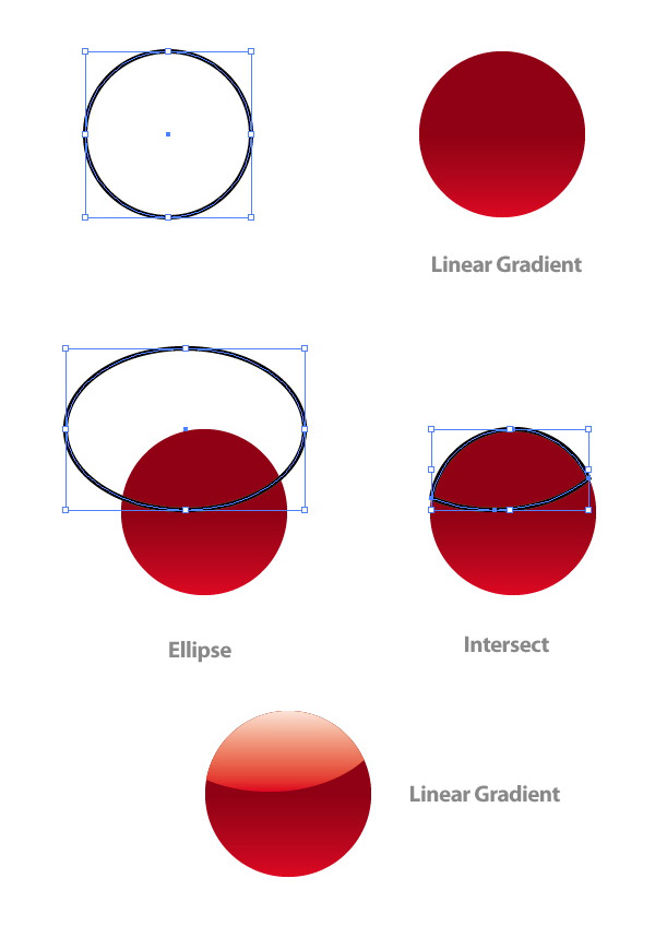
The next couple of steps deal with creating the ladybug. Create an ellipse and fill it with a Linear Gradient. Make the first swatch in the gradient a red (C=0 M=100 Y=100 K=0) and the second an even darker red (C=0 M=100 Y=100 K=35). Adjust the gradient so the red color is at the bottom of the ellipse.Copy (Command + C) the ellipse and Paste it in Front (Command + F). Draw another bigger ellipse that overlaps the center of the original ellipse. After selecting one of the original ellipses and the overlapping circle, press the Intersect Shape Areas button in the Pathfinder Panel. Make the intersected shape a Linear Gradient with the first swatch white and the second swatch red. Adjust the gradient so the white is at the top of the shape.
Step 9
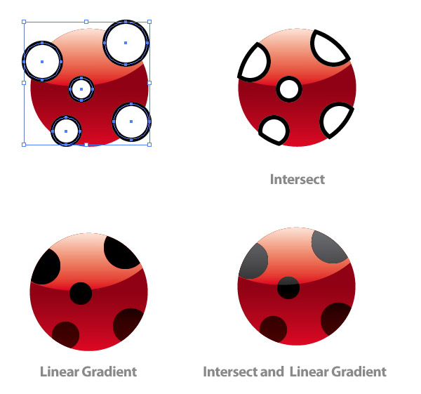
Draw five more ellipses over the ladybug body shape and group them together. Copy (Command + C) the original body ellipse shape and Paste it in Front (Command + F). With the copied body shape and the five ellipse selected, Intersect the shapes.Change the dots to a Linear Gradient with the first swatch a really dark red and the second swatch a black red. Adjust the gradient so the lightest red is at the bottom of the combined shapes. Next, Copy (Command + C) the top highlighted shape of the body and Paste it in Front (Command + F).
Copy (Command + C) the dots and Paste it in Front (Command + F). Select the copied highlight and one of the dots copy and Intersect them. Create a Linear Gradient with the first swatch at 60% black and the second at 90% black. Adjust the gradient so the lighter black is at the top of the shape.
Step 10
Create another ellipse for the ladybug’s head. Create a gradient the same as the top dots gradient and send the head behind the body shape. Draw an antenna shape with the Pen Tool (P) and place it behind the head. Copy (Command + C) the antenna and Paste it in Front (Command + F). Reflect the antenna by pressing the Flip Horizontal option from the pop-up menu of the Transform Panel.Step 11
Draw an ellipse roughly the size of the completed ladybug. Create a Radial Gradient so the inside swatch is black and the outside is white. Set the ellipse to Multiply from the Transparency Panel and send it behind the ladybug to the bottom left, creating a drop shadow. After grouping the ladybug and drop shadow, place it on the leaf. Then scale and rotate the lady bug as needed.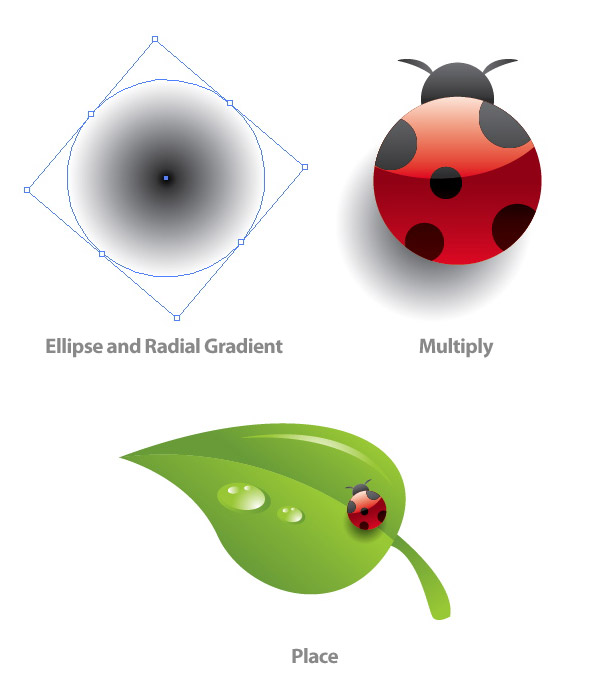
Step 12
After selecting the leaf and all the elements on it, place them over your text. I placed mine over the first letter of the word.
Step 13
Copy (Command + C) the leaf and elements, except the lady bug, and Paste (Command + V). Flip the leaf horizontally and scale down the leaf. When scaling you don’t have to constrain the proportions, this helps the leaf look different from the other. Repeat this step a couple of times around the text.
Step 14
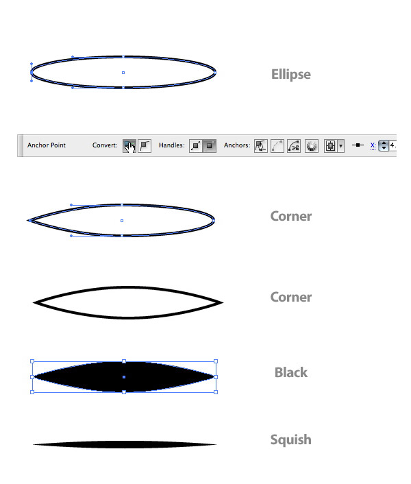
For the other leaves we are going to create an Art Brush. You can draw these elements with the Pen Tool (P), but you’ll find it more consistent and easier to use a brush.Draw an oblong ellipse. Then with the Direct Selection Tool (A), select the right anchor point in the ellipse. When you select an anchor point the Control Panel will default to the Anchor Point Options. Convert the anchor point to a Corner (the first button to the right on the Control Panel). Do this again for the left anchor point. Next, squish the ellipse down from the top to half its original size.
Step 15
Drag the oval into the Brush Panel and choose New Art Brush. In the Art Brush options change Colorization to Tints. This lets you change the color of the brush without creating a new brush. You don’t need to change the colors of the brush strokes for this tutorial, but it is good practice.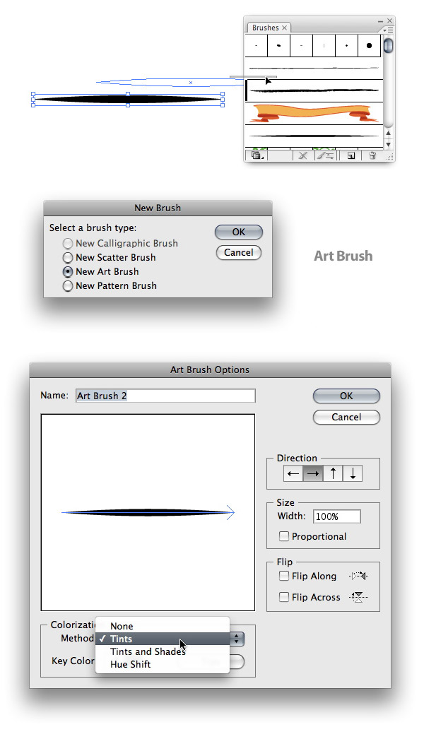
Step 16
With your new brush, make a swirl shape for a leaf blade. You might need to change the stroke of the brush if it looks to small or too big. When you get a stroke you like, go to Object > Expand. You will also want to clean up the unfilled stroke. An easy way to do this is to go Object > Path > Clean Up. Also, make sure all the check boxes are checked and press OK.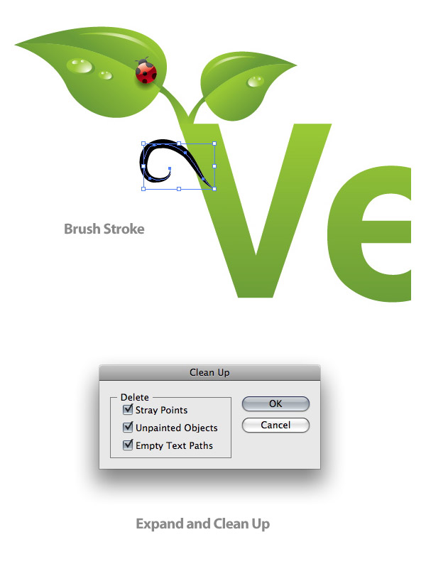
Step 17
Select the expanded brush shape and create a Linear Gradient with the same swatches as the original text gradient.
Step 18
Repeat the steps for creating the leaf blade around your text. Try to vary the shape and size of the blades.
Step 19
Next we’re going to add some more water droplets around the text. Simply Copy (Command + C) the droplets on the leaf you already made and Paste (Command + V) them around the text. Also, be sure to vary their size and shape.
Step 20
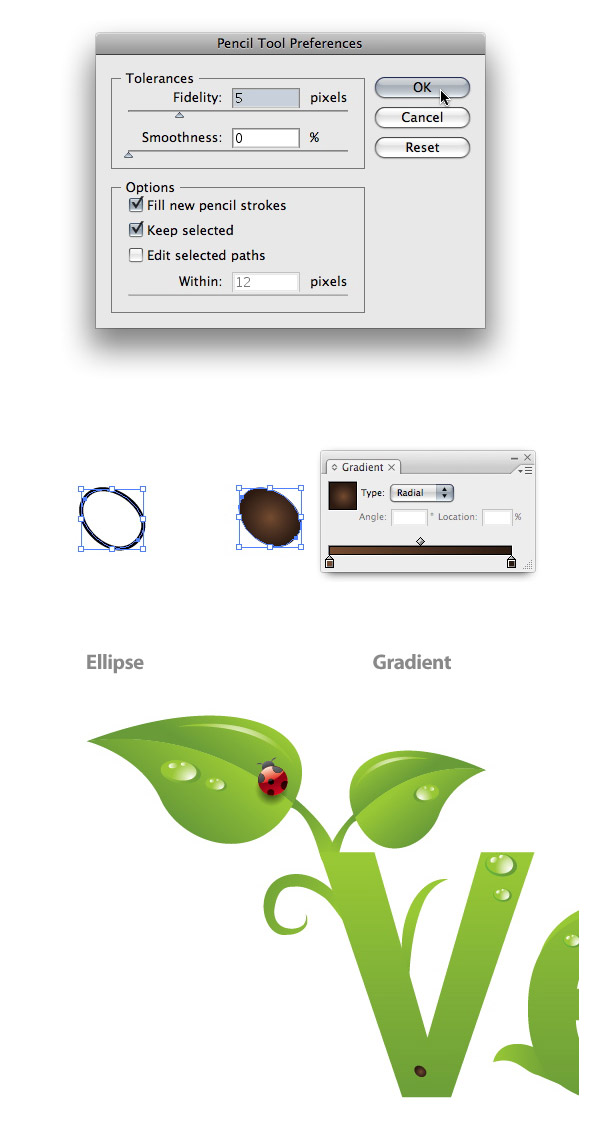
Now it is time to work on the dirt at the bottom of the text. Double click on the Pencil Tool (N) in the Tools Panel to bring up the Pencil Tool Options. Change the Fidelity to 5 to get really smooth lines.Use you Pencil Tool (N) to draw a small circular shape. Press Alt before you let go to close the shape. Next, create a Radial Gradient with the interior swatch a brown color (C=35 M=60 Y=80 K=25) and the exterior swatch a dark brown color (C=50 M=70 Y=80 K=70) . Place the spot on the first letter of your word. Scale the dot down smaller than one of the droplets.
Step 21
Repeat this till you have a pile of dirt spots on you first letter.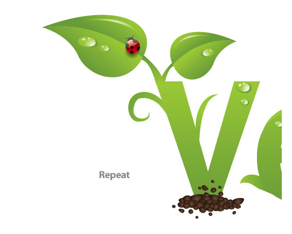
Step 22
Copy (Command + C) and Paste the dirt pile until you have covered the very bottom of all the letters.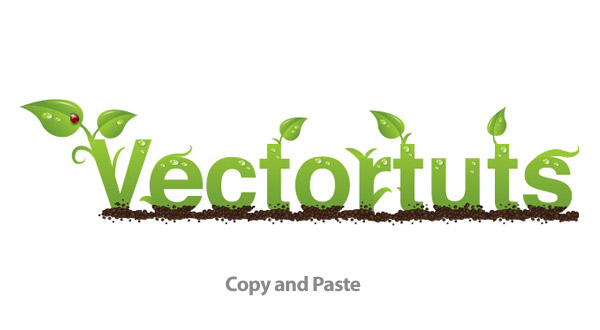
Step 23
Draw a Radial Gradient ellipse like you did for the ladybug drop shadow. Squish the ellipse to about half the size. Send the ellipse behind all the artwork and set it to Multiply.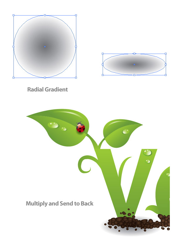
Step 24
Repeat this drop shadow under all the letters.
Step 25
For the background create a rectangle with the Rectangle Tool that is the size of you document. Give it a Radial Gradient, make the interior swatch white and the second swatch a light green (C=13 M=0 Y=38 K=0).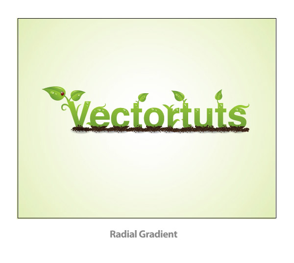
Final Image
Now you have a nice Green type treatment!